B2B SaaS Landing Page Teardowns: 15 High-Converting Examples Analyzed
15 landing page teardowns showing how clarity, trust, and focused CTAs drive higher conversions for B2B SaaS.
B2B SaaS Landing Page Teardowns: 15 High-Converting Examples Analyzed
What makes a B2B SaaS landing page convert? It’s not just about design - it’s about clarity, trust, and focus. This article breaks down 15 examples of high-performing landing pages, analyzing what works and why. Here’s what you’ll learn:
- Clear messaging wins: The best pages answer three questions in 10 seconds: What is this? Is it for me? Why should I trust it?
- Trust signals matter: Social proof (like customer logos and testimonials) and transparent pricing build credibility.
- Simplicity converts: Removing distractions, using concise headlines, and focusing on a single call-to-action (CTA) boosts conversions.
- Tailored strategies work: Pages that address specific buyer pain points or roles (like enterprise buyers or IT managers) perform better.
Quick Overview of Key Takeaways:
- HubSpot: Longer forms filter qualified leads.
- Slack: Interactive demos reduce friction.
- Asana: Feature-specific sections guide users.
- Zoom: Minimal forms improve webinar signups.
- Monday.com: Interactive product demos engage prospects.
- Salesforce: Tiered CTAs match buyer intent.
- Trello: Pricing pages optimized for upgrades.
- Intercom: Role-based messaging drives relevance.
- Dropbox: Security-focused pages address compliance concerns.
- Marketo: Dynamic content personalizes the experience.
- Zendesk: Case studies build trust with measurable results.
- Calendly: Embedded schedulers simplify booking.
- Shopify Plus: TCO calculators highlight value.
- Artisan Strategies: Clear outcomes attract SaaS teams.
- Pipedrive: Retargeting pages remove signup barriers.
Put simply: A high-converting B2B SaaS landing page is clear, focused, and tailored to its audience. The key is to remove distractions, address buyer concerns, and build trust - all while guiding visitors toward a single action.
::: @figure 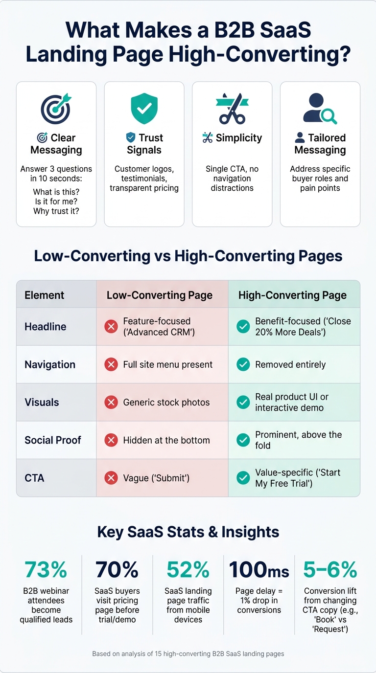 :::
:::
I've Built 300+ SaaS Landing Pages - This format always work
::: @iframe https://www.youtube.com/embed/4I8hUgbR5os :::
sbb-itb-0499eb9
1. HubSpot: Free CRM Trial Landing Page
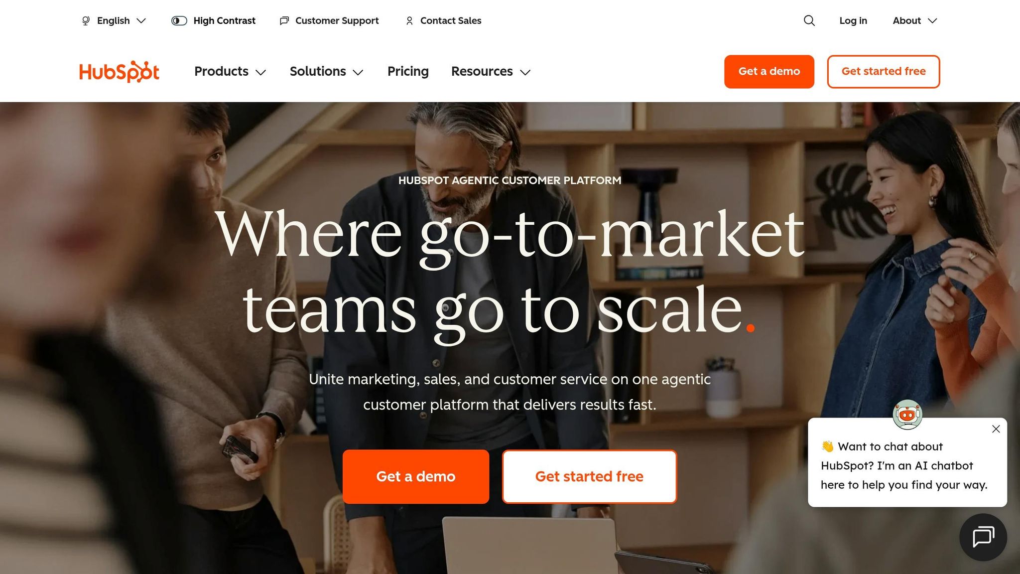
Conversion goal: Encourage visitors to start a free CRM trial - no credit card required, no strings attached.
HubSpot's free trial page isn't about flashy visuals. Instead, it shines through thoughtful design choices that attract high-intent users while filtering out those less likely to convert.
One standout feature is the longer form. Unlike the common advice to keep forms short, HubSpot deliberately asks for details like company size, role, team size, and specific challenges. This approach may reduce the number of signups, but it ensures the leads they do get are more qualified. As Rishabh Pugalia of Content Beta explains:
"HubSpot made [their form] longer on purpose, and treats the resulting drop-off as a filtering mechanism rather than a failure." [6]
The data collected from these fields allows HubSpot to customize the onboarding experience. For instance, the journey for a small startup with five employees will differ significantly from that of a 500-person enterprise.
The page's copy directly addresses common concerns of U.S. buyers, such as fragmented tools, data silos, and pressure to demonstrate ROI. Headlines like "Prove ROI" and phrases like "single source of truth" resonate with these pain points. Additionally, the term "free CRM" is repeated naturally in the hero section - appearing three times - to align with what potential users are searching for [7]. The phrase "No credit card or commitment required", placed near the call-to-action (CTA), helps eliminate any lingering doubts.
HubSpot also builds trust by emphasizing its scale. Highlighting 299,000+ customers across 135+ countries [5] taps into social proof, reassuring visitors that the platform is widely trusted. An AI chatbot widget further strengthens the page by addressing objections in real time, ensuring potential users have their questions answered immediately.
| Design Element | Purpose |
|---|---|
| 4–5 qualification fields | Filters high-intent leads and enables personalized onboarding [6] |
| "No credit card" microcopy | Reduces commitment-related hesitation near the CTA [4][5] |
| 299,000+ customer count | Builds credibility through social proof [5] |
| AI chatbot widget | Handles objections in real time [4][5] |
Key takeaway: Don't automatically shorten your forms. Including extra fields can help filter out low-value users and improve onboarding. To measure success, track 14-day activation rates in addition to initial signups [6].
Next, we'll take a closer look at Slack's demo request landing page and its unique approach.
2. Slack: Demo Request Landing Page
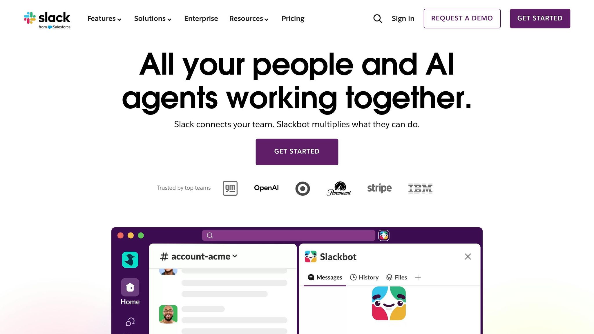
Conversion goal: Encourage enterprise buyers to request a demo or skip the sales process and try the product immediately.
Slack's demo page takes a different approach by avoiding the typical long forms that often frustrate users. Instead, it offers an interactive demo at slackdemo.com, allowing visitors to explore the product without filling out forms or scheduling sales calls. The demo is tailored to three perspectives: individual users, teams, and organizations. This setup ensures stakeholders - from IT managers to VPs of Sales - can quickly understand how Slack delivers value.
For those who choose to engage with a contact form, Slack keeps it simple. Only an email address is required, eliminating the intimidating "wall of fields" that can lead to drop-offs. This user-friendly approach is reflected in the page's desktop UX score, which achieved 94 out of 100 in the "Act" stage (CTA usability), according to LandingMetrics UX Benchmark data [8]. This score surpasses the desktop benchmark of 90/100 for the same metric. To build further trust, the page reinforces credibility with visible trust signals.
Slack pairs its low-barrier entry with strong trust elements. Grayscale logos of well-known U.S. companies like Lyft are displayed alongside testimonials. For example, Benjamin Sternsmith, Area Vice President of Sales at Lyft Business, shares:
"Slack is business done right. When you have collaboration happening in one spot, leadership doesn't need to be copied on an email. You can hop into a Slack channel, cruise along with the project, and jump in where needed." [9]
Security is another key focus for enterprise buyers, especially in the U.S. Slack addresses these concerns by prominently showcasing compliance certifications like SOC 2, ISO 27001, and HIPAA (for Enterprise Grid customers). It also highlights data encryption using TLS 1.2 over HTTPS [11][12]. Additionally, research indicates that tweaking button copy from "Request" to "Book" or "Schedule" can boost meeting rates by 5–6% [10] - a small change worth testing.
3. Asana: Feature-Specific Landing Page for Workflow Management
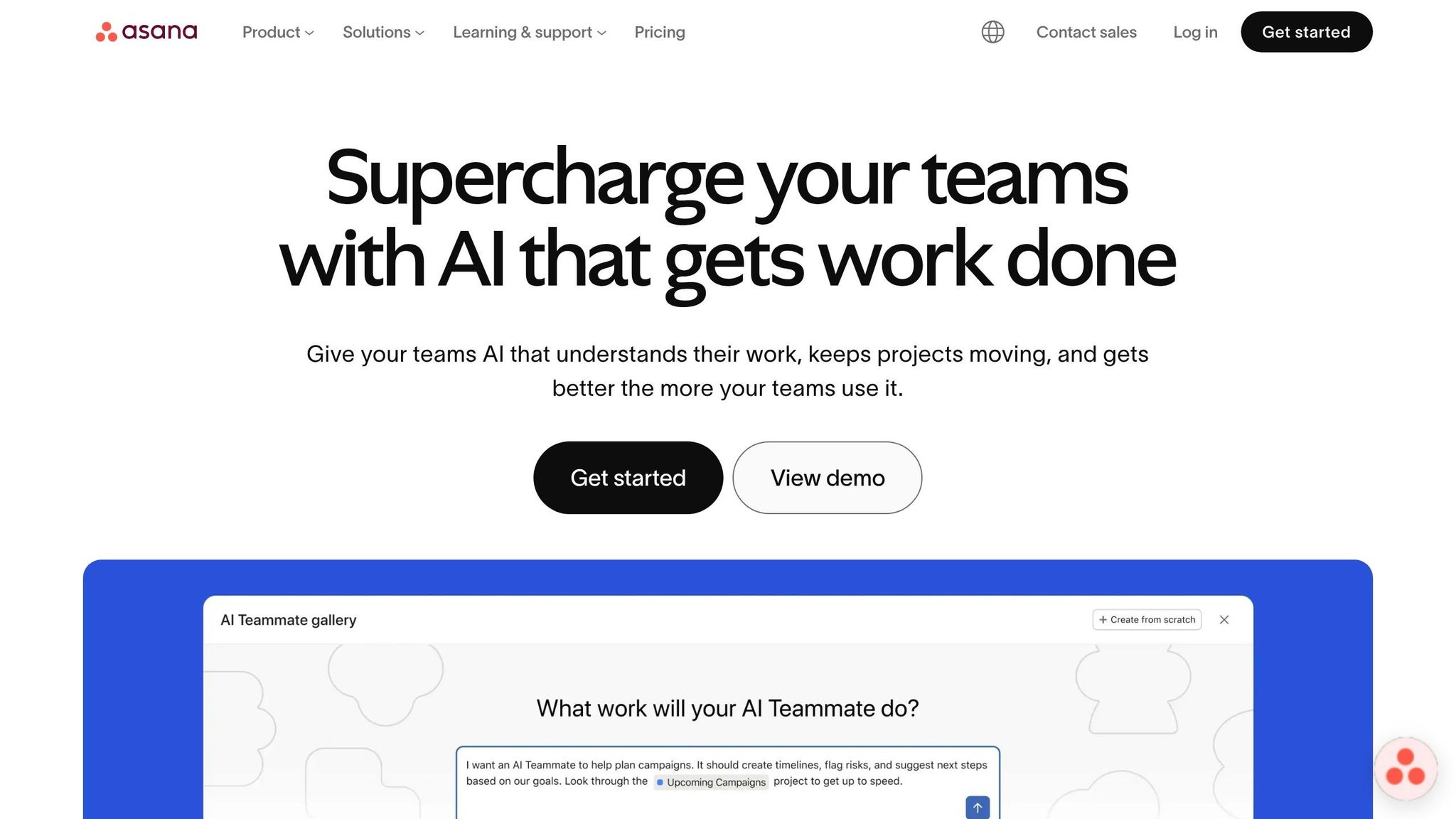
Conversion goal: Encourage enterprise teams to start a free trial or explore key workflow features.
Asana's landing page for workflow management takes a clear, segmented approach. It highlights specific features - Forms, Rules, Templates, and Bundles - in separate sections, each with a targeted call-to-action like "See [feature]." This layout makes it easy for visitors to quickly locate the tools they need. To further streamline the process, the page includes simple sign-up options such as "Continue with Google" and "Continue with Microsoft" buttons, reducing barriers to entry and keeping the focus on conversions.
The "Connect everything" section showcases logos from over 270 tools, including Slack, Gmail, Jira, and HubSpot. This integration-focused display reassures potential users - especially enterprise buyers in the U.S. - that Asana works seamlessly with their existing tech stack [13][14].
To build trust, the page highlights impressive proof points: 85% of Fortune 100 companies use Asana [16]. It also notes that Asana has been recognized as a "Leader" in the Gartner Magic Quadrant for Collaborative Work Management for three consecutive years through 2025 [16]. Real-world success stories further emphasize its value. For example, ClassPass reported completing marketing campaigns 30–40% faster, while Awin saved 15 hours of manual work per week by automating localization workflows [15].
Asana also positions its AI Studio as a key differentiator:
"AI is no longer just a tool - it's a teammate." - Asana [16]
Jennifer Kordosky, VP of Creative & Marketing Operations at Clear Channel Outdoor, reinforced this perspective:
"From what I've seen with AI Studio, what the efficiencies are, my mind is blown." [17]
This focus on AI capabilities appeals to enterprise buyers in the U.S. who are eager to adopt AI-driven tools in their workflows.
4. Zoom: Webinar Registration Landing Page
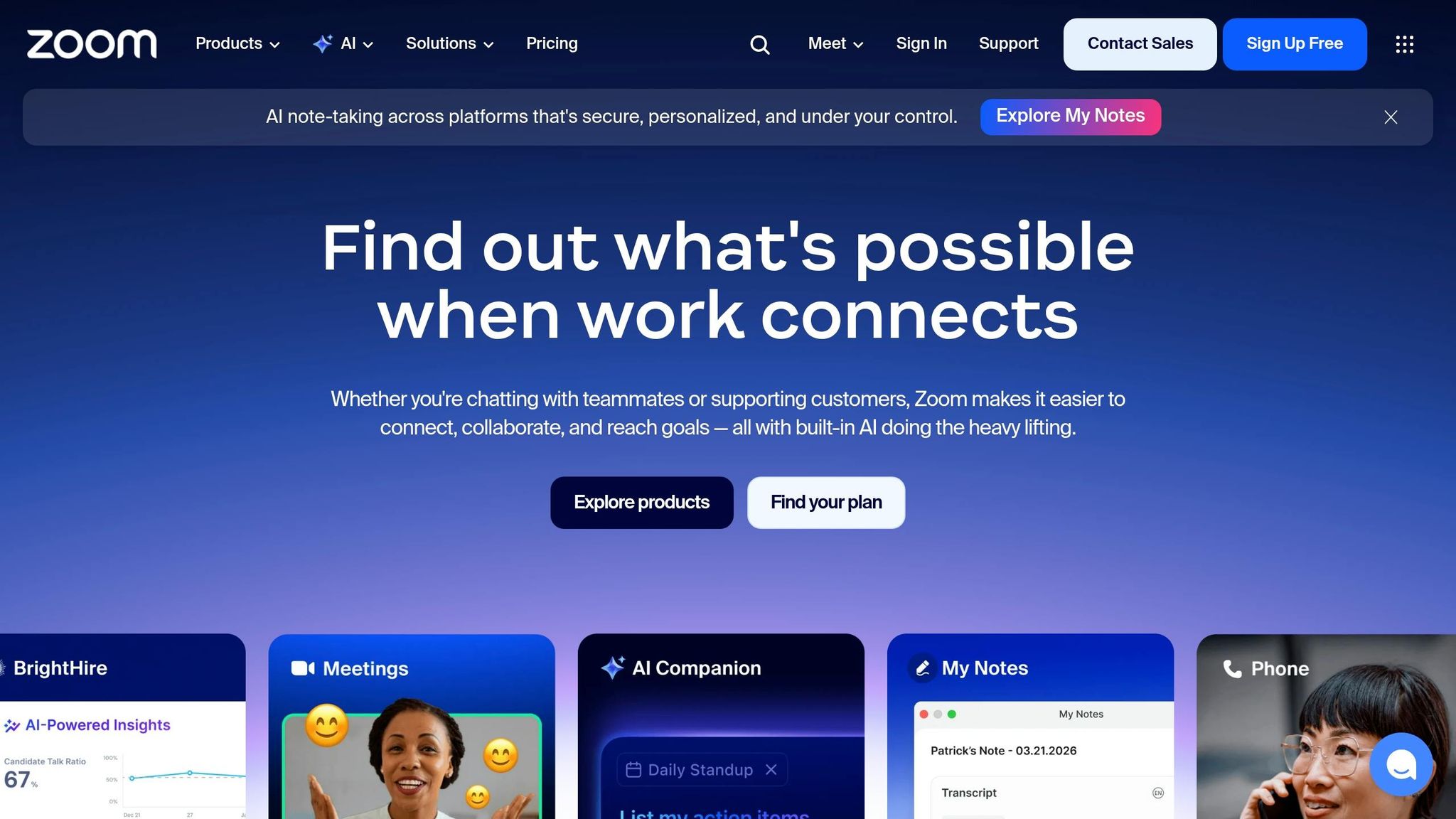
Conversion goal: Turn page visitors into webinar registrants with minimal friction.
Zoom's webinar registration page is all about simplicity. The form only asks for a first name and email address - nothing else. This streamlined approach reduces the chances of potential registrants abandoning the process. For U.S. enterprise buyers, the inclusion of a clear privacy disclaimer near the submit button helps build trust [21][22].
Another smart feature addresses a common hurdle: time zone confusion. The page clearly displays session times tailored for U.S. audiences and provides calendar links for Google, Outlook, and Apple after registration. This ensures attendees can easily add the event to their schedules, which is crucial since webinar attendance rates typically range from 25% to 40% of registrants [18].
The page also leverages social proof effectively. Speaker headshots, titles, and credentials are prominently displayed above the fold, giving visitors immediate confidence in the event's value. Zoom further emphasizes credibility by hosting webinars five days a week, showcasing consistent demand and an engaged community [20].
Webinars are a proven lead-generation tool. In fact, 73% of B2B webinar attendees become qualified leads [20], and 89% of marketers report webinars outperform other channels for generating qualified leads [19]. Zoom's registration page is designed to capitalize on this potential. As direct-response copywriter Rob Palmer explains:
"A webinar registration page has one job: convert visitors into registrants - which means selling the value of spending an hour, not just submitting an email." [18]
One standout feature is the action-oriented call-to-action (CTA) text. Instead of a generic "Submit", Zoom uses phrases like "Reserve My Spot." This first-person, benefit-driven wording makes the action feel personal, which has been shown to boost conversions [18].
5. Monday.com: Interactive Product Demo Landing Page
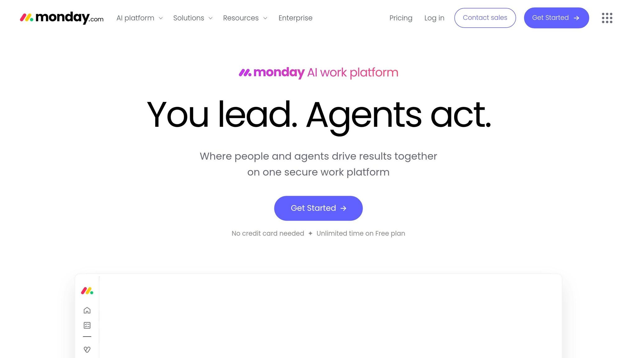
Conversion goal: Let prospects experience the product firsthand before talking to sales.
Monday.com's demo page offers a hands-on experience, letting visitors directly engage with the product. Features include a live drag-and-drop sales pipeline, a funnel chart filtering by owner or start date, and a real-time pricing calculator widget [23]. This interactive approach aligns with how modern U.S. B2B buyers prefer to operate. For example, 80% of decision-makers actively look for new vendors if performance guarantees aren’t provided [25][27].
"B2B buyers now complete most of their research before ever talking to sales - often at 11 p.m. on a Tuesday." - Chaviva Gordon-Bennett, Monday.com [26]
This functionality gives potential customers a preview of how Monday.com can solve their specific challenges.
The page also excels in using targeted social proof. Instead of generic testimonials, it organizes them by use case - HR, sales pipelines, creative workflows - so visitors see examples that resonate with their needs [28]. Attributing these quotes to real professionals, like Ray Flores from LendEDU or Alex Benda from Oh Hello Promo, adds authenticity [28]. Additionally, the claim that more than 330,000 teams use the platform reinforces trust and credibility [28].
The call-to-action (CTA) is simple and effective, but design choices could be improved.
The main CTA, "Get Started", performed well in user testing, achieving a 39% first-click rate among U.S. sales and marketing professionals [24]. Its straightforward language and low barrier to entry were key factors. However, some users found the page visually overwhelming - 34% felt overloaded, and 25% were confused by complex screenshots and excessive whitespace [24]. This highlights a practical lesson: overly spaced layouts and cluttered visuals can disrupt the educational flow rather than support it [24].
Despite these design issues, the page still earned a median NPS of 8 in user testing [24]. Features like conditional status pop-ups and AI-powered lead agents showcase the platform’s capabilities, ensuring its core value proposition remains clear even when the visuals miss the mark [23].
6. Salesforce: Industry-Specific Landing Page for Financial Services
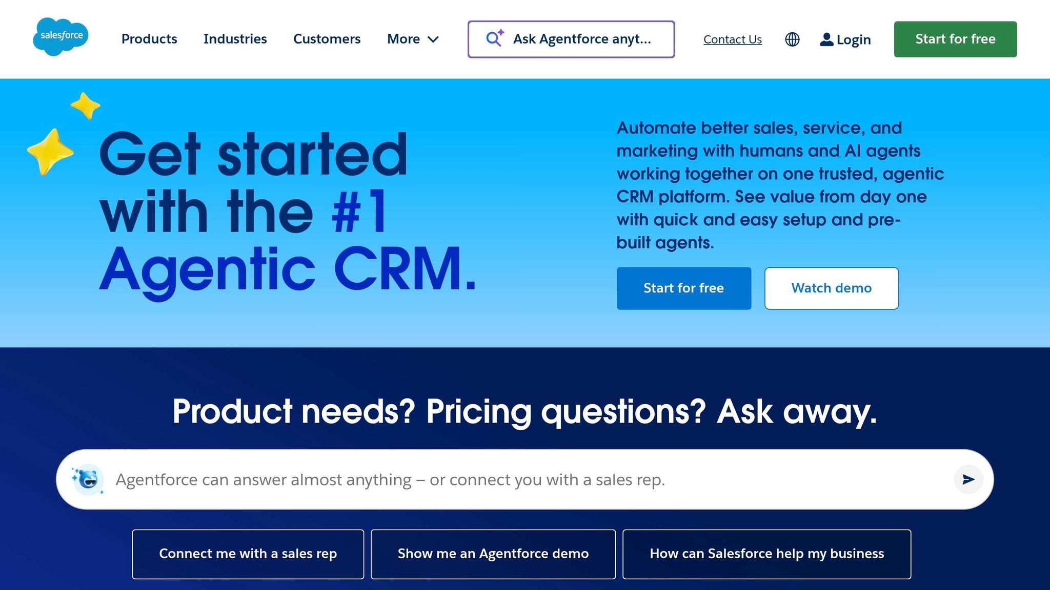
Conversion goal: Guide financial services buyers through tailored decision paths.
Salesforce's landing page for financial services doesn't rely on a single call-to-action (CTA). Instead, it offers three distinct options, catering to different stages of the buyer's journey: "Watch demo" for early-stage visitors, "Try for free" for those ready to explore the product hands-on, and "Request a call" for enterprise buyers with high intent [29][31]. This tiered approach aligns with the longer and more deliberate buying cycles common among U.S. financial institutions. The 30-day free trial stands out with its straightforward messaging: "No credit card. No installations" - addressing common concerns head-on [29][32].
The copy goes beyond generic CRM language and directly addresses the unique challenges faced by financial professionals. Terms like "Agentic AI", "Customer 360," and "Process Compliance Navigator" resonate with banking, wealth management, and insurance professionals who deal with strict regulatory requirements in the U.S. [29][30]. For example, the Process Compliance Navigator uses AI to extract clauses from regulatory documents and integrate them into workflows - solving a major operational pain point [30]. Highlighting adherence to BIAN (Banking Industry Architecture Network) standards further demonstrates Salesforce's understanding of the complex infrastructure needs of financial enterprises [29][31].
Salesforce also builds trust through high-authority proof points. The landing page features testimonials from VP and C-suite executives at well-known institutions. Prudential's Sandeep Ajith, VP of Data and Analytics, shares:
"Wholesalers are in Salesforce all day. Our sales lifecycle runs on Financial Services Cloud. From managing a lead, to prepping for meetings, to closing an opportunity, it helps us strengthen our customer relationships." [29]
Additionally, Salesforce highlights scale metrics to establish credibility: 1.4 billion financial accounts powered by Financial Services Cloud and 5 of the top financial institutions using the platform for contact center operations [31]. These numbers reassure buyers that the platform can handle enterprise-level demands.
Pricing is transparent, starting at $325/user/month for Sales or Service editions and $350/user/month for the combined package [29]. In an industry where hidden costs can deter buyers, open pricing builds trust. Backed by third-party validation from Nucleus Research and outcomes like a 31% increase in agent productivity and a 44% increase in leads [31][32], Salesforce presents a compelling, data-driven case for its platform. These elements underscore its ability to meet the intricate demands of U.S. financial services professionals.
7. Trello: Pricing Page as a Landing Page
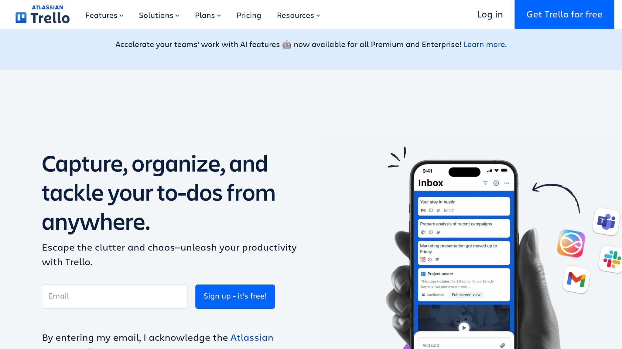
Conversion goal: Turn pricing page visitors into paying users by making the upgrade decision obvious.
Trello doesn't just treat its pricing page as a place to list costs - it turns it into a fully optimized landing page. While many SaaS companies overlook this opportunity, Trello ensures every element on the page is designed to convert. This makes sense when you consider that around 70% of SaaS buyers visit a pricing page before committing to a trial or demo [34].
Trello offers a clear four-tier pricing model: Free, Standard, Premium, and Enterprise. Each tier builds on the previous one with an "Everything in [Previous Tier], plus" structure, making it easy for potential buyers to see the added benefits of upgrading.
Smart UX Decisions
- Prominent pricing display: Prices are shown in USD right at the top, with a toggle for monthly or annual billing.
- Default to annual pricing: By showing the lower monthly rate for annual plans first, Trello subtly encourages buyers to choose annual billing. This approach can boost annual plan adoption by 15–25% [33].
- Tailored call-to-action buttons: Each plan has a specific action aligned with buyer intent:
- "Get started" for the Free plan
- "Try for free" for Premium (offering a 14-day trial with no credit card required)
- "Contact sales" for Enterprise
Here’s how the pricing breaks down:
| Plan | Annual | Monthly | Audience |
|---|---|---|---|
| Free | $0 | $0 | Individuals and small teams |
| Standard | $5 per user/month | $6 per user/month | Growing teams managing multiple projects |
| Premium | $10 per user/month | $12.50 per user/month | Teams needing advanced views and AI features |
| Enterprise | $17.50 per user/month | - | Large organizations needing strong security |
Building Trust and Credibility
Trello integrates trust signals directly into the page. The "Trusted by millions" headline grabs attention, while compliance certifications like SOC2 Type 2, ISO/IEC 27001, and PCI-DSS are prominently displayed near the Enterprise tier. These elements reassure buyers, especially larger organizations concerned about security. Additionally, Trello leverages its connection to parent company Atlassian, using the Atlassian Guard security layer to appeal to U.S. enterprise customers who value compliance and data protection.
Conversational and Direct Copy
Trello’s copy is casual yet effective. Phrases like "get sh*t done" resonate with productivity-focused buyers, cutting through jargon and speaking directly to their needs.
The page also includes a detailed feature comparison table with over 40 data points, helping buyers make informed decisions. This level of detail earned Trello a tactical execution score of 8.0/10, one of the best in its category [36].
"For the price, value, and support, Trello has always been the standard." - Stephen Wittmaak, Media Associate, PSIvet [35]
8. Intercom: Role-Based Landing Page for Customer Support Teams
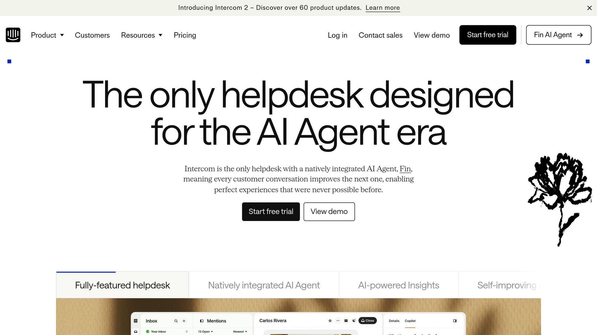
Conversion goal: Encourage support team managers and leaders to start a free trial or book a demo by addressing their specific challenges.
Intercom's landing page takes a tailored approach, speaking directly to three key roles - agents, support leaders, and customers. This structure ensures every visitor feels the page is relevant to them. Let’s dive into how AI-focused messaging, trust-building elements, and simplified forms strengthen this strategy.
AI-Powered Messaging That Focuses on Results
Intercom keeps its messaging centered on tangible outcomes, showcasing its AI tools - Fin, a native AI agent, and Copilot, an AI assistant built into agents' workflows. Each feature is paired with clear business benefits. For instance, Fin is presented as resolving customer queries rather than deflecting them, emphasizing its effectiveness [39]. The data supports these claims: Fin has reached a 50% resolution rate for some users [38], while agents using Copilot managed to close 31% more customer conversations daily in testing [37].
"Our agents are dramatically more efficient when using Copilot. In testing, agents using Copilot were able to close 31% more customer conversations daily." - Angelo Livanos, Vice President, Global Support, Lightspeed [37]
This results-driven messaging ensures visitors can immediately see how these tools could improve their own workflows.
Social Proof That Builds Credibility
The landing page uses social proof strategically to establish trust. Prominent logos from Google, Facebook, Uber, and Anthropic are featured near the top, signaling reliability before visitors even dive into the details. Role-specific testimonials, such as those from "VP of Global Support" or "Support Lead", feel especially relevant to support managers, offering more impact than generic customer reviews. Additionally, Intercom highlights its status as a leader in 97 categories on G2 [37], reinforcing its authority.
"Within six months, Fin had resolved over 6,000 conversations, saved the team over 1,300 hours and pushed self-serve support rates as high as 87%." - Constantina Samara, VP of Customer Support at Synthesia [38]
These trust signals work together to make the page feel credible and convincing.
Simplified Forms for U.S. Buyers
To make signing up easy for high-intent leads, Intercom offers a streamlined trial process requiring just an email - no credit card needed [40]. For buyers in industries like healthcare and finance, compliance is often a dealbreaker. Intercom addresses this by including HIPAA support and SSO in its Expert plan ($132 per seat/month) [38]. Highlighting these features directly on the page ensures buyers know their compliance needs are met, removing potential barriers to conversion.
This combination of tailored messaging, trust-building elements, and user-friendly forms makes the landing page highly effective at converting visitors into leads.
9. Dropbox Business: Security and Compliance Landing Page
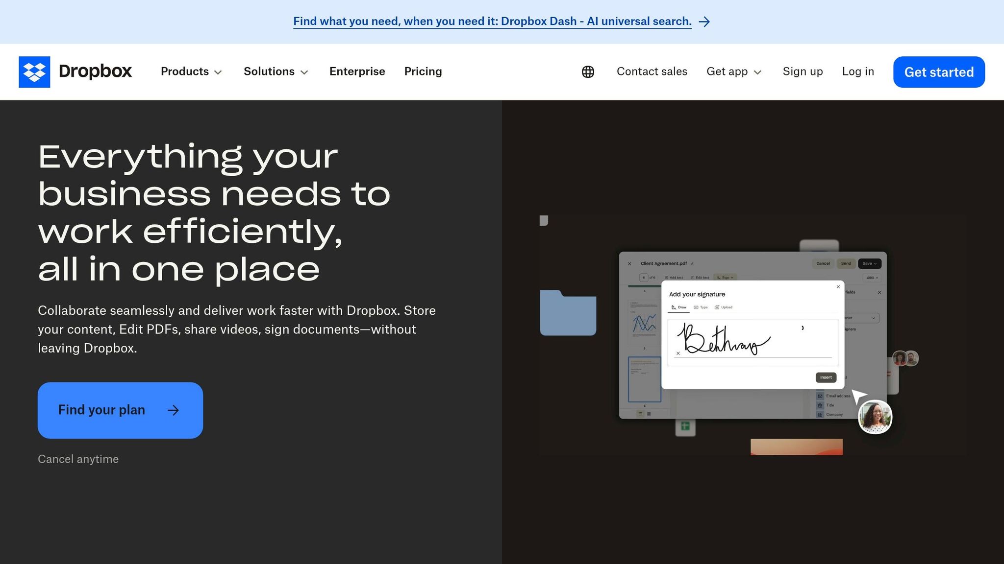
Conversion goal: Encourage enterprise IT leaders and compliance officers to take action - either by signing up for a 30-day free trial or initiating a conversation with the sales team.
Dropbox Business earns trust with its "Trust, built on proof" strategy. It combines high-level claims about Security, Privacy, Compliance, and AI with in-depth technical documentation. For non-technical decision-makers, the benefits are presented in simple terms - like explaining 256-bit AES encryption as taking "billions of years to crack" [46]. Meanwhile, IT auditors can dive into detailed reports available through the Trust Center at trust.dropbox.com [41][43].
A Compliance Matrix Tailored for U.S. Needs
Dropbox simplifies compliance for U.S. enterprise buyers juggling multiple regulatory requirements. For instance, healthcare organizations can electronically sign a Business Associate Agreement (BAA) through the Admin Console to meet HIPAA standards [42]. Publicly traded companies benefit from SOC 1 (SSAE 18) reports to assist with Sarbanes-Oxley (SOX) compliance [42]. Government contractors and research institutions can reference NIST SP 800-171 R2 for protecting Controlled Unclassified Information [42].
| U.S. Compliance Standard | Target Sector | Key Feature |
|---|---|---|
| HIPAA/HITECH | Healthcare | Electronic BAA signing via Admin Console |
| SOC 1 (SSAE 18) | Publicly Traded Companies | Supports SOX financial reporting |
| CCPA | California-based Businesses | Data subject rights and privacy controls |
| NIST SP 800-171 R2 | Government Contractors/Education | Protects Controlled Unclassified Information |
| FERPA/COPPA | K-12 and Higher Education | Student and children's data privacy |
This matrix highlights Dropbox's focus on providing tangible solutions to meet U.S. compliance requirements.
Real-World Validation From IT Leaders
Dropbox builds credibility through testimonials from IT professionals like Bryan Chandler and Alan Zych, who emphasize its strengths in encryption, audit trails, and data recovery [45].
"The biggest value that we receive is the security of knowing our information is safe... even if somebody deletes something, we can go back in and recover that information." - Bryan Chandler, SVP of Technology & Innovation, The Shopping Center Group [45]
"If you have a valid reason to share content, we want that encrypted, we want that tracked. Dropbox gives us that." - Alan Zych, VP of IT, Flynn Group of Companies [45]
These endorsements reinforce Dropbox's claims about its security and compliance capabilities.
Tackling Shadow IT and AI Transparency
Dropbox addresses shadow IT concerns with features like Domain Insights and Account Capture, which require users to join the official company account using their work email [44]. To address rising concerns about AI and sensitive data, Dropbox has added an AI Whitepaper and AI Transparency resources to its Trust Center [41]. By directly addressing these issues, Dropbox effectively meets the security and compliance priorities of U.S. enterprises.
10. Marketo: Personalized Audit Landing Page
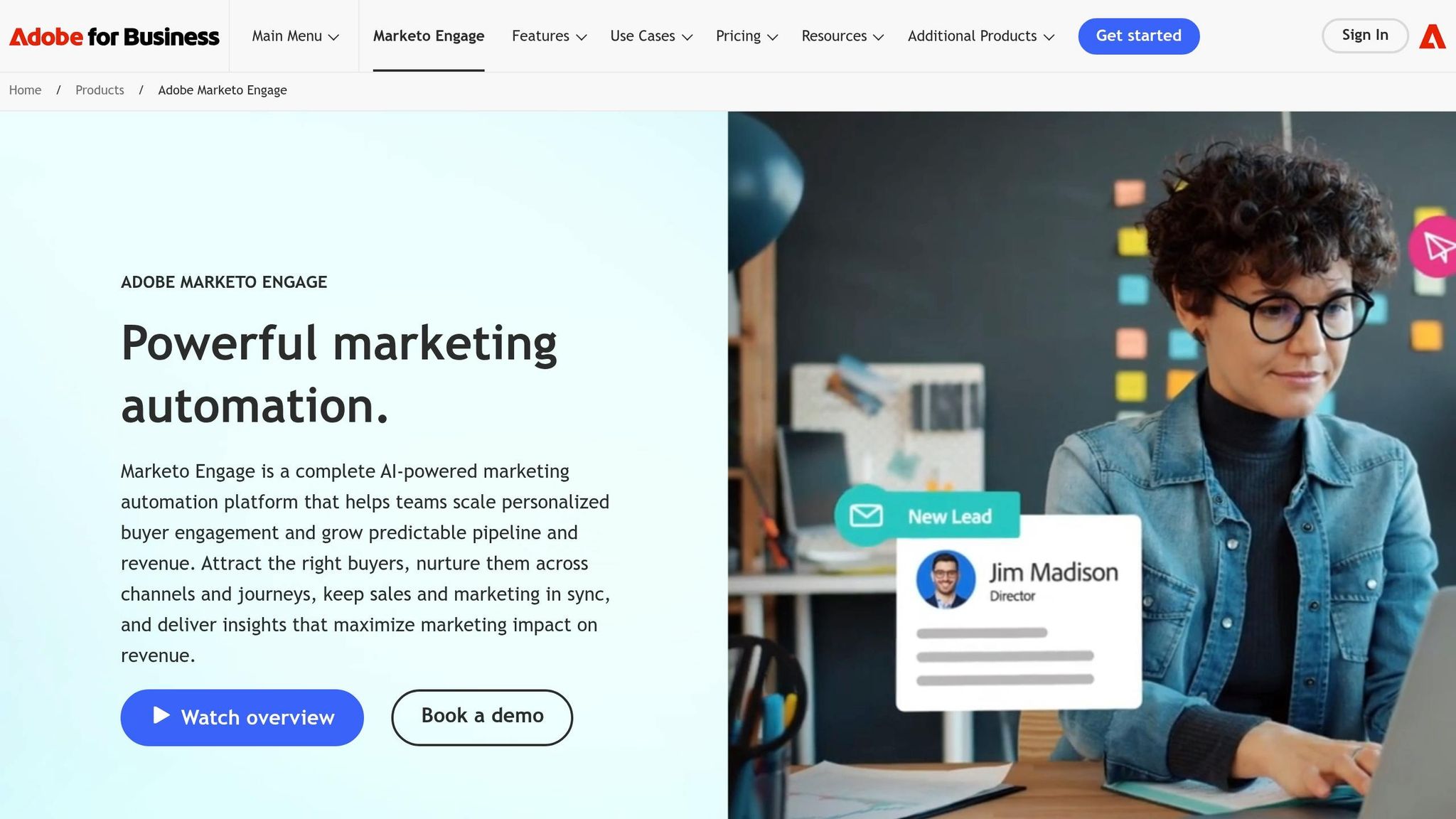
Conversion goal: Encourage marketing leaders and operations teams to use Marketo's AI-powered program audit tool, paving the way for demos or sales discussions.
Marketo takes a personalized approach by tailoring its messaging based on the visitor's company size. For enterprise visitors (1,000+ employees), the focus is on scale, security, and integration. Meanwhile, SMB visitors see messaging that highlights speed and cost-efficiency. To make it even more engaging, the page dynamically displays logos relevant to each segment, boosting engagement by 40% [47]. This immediate relevance ensures the page speaks directly to the visitor's needs, a hallmark of effective SaaS landing pages.
Results That Build Trust
Instead of relying on generic testimonials, Marketo showcases specific case studies with measurable results. For example, Pricefx achieved impressive outcomes after implementing Marketo Engage and Marketo Measure under VP Kelly Pronek:
- 2.8x revenue growth
- 24x pipeline expansion
- 222% increase in opportunities [48]
"Marketo Engage and Marketo Measure allow us to act bigger than we are and move faster than our competitors." - Kelly Pronek, VP of Revenue Generation and Enablement, Pricefx [48]
These metrics provide hard proof of Marketo's impact, making it far more convincing than vague claims of success. This focus on data-driven results also reflects the streamlined data collection process Marketo emphasizes.
Making Forms Easier to Complete
Marketo tackles form friction with progressive profiling. Returning visitors aren't asked to re-enter information they've already provided; instead, new and relevant questions are shown. Behind the scenes, hidden fields automatically capture details like UTM parameters, referrer URLs, and timestamps using the Forms 2.0 API. Personalized URLs (pURLs) further simplify the process by pre-filling form fields for recognized visitors, eliminating the need for a login. This reduces the common pain points of SaaS forms while ensuring CRM data stays accurate.
Even the call-to-action (CTA) adapts to the audience. Enterprise visitors see options like "Schedule a Demo" or "Talk to Sales", catering to their preference for a consultative approach. Mid-market visitors, on the other hand, might see "See It in Action", aligning with their need for a quick, hands-on preview [47]. These subtle tweaks in copy can significantly influence conversion intent.
11. Zendesk: Case Study Download Landing Page
Conversion goal: Encourage marketing and customer support decision-makers to download a case study, setting the stage for a demo or sales conversation.
Zendesk's case study download page stands out with its clean design and teal color scheme, which helps establish trust[49]. According to the 2024 LandingMetrics UX Benchmark, the page scores an impressive 83/100 - 6% above the industry average[50]. On mobile, it performs even better, with the CTA ("Act") score reaching 94/100, making the download button highly accessible on smaller screens[50].
Trust Through Social Proof
Zendesk amplifies its clean design with meaningful social proof. Each case study follows a Problem-Solution-Result framework, outlining a real challenge, how Zendesk addressed it, and the measurable outcomes - like improved CSAT scores or reduced response times[53]. This approach resonates with decision-makers who value concrete results.
The page's "View Demo" CTA is particularly effective, capturing 36% of first clicks, while the hero video draws 19% of early interactions. These metrics suggest that visitors are eager to see the product in action before committing their contact information[51].
"Case studies work because they protect against superficial claims. They provide context, show challenges, and give measurable results that decision-makers may relate to." - Anxhela Tomani, Marketing, LanderLab[53]
Messaging That Focuses on Results
Zendesk's messaging complements its design by emphasizing outcomes. Using the "headline flip" technique, it pairs an emotional headline with a clarifying subhead to frame the customer as the hero. This approach makes the content feel more like a success story than a typical sales pitch[54].
"A good sales pitch relates the action you want the customer or prospect to take back to why it's important to them and their company." - Courtney Gupta, Community Engagement Specialist, Zendesk[54]
UX Tweaks That Drive Engagement
In 2024, Zendesk's design team implemented a key UX improvement. Product Designer Mac Le and Pooja Patel moved the "Get Help" button to the top-right corner and restructured long-form pages into a two-step format. These changes boosted help-seeking engagement by 300% in two months[52].
"The new design loaded quicker, and the new, helpful content provided users with an easier experience to create custom fields. The experience is more approachable and doesn't seem like a massive enterprise form builder." - Mac Le, Product Designer, Zendesk[52]
12. Calendly: Onboarding Consultation Landing Page
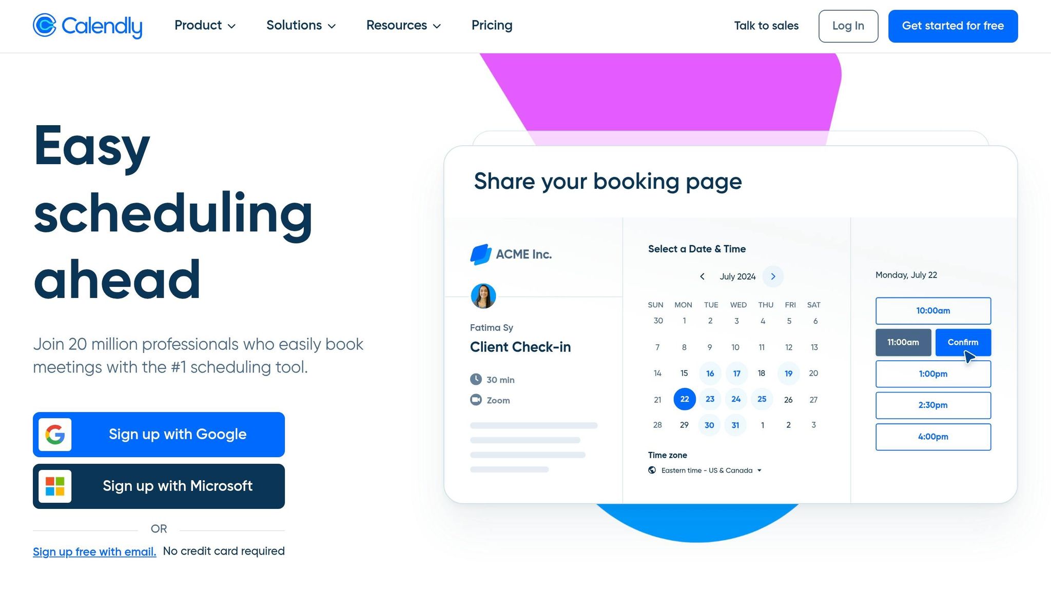
Conversion goal: Encourage prospects to book an onboarding consultation directly from the page, cutting out the back-and-forth emails that can slow down U.S. B2B sales cycles.
Calendly's onboarding consultation page is designed to simplify the booking process. Instead of redirecting users to a separate scheduling tool, the page embeds the scheduler directly. This keeps prospects within a branded environment, maintaining trust and consistency throughout the booking experience [55][57].
"Calendly's scheduling embed options offer a seamless way to embed scheduling pages directly on a website or landing page, so that prospects don't have to leave the website to get meetings scheduled at the height of their interest." - Leadpages [56]
Proof Elements That Drive Conversions
Calendly doesn't just rely on generic testimonials - it uses data to prove its effectiveness. The page highlights key metrics, such as a 2x increase in sales conversion rates, a 7-day reduction in average sales cycles, and that 93% of users report faster sales cycles after adopting the tool [58][62].
A standout example is the CallRail case study. This lead-tracking SaaS company leveraged Calendly Teams to manage 800 monthly free trial signups. Over 12 months, their SDR team doubled their meeting conversion rate, saved $150,000 in costs, and reclaimed 3,267 hours previously lost to manual scheduling [61].
"We knew that meetings were the most effective way to convey our product's value, but needed a more efficient way to customize them to each prospect, at scale. With a high volume of leads, our SDRs had no time to waste with administrative tasks or the back-and-forth that comes with scheduling." - Nick Jackson, Sales Manager, CallRail [61]
Smart Form Design and U.S. Buyer Needs
Calendly uses qualification forms to screen leads before they access the scheduler. This ensures only high-intent prospects - filtered by criteria like company size or industry - can book, driving a 26% increase in website bookings for Smith.ai, a U.S.-based virtual receptionist service [59]. For enterprise buyers, the page also highlights security features like SAML Single Sign-On (SSO) and audit log compliance to address common concerns [60].
The form itself is intentionally brief. By limiting event types to three or four and defaulting to 30-minute slots, it reduces decision fatigue. Once a meeting is booked, a custom redirect outlines the next steps, ensuring a seamless transition to the next phase. This streamlined approach sets the foundation for even more targeted strategies in subsequent landing pages.
13. Shopify Plus: Tailored Landing Page for Enterprise E-commerce
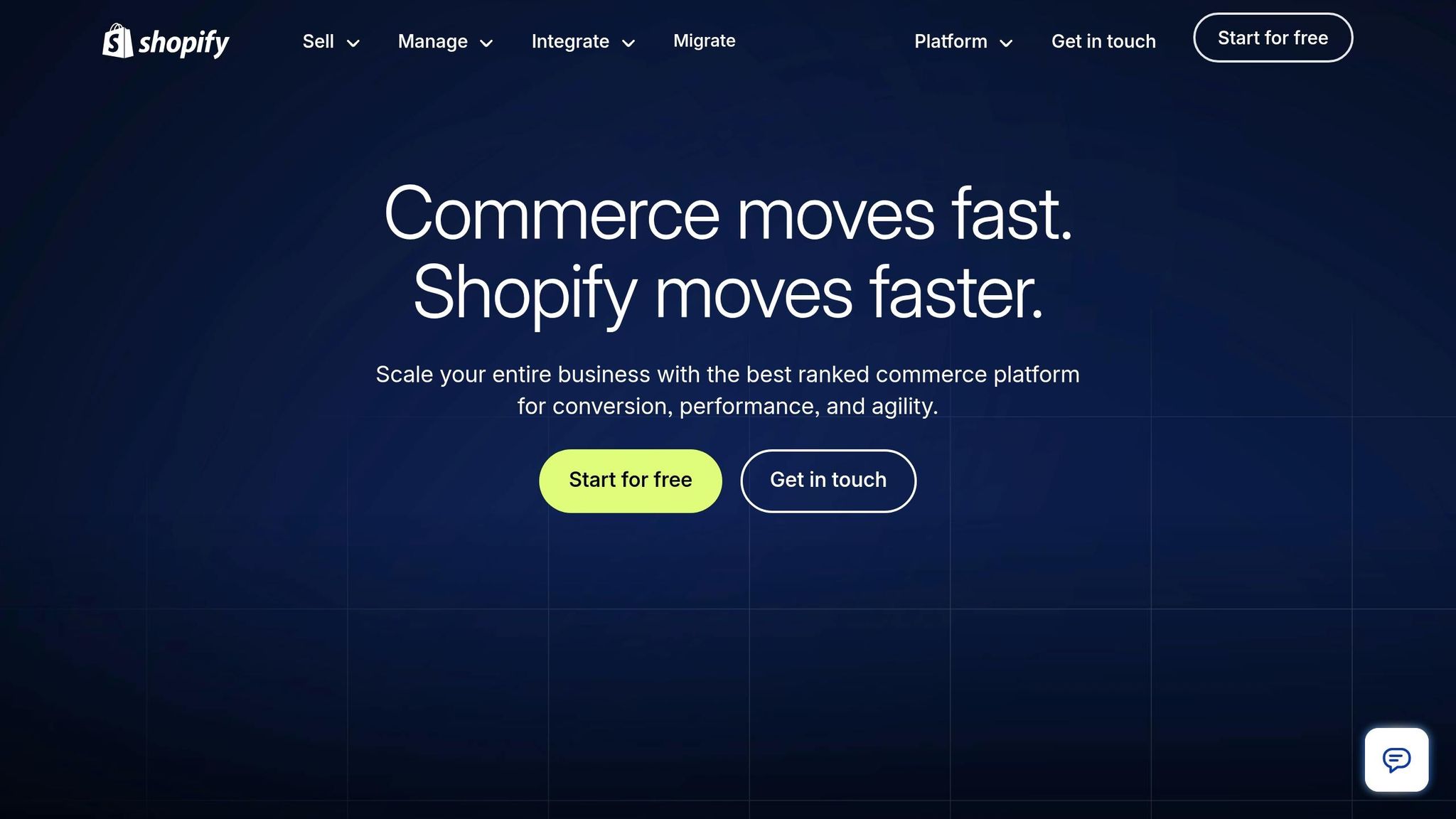
Conversion goal: This landing page is designed to move enterprise e-commerce decision-makers beyond just comparing costs, helping them see the long-term value Shopify Plus offers.
Shopify Plus categorizes its enterprise audience into three key groups: "Extreme edge of DTC", "Retail forward", and "International B2B." This segmentation helps visitors quickly identify which category fits their business. For technical buyers, the page highlights Shopify's headless architecture and robust API capabilities. Meanwhile, operations teams see features like Shopify Flow, multi-role permissions, and governance controls. These tailored messages lead into interactive tools that simplify decision-making.
Using the TCO Calculator to Highlight Value
Shopify Plus incorporates a Total Cost of Ownership (TCO) calculator, a common feature on effective SaaS landing pages, to emphasize long-term value. This tool allows prospects to input their current costs and directly compare TCO. On average, Shopify Plus demonstrates a 33% better TCO compared to competitors. Additionally, Shop Pay is shown to convert up to 50% better than guest checkout [63]. This helps justify the platform's $2,300/month starting price over a 3-year term [67].
Trust Signals That Resonate with Enterprise Buyers
To build trust, Shopify Plus highlights its partnerships with respected firms like IBM, Accenture, EY, Deloitte, and KPMG [67]. It also leverages recognition such as being named a Leader in the 2024 Forrester Wave™: Commerce Solutions for B2B [66]. Real-world success stories further validate its credibility - Ooni reported a 400% increase in sales after migrating to Shopify Plus, while Laird Superfood saw a 550% quarter-over-quarter sales boost [67].
"We're choosing Shopify Enterprise not to pay for a more expensive platform, but to offload maintenance to the platform... so our teams can focus on business innovation." - Shopify Enterprise Guide [64]
Addressing U.S. B2B Buyers' Needs
The tagline "Feels like DTC. Acts like B2B." speaks directly to U.S. wholesale buyers frustrated with outdated procurement processes. Brands using Shopify's B2B features have seen self-serve orders increase by up to 33% within a year [66]. The platform also supports up to 9 expansion stores and handles over 10,000 checkouts per minute [63][65], capabilities that are critical during peak shopping periods like Black Friday.
14. Artisan Strategies: Growth Advisory Landing Page
Conversion goal: Turn mid-stage SaaS teams' passive interest into booked advisory calls by making the revenue potential clear and minimizing perceived risk.
The Artisan Strategies growth advisory page zeroes in on a key issue for its audience: many SaaS teams aren’t struggling because of their product - they’re losing revenue within their funnel. The headline doesn’t push a service; it highlights the problem. As conversion expert Peep Laja says, "Clarity trumps persuasion" [68]. For growth-focused founders and product leads who’ve heard countless agency pitches, this clarity-first approach stands out. And it’s backed by measurable results.
Proof That Builds Trust
Instead of vague promises, the page highlights three specific outcomes: a 5× boost in retention by streamlining a 9-step signup to 3 screens, a 47% jump in checkout conversions, and $748,000 in annualized revenue growth from optimizing pricing. These are not averages or estimates - they’re tied to real projects. This level of detail matters, especially when 72% of people trust customer reviews and testimonials more than brand claims [69]. To further ease concerns, the page offers a money-back guarantee tied to measurable revenue gains, addressing the skepticism of U.S. buyers unfamiliar with the firm.
A Frictionless Engagement Path
Unlike many B2B pages that overwhelm visitors with long forms, this one keeps it simple. Instead of asking for detailed information upfront, it aligns the call-to-action (CTA) with where buyers are in their journey. For those still researching, softer CTAs like "See How It Works" reduce drop-offs, while "Get a Quote" appeals to high-intent visitors [70]. For a solo advisory firm where every lead matters, reducing form friction is essential to maintaining a steady pipeline.
Why It Clicks with U.S. SaaS Teams
The message - “hands-on, embedded with your team, not just slide decks and handoffs” - speaks directly to a common pain point for U.S. growth teams. Many are frustrated with consultants who deliver plans but don’t stick around to execute. By focusing on activation, monetization, and retention, the page addresses the areas where SaaS companies often stall after gaining initial traction. This targeted expertise is exactly what buyers need to see when evaluating potential partners.
15. Pipedrive: High-Intent Retargeting Landing Page
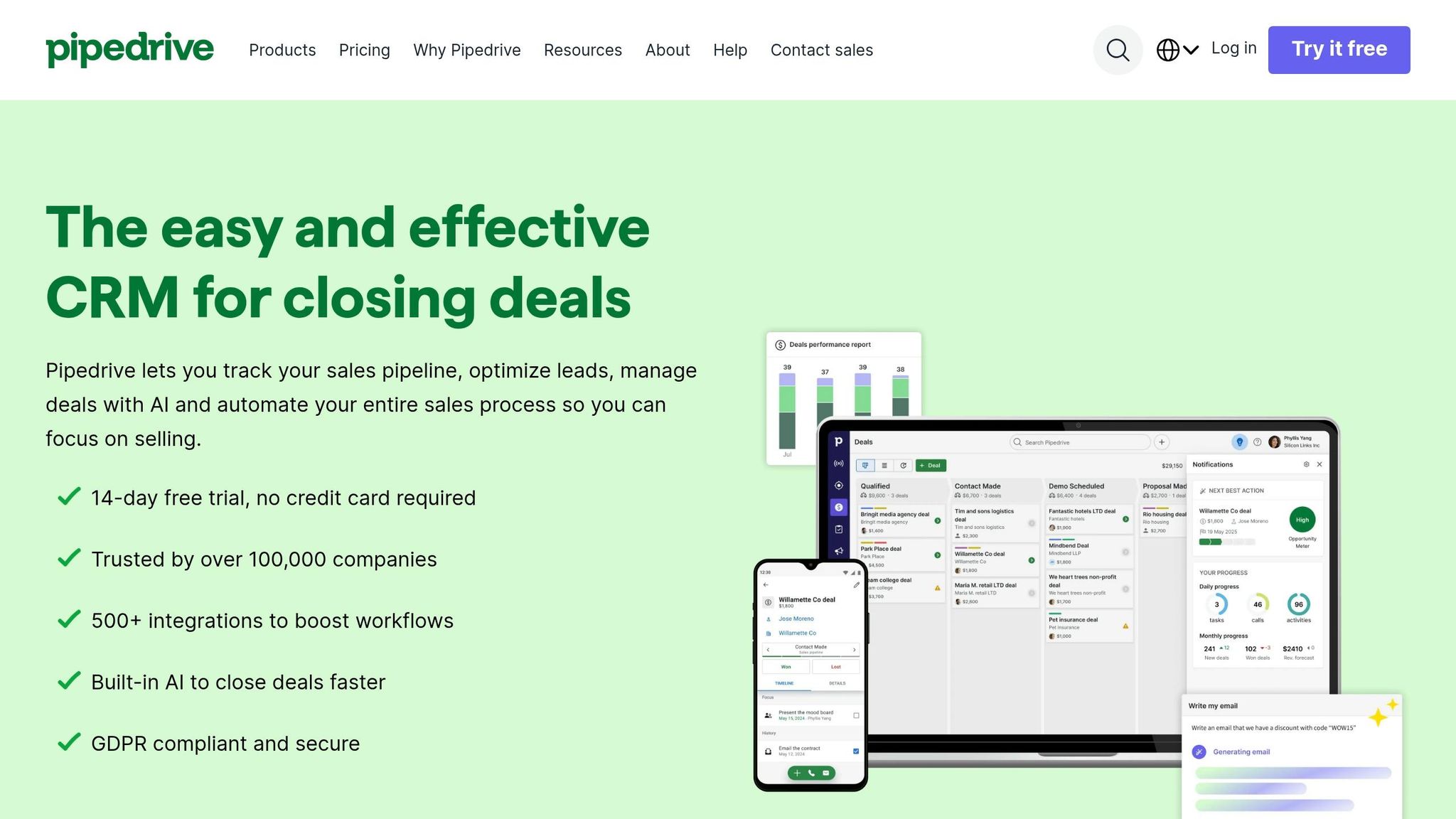
Conversion goal: Reconnect with visitors who've shown interest but haven't signed up, encouraging free trial signups with minimal resistance.
Pipedrive’s retargeting page is designed to remove hurdles that might prevent conversions. The offer of a "14-day free trial, no credit card required" eliminates financial concerns entirely [71]. Instead of bombarding users with a list of features, the page focuses on outcomes. Headlines like "Less time managing, more time closing deals" emphasize the practical benefits for sales teams, reassuring potential users that Pipedrive can solve their specific challenges [71].
Social Proof That Builds Trust
Pipedrive establishes credibility right away by featuring G2 and Capterra badges prominently in the hero section. This is a smart move since 80% of B2B buyers consult review platforms before making decisions [74]. With a 4.5/5 rating on G2 and recognition like "Easiest to Use CRM" from The Ascent [75], the page reinforces trust further by sharing customer success stories. For example, Big Dog Solar increased revenue by 40%, and Monterail boosted its conversion-to-call rate by 35% after adopting Pipedrive [71][73].
"Pipedrive has enabled us to have instant access to that data, so it's not just quadrupling our revenue but ensuring that we have predictable revenue." - Suds Singh, Founder and MD, Interesting Content [71]
These trust elements work together to make the page persuasive and confidence-inspiring.
A User Experience Tailored for Decision-Making
The page immediately showcases Pipedrive’s visual kanban-style pipeline dashboard, giving users a clear idea of the product. Additional technical details, like 500+ integrations and AI-powered forecasting, are revealed progressively further down the page [71][75]. For visitors who aren’t ready to sign up, the LeadBooster chatbot collects leads around the clock without requiring long forms [73][76].
Meeting U.S. Buyers’ Expectations
Security is a major concern for enterprise buyers in the U.S., and Pipedrive addresses this directly by highlighting features like AES-256 encryption, SOC 2 certification, and GDPR compliance [71]. The mobile app is also emphasized, catering to the 83% of visitors who access the site via mobile devices [72]. With over 100,000 companies in 179 countries using Pipedrive, the page effectively reassures high-intent buyers, making it easier for them to confidently click "Start my free trial."
Conclusion
After analyzing 15 B2B SaaS landing pages, some consistent patterns emerge that set high-performing pages apart from the rest.
As Mark Shvaya explains: "The difference isn't design - it's message clarity, social proof placement, and a single focused CTA." [1] These elements are the backbone of success, helping some pages achieve conversion rates of 11% or more, while others struggle to move beyond average performance [3].
The standout feature of high-converting pages is their focus. They strip away distractions like navigation menus and external links, guiding visitors toward a single, primary action. The hero section does most of the work, delivering the key message - what the product is, who it’s for, and why it’s credible - in just five seconds [2]. Headlines are concise, under eight words, and emphasize outcomes rather than features. For example, TripMaster saw a 20% conversion rate in 2025 by changing their headline from "Transportation Management Software" to "Reduce Transit Delays by 40%" [77].
Key trust signals, such as logos, G2 badges, and testimonials focused on results, are placed prominently above the fold, right beside the call-to-action (CTA). Pairing this with micro-copy like "No credit card required" or "Takes 10 seconds" addresses common objections and reduces friction.
For U.S. audiences, mobile-first design is non-negotiable, with 52% of SaaS landing page traffic now coming from mobile devices [78].
Here’s a quick breakdown of what separates high-performing pages from the rest:
| Element | Low-Converting Page | High-Converting Page |
|---|---|---|
| Headline | Feature-focused ("Advanced CRM") | Benefit-focused ("Close 20% More Deals") |
| Navigation | Full site menu present | Removed entirely |
| Visuals | Generic stock photos | Real product UI or interactive demo |
| Social Proof | Hidden at the bottom | Prominent, above the fold |
| CTA | Vague ("Submit") | Value-specific ("Start My Free Trial") |
Speed also plays a critical role. Every 100ms delay in load time can reduce conversions by 1%, and pages loading in under 1.8 seconds avoid losing up to 23% of sign-ups compared to slower pages [78]. A fast, focused, and clear page is the formula for success.
FAQs
::: faq
What should my landing page’s one CTA be?
Your landing page should feature one clear call-to-action (CTA) that guides visitors toward your primary conversion goal. Use direct and actionable phrases like "Get a demo," "Start free trial," or "See it in action."
Make sure your CTA stands out visually and speaks directly to what your audience is looking for. A well-placed, relevant CTA can significantly boost engagement and conversions. :::
::: faq
When should I use a long form vs a short form?
A long-form landing page is ideal for complex products or services that require more explanation. These pages give you room to dive into details, answer potential objections, and build trust with your audience. Think of it as a conversation where you anticipate and address questions before they’re even asked.
On the other hand, short-form landing pages are better suited for simple, familiar offerings. If your audience already understands the product or service, a concise page with a clear message and an easy-to-spot call-to-action can drive quicker decisions.
The key is to match the page length to your audience's needs. Provide enough information to inform and persuade without overwhelming or under-delivering. Always keep clarity and a strong call-to-action at the forefront to maximize conversions. :::
::: faq
What trust signals should I show above the fold?
To make a strong first impression and build trust immediately, include elements like recognizable logos, certifications, case studies, social proof, and trust badges in the above-the-fold section of your page. These details help reassure visitors of your credibility and encourage them to explore further. :::
Go deeper than any blog post.
The full system behind these articles—frameworks, diagnostics, and playbooks delivered to your inbox.
No spam. Unsubscribe anytime.