B2B SaaS Pricing Page Analysis: What 200 Top Companies Get Right and Wrong
Three-tier pages, outcome-focused messaging, and single CTAs boost conversions; avoid feature overload and hidden pricing.
B2B SaaS Pricing Page Analysis: What 200 Top Companies Get Right and Wrong
Your pricing page is more than just a list of numbers - it’s where potential customers decide whether to invest in your product. After analyzing 200 B2B SaaS pricing pages, here are the biggest takeaways:
- Three-tier pricing structures convert 14% better than four or more tiers.
- Framing annual discounts as "two months free" improves conversions by 16% compared to "20% off."
- CTAs like "Start free trial" outperform "Buy now" by 31% and "Sign up" by 18%.
- Overloading pages with features (e.g., 40+ items) drops conversion rates from 18.2% to 3.4%.
- Clear, outcome-focused messaging and social proof above pricing tiers boost conversions by 9%.
We compared Slack, Salesforce, and Artisan Strategies to highlight what works and what doesn’t. Slack excels in feature clarity but struggles with steep price jumps. Salesforce leverages social proof and AI positioning but hides key pricing details behind "Contact Sales" forms. Artisan Strategies keeps things simple with a single-tier model but risks missing out on diverse customer needs.
Quick Comparison
| Company | Strengths | Weaknesses |
|---|---|---|
| Slack | Clear feature comparisons, credit for inactive users | Steep price jumps, lacks transparent Enterprise pricing |
| Salesforce | Social proof, detailed pricing for most tiers | "Contact Sales" for Enterprise pricing, scaling features locked behind higher tiers |
| Artisan Strategies | Simplicity, outcome-focused messaging | Single-tier model limits flexibility |
To boost conversions, focus on simplicity, clear messaging, and strong CTAs. Avoid overwhelming users with too many features or unclear pricing. Small changes can make a big difference.
::: @figure 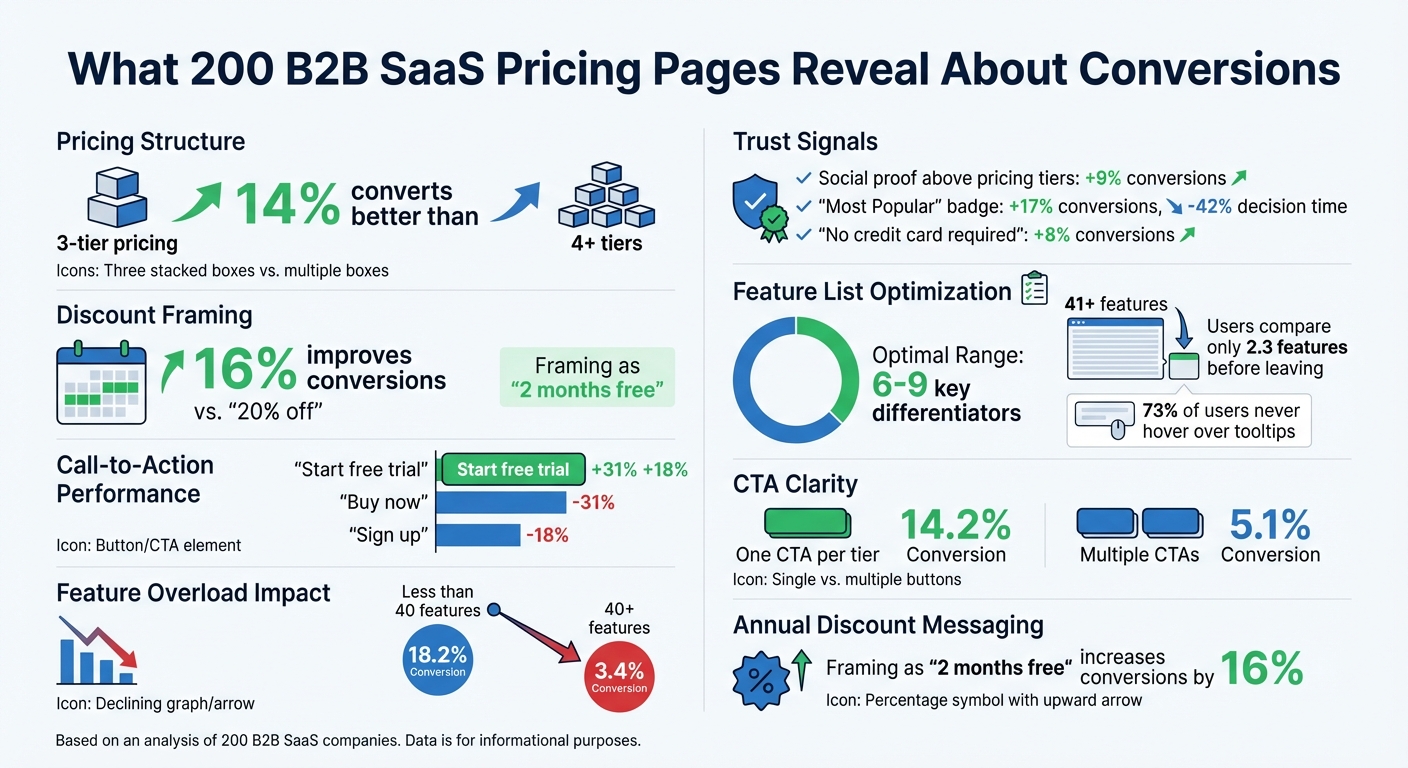 :::
:::
1. Slack
Pricing Structure
Slack offers a four-tier, per-seat pricing model: Free, Pro ($7.25/user/month billed annually), Business+ ($15.00/user/month billed annually), and Enterprise+ (pricing available upon contacting sales).
The Free plan comes with a notable limitation - a 90-day message history - unlike competitors such as Pumble, which provides unlimited history. This decision has been described as Slack's "most controversial pricing decision" [4].
The Pro plan is aggressively priced, undercutting competitors like Zoom Pro ($16.99) and Webex Meet ($14.50) by approximately 75%. Meanwhile, the Business+ tier, priced 118% higher, includes features like SAML SSO, SCIM, and AI tools. However, this significant price jump might compel mid-market customers to pay for features they don’t necessarily need [4].
An attractive aspect of Slack's pricing is its policy of crediting inactive users, ensuring customers are only charged for active participants.
Value Messaging
Slack's messaging strategy is carefully crafted to drive adoption and conversions. It presents itself as a "comprehensive work OS", a central hub for people, information, and over 2,600 integrations, rather than just a messaging app. The Free tier is positioned to encourage adoption by supporting unlimited team members, making it easy for organizations to start using the platform.
For its paid plans, Slack emphasizes measurable benefits. For example, it claims a 338% ROI over three years, $2.1 million in productivity savings for technical teams, and that 85% of users report improved communication [5]. The Business+ plan is labeled as "Best Value", showcasing its AI-powered tools and enterprise-grade security, while the Enterprise+ tier targets organizations with more complex needs. However, the lack of transparent pricing for Enterprise+ - relying instead on a "Contact Sales" button - could frustrate procurement teams looking for clear cost benchmarks before initiating discussions [4].
Visual Design
Slack's pricing page is designed with simplicity in mind, using side-by-side cards and a comparison table to help users quickly evaluate features. Features are grouped into intuitive categories like "Productivity", "AI-powered work", and "Security", making it easy to navigate.
Despite its clear layout, a 2026 analysis scored Slack 5/10 for pricing psychology. The critique highlighted missed opportunities, such as the absence of charm pricing (e.g., $6.99 instead of $7.25) and the lack of an easily visible annual discount toggle. While the "Best Value" badge draws attention to the Business+ plan, the omission of a "Most Popular" label could leave some buyers uncertain about which plan to choose. Additionally, the Enterprise+ tier’s lack of pricing transparency - offering only a "Contact Sales" button - may slow down the decision-making process for organizations that prefer to self-qualify with detailed pricing information [4].
sbb-itb-0499eb9
2. Salesforce
Pricing Structure
Salesforce offers two pricing models: "Suites" for small businesses and "Clouds" for mid-market and enterprise clients. The Starter Suite, aimed at basic CRM needs, starts at $25 per user/month, while the Pro Suite is priced at $100 per user/month, adding features like forecasting and access to AppExchange. For companies requiring more advanced tools, the Enterprise tier ranges from $165 to $175 per user/month, unlocking full API access and workflow automation. At the high end, the Unlimited tier costs $330 to $350 per user/month, bundling in Premier Support (valued at about 30% of license fees). The top-tier Agentforce 1, designed for AI-driven organizations, is priced between $500 and $550 per user/month, including one million Flex Credits for AI agents.
While the Starter and Pro Suites offer monthly billing at a 20–30% premium, most other tiers require annual contracts paid upfront. However, a notable drawback is that essential scaling features like full API access and Flow Builder are locked behind the Enterprise tier. This forces growing businesses to make a steep pricing leap, even if they don’t need all the advanced tools [6].
Value Messaging
Salesforce brands itself as the "World's #1 AI CRM", focusing on delivering business outcomes rather than just technical specs. For example, Sales Cloud is marketed with the tagline "Connect teams, close more deals," while Service Cloud promotes "Manage customer support cases faster." To justify its higher price point, Salesforce leans on social proof, highlighting that over 150,000 businesses trust the platform to secure their data [8].
With the introduction of Agentforce in 2026, Salesforce has shifted its narrative from providing "software access" to offering "workforce augmentation." This positions AI agents as virtual employees working around the clock to support customers. The Agentforce 1 tier, priced at $550 per user/month, is framed as a strategic investment rather than just another software expense. This reframing strengthens the pricing page's role in persuading potential buyers who may initially be skeptical about the costs.
Conversion Features
Salesforce incorporates several tools to cater to different buyer journeys. Options like "Start for free" and "Start today" encourage users to explore the platform through trial environments, while a "Buy Now" button simplifies the upgrade to a paid subscription. For complex enterprise solutions, such as Einstein AI, the pricing page replaces direct pricing with a "Contact Sales" prompt, facilitating personalized conversations.
To assist with estimating costs for consumption-based products like Data 360 and Agentforce, Salesforce provides a Flex Credit Pricing Calculator. Additionally, the page offers multiple support options, including a dedicated 1-800 sales number and live chat. These features reflect Salesforce's focus on accommodating a variety of buyer needs and ensuring a smooth path to conversion [7].
3. Artisan Strategies
Pricing Structure
Artisan Strategies takes a no-nonsense approach to pricing. Instead of overwhelming users with complicated multi-tier plans, they stick to a single, straightforward subscription model. Take Onsara, their macOS app designed for individuals with ADHD, as an example. It gives users full access to all core features without splitting them across different pricing tiers. This simplicity eliminates the hassle of comparing plans and makes it easier for solo users and small teams to make a quick decision. The result? A pricing model that focuses on clarity and delivers immediate value.
Value Messaging
When it comes to messaging, Artisan Strategies zeroes in on outcomes rather than bombarding users with a laundry list of features. For Onsara, the focus is on tackling task paralysis and decision fatigue - the overwhelming feeling of being stuck with too many things to do. This message hits home because it directly addresses a common frustration instead of drowning users in technical jargon. In fact, research shows that emphasizing results like "Save 10 hours weekly" can boost conversion rates by 34% [9].
Onsara’s pricing page also uses a clever design trick: progressive disclosure. It highlights the must-have features upfront while offering additional details only when users want them. For instance, it makes it clear that Onsara isn’t just another to-do list or Pomodoro timer. Instead, it’s presented as a tool specifically designed to help users figure out their next step - something that truly sets it apart.
This SaaS Pricing Strategy Kills Conversions (and what to do instead)
::: @iframe https://www.youtube.com/embed/sfNILPH-Wxk :::
Strengths and Weaknesses Compared
These companies take unique approaches to pricing, each with its own strengths and weaknesses.
Slack stands out with its clear feature comparisons. Their use of well-organized cards and distinct columns makes it simple to understand what each tier offers [11]. The page design is polished and professional, with expandable FAQs that address questions without making the layout feel cluttered [12]. However, Slack has a major drawback: the Business+ tier comes with a steep 118% price jump from the Pro tier - the largest increase among competitors - which could alienate mid-market customers [4].
Salesforce takes a different route by displaying clear pricing numbers upfront, an uncommon practice in the enterprise sector [12]. They also use unique calls-to-action (CTAs) for each tier and offer a "Try it free" option, which lowers the barrier for potential customers [2][12]. But there’s a catch - enterprise tiers are locked behind "Contact Sales" forms, forcing procurement teams to schedule calls just to get basic pricing details [2].
Artisan Strategies simplifies things even further with a single-tier pricing model. This approach avoids overwhelming users with too many options and directly addresses customer pain points with outcome-focused messaging. The page stays clean thanks to progressive disclosure, offering extra details only when needed. However, this simplicity comes at a cost: a single-tier model may miss opportunities to capture customers with varying budgets and needs.
Looking at these approaches side by side highlights how pricing strategies can shape conversion rates. From this analysis of 200 companies, one takeaway is evident: small yet thoughtful adjustments in pricing structure, messaging, and design can make a big difference in boosting conversions.
Conclusion
After analyzing 200 B2B SaaS pricing pages, one thing is clear: the top-performing pages treat pricing as a decision-making experience, not just a list of numbers and features. A well-thought-out pricing strategy can make all the difference. For instance, feature lists work best when they highlight 6–9 key differentiators. When pages go overboard - listing 41 or more features - conversion rates plummet from 18.2% to just 3.4% [13].
Another standout finding is how psychological triggers can influence buyer behavior. Adding social proof above pricing tiers boosts conversions by 9% [1], and marking a tier as "Most Popular" increases conversions by 17% while slashing decision time by 42% [1][13]. Even small changes in messaging, like framing an annual plan discount as "two months free" instead of "20% off", can improve conversions by 16% [1]. These tactics help reduce friction and guide users toward making decisions.
However, the analysis also revealed common mistakes. Overwhelming users with too many features or hiding details behind tooltips can hurt engagement. Visitors tend to leave after comparing just 2.3 features on overly complicated pages [13], and since 73% of users never hover over tooltips, hiding critical details there is a losing strategy [13]. Clarity matters - pages with one clear CTA per tier (e.g., "Start Free Trial") convert at 14.2%, while multiple CTAs drop that to 5.1% [13].
To improve conversions, focus on simplicity and clarity. Keep tier structures straightforward, limit feature lists to what’s truly important, and use language that emphasizes outcomes rather than technical terms. Adding trust signals like "No credit card required" near CTAs can lift conversions by 8% [1]. Set the pricing toggle to annual billing by default but show the monthly equivalent to make costs feel more manageable [1][10]. Finally, offering free access options is crucial - 94.6% of SaaS companies meet this standard, and failing to do so could leave you behind [3].
FAQs
::: faq
Should my pricing page have 3 tiers or more?
Studies indicate that having three tiers on your SaaS pricing page tends to drive the best results when it comes to conversions. Why? It helps avoid overwhelming potential customers with too many options, a phenomenon known as choice overload. With fewer choices, people feel more confident and less paralyzed when making a decision.
In most cases, the middle tier is labeled as "Most Popular." This subtle nudge helps guide customers toward a balanced option, often seen as providing the best value without being the most expensive.
While some SaaS companies experiment with four tiers, going beyond three can lead to confusion and hesitation. Sticking to three tiers strikes the right balance - keeping things simple while effectively segmenting customers based on their needs and budget. :::
::: faq
What’s the best CTA for a pricing page?
The best call-to-action (CTA) for a pricing page is a clear, action-focused button with phrases like "Buy Now" or "Get Started". These CTAs encourage users to take immediate action. A well-designed pricing page aims to guide visitors smoothly toward making a confident purchase decision. :::
::: faq
How many features should I list per plan?
Successful SaaS pricing plans usually focus on highlighting 3 to 4 key features per plan. Why? Because this keeps things clear and digestible for potential customers. By showcasing only the most important benefits, you avoid overwhelming users with too much information, which can ultimately improve conversions. :::
Go deeper than any blog post.
The full system behind these articles—frameworks, diagnostics, and playbooks delivered to your inbox.
No spam. Unsubscribe anytime.