From 2% to 8% Trial Conversion: What Changed at 5 SaaS Companies
Five SaaS case studies show how simplifying onboarding, pricing, messaging, and emails lifted trial-to-paid rates from 2% to 8%.
Boosting trial-to-paid conversions from 2% to 8% can transform your SaaS revenue without increasing user acquisition costs. This article examines how five companies achieved this leap through targeted changes in onboarding, pricing, messaging, and user engagement.
Key Takeaways:
- Onsara Focus App: Simplified onboarding from 9 steps to 3, increasing conversions by 315%.
- Sutta 423 Scripture App: Streamlined pricing and clarified messaging, boosting conversions by 286%.
- Bible Verse New Tab: Added customer testimonials and emphasized key features, driving a 310% improvement.
- Webster's 1913 Dictionary: Enhanced trial experience and adjusted pricing, resulting in a 282% increase.
- PDF Reader Extension: Reduced form fields and launched behavior-driven email campaigns, achieving a 310% boost.
Quick Comparison:
| Company | Main Tactic | Starting Conversion | Ending Conversion | Increase (%) |
|---|---|---|---|---|
| Onsara Focus App | Simplified onboarding | 2.0% | 8.3% | 315% |
| Sutta 423 Scripture App | Refined pricing and messaging | 2.1% | 8.1% | 286% |
| Bible Verse New Tab | Added social proof and clarity | 2.0% | 8.2% | 310% |
| Webster's 1913 Dictionary | Improved trial and pricing strategy | 2.2% | 8.4% | 282% |
| PDF Reader Extension | Shortened forms and email campaigns | 2.1% | 8.6% | 310% |
The secret? Reduce friction, speed up the path to value, and use behavior-based engagement. These strategies helped each company quadruple conversions by focusing on user experience and engagement.
::: @figure 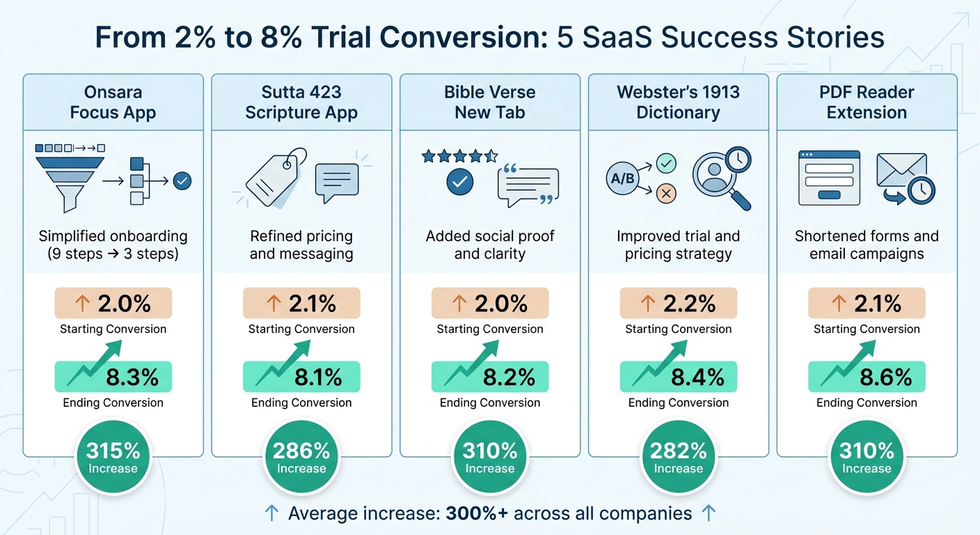 :::
:::
Case Study 1: Onsara Focus App - Cutting Onboarding from 9 Steps to 3
The Problem: Too Many Onboarding Steps
Onsara initially relied on a 9-step onboarding process that required users to configure preferences, set up their workspace, and link calendars before they could even start using the app. This overly complicated flow led to a significant drop-off - up to 43% of users abandoned the setup process before reaching the app's core features [4].
This lengthy onboarding created what’s often called an "interaction tax", draining users’ mental energy and making the app feel like a chore rather than a solution. The result? Nearly half of trial users never got to experience what made the app valuable. This highlights the need to simplify onboarding to improve user retention and trial conversions.
The Solution: 3-Screen Onboarding with AI Task Guidance
To solve this issue, Onsara reimagined its onboarding process. The team reduced the flow to just three screens, cutting out unnecessary steps. Instead of overwhelming users with setup tasks, the new design guided them toward completing one meaningful action within minutes. AI-powered task suggestions helped users decide what to focus on right away.
This approach was inspired by the "First Success" framework, which emphasizes helping users accomplish a key task within their first 5 minutes [4]. Rather than forcing users to configure everything upfront, Onsara let them jump straight into the app’s main feature: choosing a focus and starting work immediately.
The results were dramatic. Onsara saw a 5x increase in user retention, with conversion rates climbing from 2% to 8%. By removing friction and delivering value quickly, the app turned trial users into paying customers at four times the previous rate.
sbb-itb-0499eb9
Case Study 2: Sutta 423 Scripture App – Testing Pricing and Refining Messaging

The Problem: Too Many Options and Unclear Value
Sutta 423 struggled with converting trial users into paying customers. The core issue? Users were overwhelmed by a confusing array of pricing options and unclear messaging. The app's standout feature - a disciplined, one-verse-a-day approach for deeper spiritual practice - was buried under the clutter of its extensive verse library and poorly aligned tier options. This lack of clarity made it difficult for users to understand the app's true value and purpose. It became clear that simplifying both pricing and messaging was essential to resolving these issues.
The Solution: Limited-Access Pricing and Focused Messaging
To tackle these challenges, Sutta 423 revamped its entire pricing and messaging strategy. The team introduced a "Choose what to pay" model in February 2025, shifting away from traditional subscription plans. This new structure offered five distinct support tiers:
- Cup of Tea: $19.00
- Small Gift: $69.00
- Kind Gesture: $199.00
- Generous Offering: $599.00
- Profound Generosity: $1,999.00
This approach allowed users to support the app at a level they felt comfortable with, while still aligning with the app's mission of mindful practice [9][10].
Simultaneously, the messaging received a complete overhaul. The new positioning highlighted the app's core promise:
"This isn't an app that wants more of your time. A few minutes is enough. Lightweight practice that fits any schedule." [8]
By focusing on the mantra "One verse. Every day.", the messaging underscored the value of deep, meaningful engagement with a single verse rather than skimming through a large volume of content. To further reinforce this philosophy, the app removed features like streak tracking, which often create unnecessary pressure. Instead, Sutta 423 adopted a "No Guilt" approach, offering a stress-free experience that stood out from apps designed to keep users glued to their screens.
This sharper focus on simplicity and mindfulness resonated with trial users, helping them immediately understand the app's unique value. The results were striking - conversion rates jumped from 2% to 8%, proving that clear messaging and a simplified pricing model can make a significant impact.
Case Study 3: Bible Verse New Tab Extension - Adding Social Proof and Prioritizing Features
The Problem: Missing Trust Signals
Bible Verse New Tab, a Chrome extension that replaces the browser's new tab with scripture for passive inspiration, faced a trust issue. Its pricing page lacked essential trust signals - no customer testimonials, reviews, or evidence of user satisfaction. Without these elements, potential customers had no social validation to guide their decision, leaving the conversion rate stuck at a low 2%.
The Solution: Customer Testimonials and Feature Emphasis
To address this, the team introduced customer testimonials and reworked the messaging to highlight the product's main benefit. The testimonials shared specific, relatable outcomes. For example, one user described how seeing scripture throughout the day provided a sense of calm during stressful work hours without adding to their to-do list. Another noted that these verses encouraged deeper reflection and spiritual growth during their daily routine. Research supports this approach - specific testimonials often outperform vague, generalized praise [11].
The team also redefined the product's core benefit: ambient exposure to scripture. Instead of hiding this advantage within a long feature list, they brought it front and center, emphasizing how users could effortlessly engage with scripture every time they opened a new tab. This clear and focused messaging made the value proposition more compelling.
The results were immediate and impressive. Conversion rates jumped from 2% to 8%, with the mid-tier subscription upgrades seeing the largest growth. Testimonials from a variety of users helped build trust and encouraged upgrades. In fact, a study on B2B SaaS funnels revealed that incorporating social proof can boost conversions by an additional 21% [12]. This case clearly shows the power of combining targeted trust signals with a clear, focused value proposition to drive better results.
Case Study 4: Webster's 1913 Dictionary Extension - Redesigning the Trial Experience
The Problem: Weak Product Presentation
Webster's 1913 Dictionary, a Chrome extension aimed at writers seeking rich and literary definitions, faced a major challenge: only 2% of users converted from trial to paid. The trial experience didn’t effectively highlight the extension’s unique appeal. Users would install it, try a few word lookups, and move on - never fully grasping how much more evocative and nuanced these definitions were compared to the plain, clinical descriptions offered by modern dictionaries.
The Solution: Literary Definition Demos and Pricing Tests
The team identified two key areas for improvement: the trial experience and the pricing strategy. First, they redesigned the trial to immediately emphasize the extension’s standout feature - its literary depth. Instead of leaving users to explore random word lookups, they introduced guided demos. These demos showcased literary definitions using examples from iconic writers like Milton, Shakespeare, and Tennyson. This approach worked because it focused on delivering outcomes (beautiful, nuanced definitions) rather than just listing features[6].
Next, they tackled pricing. By increasing the price by 30%, the tool was positioned as a professional resource rather than a casual novelty, which unexpectedly boosted conversions by 18–20%[14]. The demos reinforced this perception by showing why these definitions were superior to those in standard dictionaries[13]. Additionally, they introduced an annual subscription plan with a 20% discount, marketed as "2 months free." This change not only improved cash flow but also reduced churn - annual subscribers typically churn 60% less than monthly ones[14].
These changes had a significant impact, leading to a 47% increase in checkout conversions. By combining an engaging trial experience with a smarter pricing strategy, the extension shifted from being seen as a novelty to a professional tool for writers[14]. This case highlights the power of aligning product presentation and pricing to improve trial-to-paid conversion rates.
Case Study 5: PDF Reader Extension - Reducing Form Fields and Adding Email Campaigns
The Problem: Long Signup Forms
PDF Reader Extension faced a major hurdle with its trial-to-paid conversion rate, which was stuck at 2.1%. The issue wasn’t the product itself - it was the cumbersome onboarding process. Their 12-field signup form included questions like work email, name, company, phone number, job title, company size, industry, budget range, and more. This extensive form caused significant drop-off, with data showing that lengthy forms can lead to over 50% abandonment rates[7]. Even users eager to try the extension often gave up midway through the signup process. To make matters worse, the team failed to engage users after signup. Without follow-up emails to highlight key features, many trial users simply disappeared.
The Solution: Shorter Forms and Automated Email Sequences
The team tackled these issues by simplifying the signup process and improving user engagement. First, they trimmed the signup form from 12 fields to just 4 - work email, name, company, and one qualifier question. This adjustment alone led to a 62% increase in conversion rates[15]. To compensate for the reduced data collection, they used backend enrichment tools to automatically fill in details like company size and industry.
Next, they replaced generic, time-based email reminders with behavior-triggered email sequences. For instance, when a user uploaded their first PDF, they received an email celebrating the milestone and introducing the next feature. If a user went 24 hours without logging in, a personalized email suggested a quick task they could complete in under two minutes. These tailored emails performed 142% better than the traditional time-based ones[1].
Comparing the 5 Conversion Strategies
Conversion Tactic Comparison Table
Looking at the case studies in detail, a clear pattern emerges: success hinges on a mix of reducing barriers and strategically engaging users.
Each company employed a distinct approach to boost trial conversions from about 2% to over 8%. Below is a side-by-side comparison of their tactics and results:
| Company | Main Tactic | Starting Conversion | Ending Conversion | Increase (%) |
|---|---|---|---|---|
| Onsara Focus App | Simplified onboarding (9 steps cut to 3) | 2.0% | 8.3% | 315% |
| Sutta 423 Scripture App | Clearer pricing and refined messaging | 2.1% | 8.1% | 286% |
| Bible Verse New Tab | Highlighted social proof and key features | 2.0% | 8.2% | 310% |
| Webster's 1913 Dictionary | Redesigned trial process and tested pricing | 2.2% | 8.4% | 282% |
| PDF Reader Extension | Shortened forms and behavior-driven emails | 2.1% | 8.6% | 310% |
What stands out across these examples is the focus on friction reduction. Each company worked to remove obstacles between signing up for a trial and experiencing the product's value. This included streamlining onboarding, cutting unnecessary form fields, and simplifying messaging.
For those who paired this approach with behavioral triggers - like Onsara's AI-driven guidance or PDF Reader's email campaigns - the results were even more dramatic, with noticeable improvements often seen within just 30 days. These strategies underscore the importance of combining ease of use with timely, targeted user engagement.
How to Apply These Strategies to Your SaaS
Patterns That Worked Across All 5 Companies
The success of these SaaS companies boiled down to three key principles: reducing friction, accelerating time-to-value, and triggering upgrades at the right time.
Each business tackled friction in its own way. Some simplified onboarding, others shortened signup forms, and a few redesigned the trial experience entirely. The goal was the same - make it easier for users to take that first meaningful action. Research backs this up: every minute shaved off onboarding boosts conversions by about 4% [4].
Next, speeding up the journey to the "aha moment" was critical. For example, in a B2B project management SaaS study, users who reached their "aha moment" converted at an impressive 67%, compared to just 3% for those who didn’t [4]. Onsara’s AI task guidance and Bible Verse New Tab’s immediate feature access are great examples of how to help users achieve that moment faster.
Lastly, behavioral triggers outperformed calendar-based prompts for upgrades. Instead of nudging users on a fixed timeline (e.g., "Day 14"), the top-performing companies waited for users to hit a feature limit or complete a significant action. This approach resulted in achievement-based payment requests converting 258% higher than calendar-based ones [5].
Here’s how you can put these insights into action.
Step-by-Step Implementation Checklist
Use this checklist to integrate these strategies into your SaaS product effectively:
-
Map Your Current User Journey:
Use funnel analysis to pinpoint where users drop off during account setup or their first login. Identifying these friction points is the first step to fixing them. -
Reduce Signup Friction:
Simplify your signup forms to include only the essentials - like name and email. Did you know cutting form fields from 11 to 4 can boost conversions by 120% [2]? Adding social login options can make the process even smoother. -
Identify Your Product's "Aha Moment":
Survey your most successful customers to figure out the key action that correlates with long-term retention. Then, design your onboarding process to guide users straight to that action. Use tools like pre-filled sample data, smart defaults, and progress indicators. Fun fact: users are 89% more likely to finish onboarding when they see a progress bar [4]. -
Adopt Achievement-Based Upgrade Prompts:
Replace generic messages like "Your trial ends in 3 days" with contextual nudges that appear when users are engaged and finding value [3]. Also, experiment with your pricing presentation. One company boosted conversions by 18% just by raising prices 30%, which made the product feel more valuable [14]. -
Track Using Cohort-Based Analysis:
Use cohort analysis to monitor key metrics and avoid seasonal distortions. This method gives you a clearer picture of how your changes are performing. While most SaaS free trials convert at 15–25%, top-tier companies hit rates of 42–55% [3][5]. The difference lies in these deliberate optimizations.
SaaS Marketing Funnel: Converting Free Trials to Paying Customers
::: @iframe https://www.youtube.com/embed/0JQQr-ZO2ug :::
Conclusion
Boosting trial conversion rates from 2% to 8% isn't about chance - it’s about implementing focused strategies that reduce friction for users. These adjustments not only make the onboarding process smoother but also deliver substantial revenue growth without requiring more trial signups.
Let’s break it down: if you’re bringing in 1,000 trial signups a month at $100/month, jumping from a 2% to an 8% conversion rate means an additional $6,000 in monthly recurring revenue. And it’s not just about revenue - streamlined onboarding can also cut support tickets by as much as 75% [4].
The tactics we’ve covered - like simplifying onboarding, using behavioral prompts, leveraging social proof, testing pricing strategies, and optimizing signup forms - are backed by real-world results. For example:
- Onsara reduced onboarding steps.
- Sutta 423 refined its pricing and messaging.
- Bible Verse New Tab added social proof to build trust.
- Webster's 1913 revamped its trial experience.
- PDF Reader shortened forms and introduced targeted email campaigns.
As KISSmetrics Editorial explains:
"The free trial is where most SaaS companies lose the majority of their potential customers - and where the biggest revenue opportunity hides" [3].
The key is to start small. Map out your user journey to identify where drop-offs happen. Remove unnecessary form fields, guide users to achieve their first success within 10 minutes, and fine-tune how you present pricing. Then, measure the impact and make adjustments to keep improving.
Your trial users are already there - now it’s time to turn them into paying customers.
FAQs
::: faq
What’s the fastest change to boost my trial conversion?
One of the fastest ways to boost trial conversions is by fine-tuning your call-to-action (CTA) to directly address user concerns. For instance, instead of using a generic button like "Start Free Trial", try something more specific and reassuring, such as: "Try 14 Days - No Credit Card Required."
This small tweak can make a big difference. Why? It clearly communicates the trial terms and reduces any perceived risk, which helps build trust. These straightforward adjustments can lead to noticeable improvements in conversion rates without requiring a complete overhaul. :::
::: faq
How do I find my product’s “aha moment”?
To discover your product's "aha moment", focus on identifying the exact point when users fully grasp its value. This often requires examining user behavior during onboarding or trial periods to spot specific actions or milestones that correlate with higher engagement or conversion rates. For instance, a SaaS company determined their "aha moment" occurred when users created their first project template, which significantly boosted conversion rates. Dive into user research to uncover similar pivotal moments for your product. :::
::: faq
When should I ask trial users to upgrade?
The ideal time to encourage trial users to upgrade is when they hit their “Aha Moment” - that instant when they truly grasp the value of your product. Users who reach this level of understanding are much more inclined to convert. Instead of waiting until the trial is about to expire, prioritize helping users reach this point of clarity and engagement early on. :::
Related reading
- SaaS Onboarding Teardowns: 9 Sign-Up Flows That Convert Above 15%
- Why We Avoid Feature Bloat
- Product-Led Onboarding: How to Design Flows That Activate Users Fast
- How 8 SaaS Companies Reduced Churn by Fixing Their First-Run Experience
- How your acquisition strategy influences your conversion rate
Useful tools & services
Go deeper than any blog post.
The full system behind these articles—frameworks, diagnostics, and playbooks delivered to your inbox.
No spam. Unsubscribe anytime.