Why Your Pricing Page Is Losing You Customers (and How to Redesign It)
A confusing pricing page kills sales—simplify tiers, clarify value, and show transparent pricing to boost conversions.
Why Your Pricing Page Is Losing You Customers (and How to Redesign It)
Your pricing page might be costing you sales.
Here’s the problem: most pricing pages confuse or overwhelm visitors instead of guiding them to make a decision. Common mistakes - like vague plan names, cluttered layouts, or hidden fees - lead to lost trust and lower conversions. The good news? Fixing these issues can significantly boost your trial-to-paid conversions and revenue.
What’s wrong with most pricing pages?
- Unclear value: Buyers can’t tell which plan fits their needs.
- Too many options: More than 4 plans can reduce conversions by 20%.
- Hidden pricing: Lack of transparency drives users away.
- Poor design: Cluttered layouts and bad mobile experiences increase drop-offs.
How to fix it:
- Use clear plan names like “For Startups” instead of “Pro.”
- Stick to 3 pricing tiers to avoid decision paralysis.
- Show transparent pricing upfront, with no hidden fees.
- Highlight a recommended plan to guide decisions.
- Simplify the layout and make it mobile-friendly.
Quick tip: Adding details like “No credit card required” near your call-to-action can improve conversions by 8%.
Your pricing page isn’t just a list of options - it’s a sales tool. Make it easy for buyers to choose, and you’ll see better results.
7 SaaS Pricing Page Strategies That Convert EXTREMELY Well
::: @iframe https://www.youtube.com/embed/U2pUyTi0sqs :::
Common Pricing Page Mistakes That Push Customers Away
::: @figure 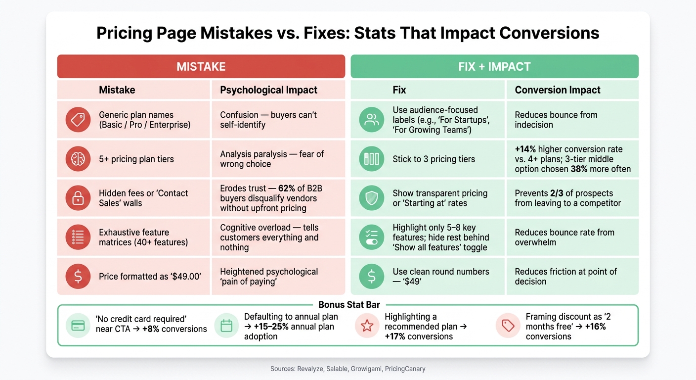 :::
:::
Vague or Weak Value Proposition
One major issue with pricing pages is the focus on listing features rather than addressing buyer needs. Labels like "Basic", "Pro", and "Enterprise" don’t help visitors understand if the product is a good fit. Instead, they’re forced to sift through long feature lists to figure it out.
"Most pricing pages are designed as information repositories; they should be designed as decision-making tools." - Salable [1]
The real culprit here is the overuse of feature matrices. Pages with massive tables listing 40+ features tend to drive visitors away, leading to high bounce rates [4]. As Salable explains: "A table with forty features tells customers everything and nothing simultaneously." [1] Buyers don’t want to see every single feature - they just want to know, "Is this right for me?"
Using buyer-focused labels like "For Solo Founders" or "For Growing Teams" helps visitors identify the right plan quickly. This approach eliminates guesswork and streamlines the decision-making process. But that’s not the only obstacle - too many plan options can also derail conversions.
Too Many Plan Options
While more choices might seem like a good thing, on pricing pages, they often have the opposite effect. Pages with more than four visible options experience a 20% drop in conversions [5]. Offering five or more plans can reduce conversion rates by as much as 18% [8].
"When consumers are presented with too many options, the cognitive load increases. The fear of choosing the wrong plan overpowers the desire to buy the product. This is called Analysis Paralysis." - Revalyze [5]
To avoid overwhelming buyers, stick to three plan tiers. This layout not only simplifies the decision but also increases the likelihood of customers choosing the recommended middle option by 38% [8]. Additionally, three-tier layouts result in 14% higher conversion rates compared to pages with four or more plans [4]. If you have additional plans for niche use cases, hide them behind a "Show more options" toggle to keep the main view clean. Beyond plan options, unclear pricing can also drive buyers away.
Hidden or Confusing Pricing Details
Transparency is key when it comes to pricing. If buyers can’t quickly calculate their total cost, they’re more likely to leave than to ask questions. Confused visitors tend to bounce within 10 seconds, while those who find pricing too high still spend 30+ seconds evaluating before leaving [2].
Hidden fees are especially damaging in B2B sales. 62% of B2B buyers disqualify vendors who don’t display pricing upfront [3]. Forcing buyers into a "Contact Sales" process for plans that could be self-serve signals a drawn-out, high-pressure experience - something most buyers want to avoid.
"Hiding your pricing does not create intrigue. It creates friction that sends two-thirds of your prospects to a competitor who does show pricing." - Alexander Chua, Co-Founder, Growigami [3]
A good example of transparency is Monday.com’s seat-count slider, which updates the total cost in real time, eliminating the need for mental math [3]. Small details like adding "No credit card required" below a call-to-action button can also boost conversions by 8% [4].
Poor Layout and Usability
Even well-thought-out pricing can fail if the page layout is cluttered or hard to navigate. A clean, intuitive design helps visitors quickly identify the best plan for their needs. On the other hand, weak visual hierarchy forces buyers to scan the entire page, making it harder to decide.
Mobile users face even more challenges. Multi-tier layouts often collapse into long vertical scrolls, making it difficult to compare plans side by side. This lack of context significantly increases abandonment rates [2][8]. Additionally, small design choices like displaying "$49.00" instead of "$49" can amplify the psychological "pain" of spending, while poor mobile structure erodes buyer confidence when it matters most [5].
| Mistake | Psychological Impact | Quick Fix |
|---|---|---|
| Generic plan names (Pro/Lite) | Confusion over fit | Use audience-focused labels (e.g., "For Startups") |
| 5+ plan tiers | Analysis paralysis | Stick to 3 tiers |
| Hidden fees or "Contact Sales" walls | Erosion of trust | Show transparent pricing or "Starting at" rates |
| Exhaustive feature matrices | Cognitive overload | Highlight 5–8 key features only |
| "$49.00" price formatting | Heightened spending pain | Use clean, round numbers without decimals |
How to Redesign Your Pricing Page
Write Clearer, More Direct Value Propositions
"The job of a pricing page is not to explain your product... The job of a pricing page is to remove doubt about which plan to buy and make the decision easy to act on." - Anant Jain, Creative Director, Designpixil [6]
A pricing page isn’t just about listing options - it’s about making decisions effortless. Instead of vague headers like "Choose your plan", try something more direct, such as "Scale your revenue with the right plan for your team." When describing plans, focus on outcomes rather than features. For example, instead of listing technical specifications, highlight benefits like "Scale to 10,000 users."
You can also rename pricing tiers to reflect your audience’s goals or business stages. Labels like "Freelancer / Studio / Agency" or "Launch / Grow / Scale" help visitors quickly identify the plan that fits their needs without digging through complex feature lists.
Once your value propositions are clear, it’s time to align your plans with the specific needs of your buyers.
Match Plan Structure to Buyer Needs
Stick to three pricing tiers, with each one catering to a distinct type of buyer. This approach avoids overwhelming visitors while ensuring every option feels purposeful.
- Entry Tier: Showcase your core value to attract new users.
- Middle Tier: Focus on collaboration or growth, but include a "felt limitation" like a seat cap or usage limit to encourage upgrades.
- Top Tier: Address advanced needs like compliance, security, or large-scale operations.
Tailor your calls-to-action (CTAs) to match the level of commitment for each tier. Use phrases like "Start for free" for the entry-level plan, "Buy now" for those ready to commit, and "Contact sales" for high-touch, custom solutions [9].
Once your plans are structured effectively, transparent pricing is the next step.
Make Pricing Transparent
Clarity in pricing builds trust. Display upfront costs prominently, and set the annual plan as the default option. Include the monthly equivalent (e.g., "$8/mo billed annually") to make it easier for buyers to understand. Adding a badge like "Save 20%" or "2 months free" provides an extra nudge for commitment. Research indicates that defaulting to annual plans can boost adoption rates by 15% to 25% [7][9].
For usage-based pricing, consider including a cost estimation tool. This allows buyers to calculate their potential monthly spend without relying on guesswork, making the process smoother and more transparent.
Fix Layout and Readability
A well-structured layout can make all the difference. Highlight the recommended plan with a badge like "Most Popular" or "Recommended" to guide hesitant buyers. Limit each pricing card to 5–8 key features, and hide the more detailed technical information behind a "Show all features" toggle to keep things clean and digestible.
On mobile, stack pricing tiers vertically with the recommended plan at the top for easy navigation. Make sure your CTA buttons are large enough - at least 44x44 pixels - to prevent accidental taps. As PricingCanary puts it:
"Pricing page design is mostly a clarity problem, not a decoration problem." [10]
A clean, straightforward layout reduces friction and helps visitors move confidently toward conversion.
Testing and Improving Your Pricing Page Over Time
Once you've refined your pricing page design, the next step is to keep testing and gathering feedback. Think of your pricing page as a work in progress rather than a finished product. Successful companies treat it as a living system, constantly analyzing performance and experimenting to improve results.
Track the Right Metrics
Start by identifying the metrics that matter most: visit-to-signup conversion rates, plan adoption by tier, monthly-to-annual plan splits, and trial-to-paid conversion rates. To give you an idea, median conversion rates typically range from 2.1% to 3.8%, while the best performers hit 5.4%–15% [7][14]. Free trials without requiring a credit card convert at 2%–5%, while trials that do require a credit card convert at a much higher rate of 40%–60% [12].
Another key metric is Revenue Per Visitor (RPV). This tells you if your updates are driving actual revenue growth, not just more clicks or signups. Tools like Hotjar or Microsoft Clarity can also help by showing where visitors hover, scroll, or drop off. These behavioral insights often highlight issues that raw numbers can’t explain [7][15].
Run A/B Tests to Find What Works
A/B testing is a powerful way to see what resonates with your audience. Focus on elements surrounding the price - like call-to-action (CTA) text, default selections, and where you place social proof. As Atticus Li, Experimentation and Growth Leader, explains:
"The ones that work don't test the price. They test everything around the price. And the results are often more impactful than a $5 price change would have been anyway." [16]
For instance, Basecamp increased conversions to paid plans by 14% simply by making annual plans more prominent on their pricing page [11]. Groove HQ saw even more dramatic results: they simplified their plan options and added a comparison page, which boosted free trial conversions by 358% [15].
When running tests, focus on one variable at a time - like a headline, CTA, or layout - and let it run for 4–6 weeks to measure its full impact [13]. Testing multiple changes at once makes it impossible to figure out what actually worked [12]. These experiments connect your design tweaks to measurable improvements in conversions.
Use Customer Feedback to Sharpen Your Pricing
While metrics show you what's happening, customer feedback tells you why. Direct insights from users can help you fine-tune your pricing strategy. Look at support tickets, cancellation surveys, and customer interviews - these are often overlooked but rich sources of information.
For example, if users frequently submit support tickets about confusion over plan features, it’s a sign your descriptions need to be clearer. If cancellations are tied to cost concerns, it might mean your entry-level plan isn’t meeting expectations. Exit surveys during the cancellation process can uncover honest feedback that users might not share otherwise [17].
Even small changes, like validating your tier names with a handful of customers, can make a difference. If users can’t identify their own plan by name, it’s time to rethink your labels [7]. Combining customer feedback with behavioral data helps you pinpoint areas for improvement and make changes that truly resonate.
Conclusion: Your Pricing Page Is Never Done
Your pricing page is never truly complete. Despite being one of the most critical pages on your site - where visitors often decide to stay or leave - many SaaS teams treat it as a static feature, missing out on potential revenue in the process.
The key is making decisions easy, not overwhelming visitors with every detail. As Anant Jain, Creative Director at Designpixil, aptly puts it:
"The job of a pricing page is not to explain your product... The job of a pricing page is to remove doubt about which plan to buy and make the decision easy to act on." [6]
Success comes from meaningful structural changes, not just surface-level updates. For example:
- Offering just three pricing tiers can improve conversions by 14%.
- Framing annual discounts as "two months free" boosts conversion rates by 16%.
- Highlighting a recommended plan increases conversions by 17% [4].
These are not just tweaks - they're trust-building strategies that directly impact your bottom line. A well-designed pricing page builds confidence, while a confusing one drives visitors away. Ideally, your pricing-to-signup conversion rate should fall between 25% and 40%. If it’s under 15%, it’s a sign that something needs urgent attention [2][4].
Patrick Campbell, CEO of ProfitWell, sums it up well: "Your pricing strategy is one of the most important levers for growth, yet it's often the most overlooked." [11]
Your pricing page should be treated as a dynamic tool, constantly evolving to meet customer expectations and drive growth. Conduct quarterly audits, test one variable at a time, and listen to customer feedback to identify pain points. By refining and adapting regularly, you can ensure your pricing page remains a powerful driver of conversions.
FAQs
::: faq
What should my three pricing tiers be?
A "Good, Better, Best" pricing structure can make it easier for customers to choose while emphasizing the value of your offerings. Here's how to structure it effectively:
- Entry-level plan: Offers basic features at a lower price, ideal for small businesses or new customers just starting out.
- Mid-tier plan: Includes additional features and is often labeled as "Recommended" or "Most Popular" to guide customer decisions.
- Premium plan: Provides access to all features, tailored for larger organizations or advanced users who need the full suite.
Stick to three or four options to keep things simple and avoid overwhelming potential customers. :::
::: faq
When should I use “Contact sales” on my pricing page?
“Contact sales” works best when your product or service involves personalized discussions, custom solutions, or complex offerings that can’t be addressed with standard pricing tiers. This approach is especially effective for enterprise-level deals or situations requiring bespoke pricing.
To make this option effective, provide clear guidance on why reaching out is necessary and what value customers can expect. This helps avoid confusion or hesitation, ensuring potential clients feel confident about taking the next step. :::
::: faq
What should I A/B test first on my pricing page?
Take a close look at how your pricing tiers are presented. Try experimenting with the number of tiers, their order, or how the features are grouped within each one. For example, offering just three tiers can make decisions easier for customers, helping to avoid overwhelming them with too many choices.
By simplifying the options, you can reduce decision paralysis and make it clearer where the value lies. A well-organized pricing page not only communicates your offering effectively but also sets the stage for better conversion rates and future improvements. :::
Go deeper than any blog post.
The full system behind these articles—frameworks, diagnostics, and playbooks delivered to your inbox.
No spam. Unsubscribe anytime.