SaaS Onboarding Teardowns: 9 Sign-Up Flows That Convert Above 15%
Nine SaaS sign-up flows that drive 15%+ conversions by using personalization, quick wins, and guided steps to help users reach the 'aha' moment fast.
SaaS Onboarding Teardowns: 9 Sign-Up Flows That Convert Above 15%
Your SaaS onboarding flow can make or break your product's success. Did you know 64% of users abandon sign-up flows and 40-60% churn within 30 days if they don't experience value quickly? The solution? A well-designed onboarding process that guides users to their "aha moment" fast. This article breaks down 9 SaaS onboarding flows - from Slack to Spotify - that achieve 15%+ conversion rates by focusing on:
- Personalization: Tailoring the experience based on user inputs.
- Quick Wins: Encouraging users to complete meaningful actions within minutes.
- Guided Steps: Using interactive tutorials, checklists, and tooltips to reduce friction.
These strategies increase activation, retention, and revenue while reducing churn. Here's a quick look at how they do it:
| SaaS Product | Conversion Focus | Key Tactic | Impact |
|---|---|---|---|
| Slack | Team collaboration | Invite teammates early | 93% retention after 30 days |
| Notion | Flexible templates | Role-based onboarding | 40% higher retention at 30 days |
| Canva | Design templates | Pre-filled Brand Kits | Retention boosted from 15% to 40% |
| Figma | Interactive tools | Quick feature demos | 73% Day 1 retention rate |
| Personalized feed | Interest-based setup | Doubled conversion rate | |
| Spotify | Music preferences | Artist selection flow | 46% free-to-premium conversion |
| Calendly | Scheduling ease | Calendar integration | Viral growth through shared links |
| Onsara | Focus tools | Behavioral onboarding | 28.2% conversion rate |
| Artisan Clients | Custom strategies | Simplified forms | 19-67% lift in conversions |
These SaaS companies prove that delivering value early and reducing friction can transform your onboarding flow into a conversion powerhouse.
::: @figure 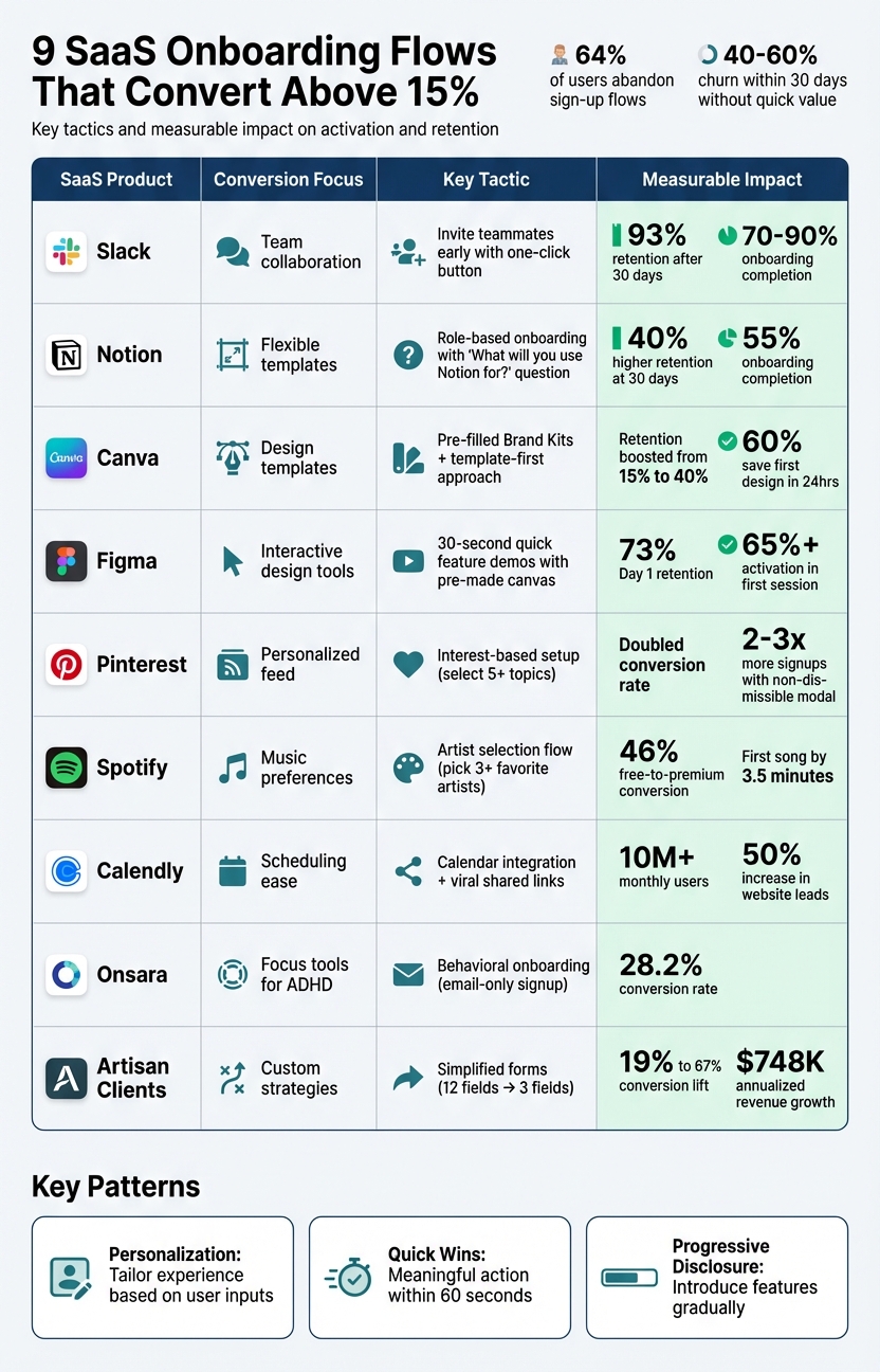 :::
:::
1. Slack
Conversion Rate (above 15%)
Slack's onboarding completion rate is impressive, ranging between 70% and 90%, far surpassing the industry average of 20–30% [1]. This success isn’t accidental. Slack pinpointed a key activation milestone: when a team sends 2,000 messages, there's a 93% likelihood they’ll remain long-term users [8]. As Amina Dudha explains:
"Once teams send 2,000 messages, 93% keep using Slack. That's not luck. Slack designed their entire onboarding around helping teams communicate differently." [8]
Personalization and User Guidance
Slack’s onboarding feels tailored from the start. A 3-step survey asks for your team name and current project, then automatically names your first channel after that project [10,11]. As you fill out the survey, a dynamic wireframe updates in real time, giving you a live preview of how your inputs will appear in the app [7].
Instead of overwhelming users with a long tutorial, Slack uses empty states in new channels to display helpful tips and keyboard shortcuts right when they’re relevant [6]. Meanwhile, the Slackbot serves as a hands-on guide, teaching features through interactive chats rather than static instructions [11,14]. This approach naturally encourages users to engage with the platform right away.
First Action Post-Signup
After signing up, Slack directs users to invite teammates and send their first message in the newly created channel [10,11]. This step isn’t arbitrary - adding a one-click team invite button during onboarding increased Slack’s signup-to-activation rate by 25% [1]. By focusing on team interaction from the beginning, Slack ensures users quickly experience the platform’s core value.
Reported Impact on Activation/Retention
The results speak for themselves. Users who complete the onboarding process and invite at least one teammate show a 93% higher retention rate after 30 days compared to those who skip this step [9]. Additionally, workspace creators drive a 143% net dollar retention rate, and this streamlined onboarding process helped bring in 54,000 new user accounts in just one month [10].
sbb-itb-0499eb9
2. Notion
Conversion Rate (above 15%)
Notion boasts a 55% onboarding completion rate [1]. The secret? A smooth entry process that only requires an email address - no password needed upfront [11][13].
From there, Notion quickly customizes the user experience right after account creation.
Personalization and User Guidance
Right after signing up, Notion asks a simple but impactful question: "What will you use Notion for?" [15]. Your answer shapes the experience. If you choose "For myself", you'll see personal templates like reading lists or travel plans. If you pick "With my team", the focus shifts to professional templates like roadmaps and OKRs [15].
Ash Withers from Candu highlights this approach:
"Notion's onboarding flow is a masterclass in progressive disclosure, introducing features at the right time instead of overwhelming new users upfront." [14]
Notion also uses your email domain to detect if your team already has a workspace. If it finds one, it encourages you to join instead of starting a duplicate environment [14][4]. Instead of bombarding users with static tutorials, Notion offers a "Getting Started" checklist. This checklist teaches key commands - like typing "/" for slash commands - through hands-on interaction [12]. It’s a personalized, action-driven introduction that gets users engaged right away.
First Action Post-Signup
Notion's onboarding is designed to guide users toward creating their first page within the first minute. The flow takes just 50 seconds and includes friendly prompts along with five curated templates to ease decision-making [16][17].
Reported Impact on Activation/Retention
The results are clear: users who create their first page enjoy a 40% higher retention rate at 30 days compared to those who don’t [1]. This early "first win" approach highlights how initial activation can lead to stronger long-term adoption [16]. Considering that 40% to 60% of SaaS users typically churn within the first 30 days without experiencing quick value, Notion’s strategy significantly improves retention [15][1].
3. Canva
Conversion Rate (above 15%)
Canva has seen remarkable growth, boasting 170 million monthly active users and reaching $1 billion in annual recurring revenue, with a year-over-year growth rate of 100% [18]. Although exact conversion rates remain undisclosed, Canva’s onboarding strategy speaks volumes: 60% of new users save their first design within 24 hours of signing up [21].
Their template-first approach has proven to be a game-changer, driving an 18% increase in sign-ups and boosting retention by 25 percentage points - from 15% to 40% [21].
Personalization and User Guidance
Canva eliminates the intimidating blank slate by asking a simple, targeted question during signup: "What will you use Canva for?" Based on this response - whether it's Instagram posts, presentations, or YouTube thumbnails - the platform guides users to relevant, pre-designed templates [19].
The onboarding flow also adapts dynamically based on the user’s email domain. If you sign up with a company email, Canva prompts team-specific steps like adding a logo and team name. For personal email domains, users are categorized (e.g., Student, Teacher, Small Business) to receive tailored template suggestions [20]. This approach ensures users see content that aligns with their specific needs from the start.
Another standout feature is the early introduction of Brand Kits. Users can upload logos, colors, and fonts, which then seamlessly integrate into future templates [19][21]. This not only enhances usability but also increases the likelihood of users sticking with Canva, as their personalized settings make switching to another tool less appealing.
First Action Post-Signup
Canva’s onboarding doesn’t stop at personalization - it pushes users to take immediate action. After setup, users are guided to create and export a finished design within their first session, ideally in under 5 minutes [21]. The philosophy is straightforward: "Show value, then teach" [19]. Advanced features remain hidden until users complete their first design, keeping the experience simple and focused [19].
This streamlined approach has delivered exceptional results. Time to first action dropped from 9 minutes to 4 minutes, template adoption soared from 28% to 62%, and user feedback ratings improved from 3.8 to 4.5 out of 5 [21].
Melanie Perkins, Canva’s Co-founder and CEO, reflected on this growth journey:
"It took nearly three years for us to reach the milestone of one million people using Canva, and another two years after that for us to hit ten million. Today, reaching the milestone of more than one hundred million people using Canva every month still feels incredibly surreal." [18]
Reported Impact on Activation/Retention
At the heart of Canva’s activation strategy lies one critical milestone: completing and exporting a design [19]. Users who achieve this are far more likely to stay engaged in the long term. By focusing on getting users to this "win" as quickly as possible, Canva’s personalized onboarding process has boosted retention rates from 15% to 40% [21].
4. Figma
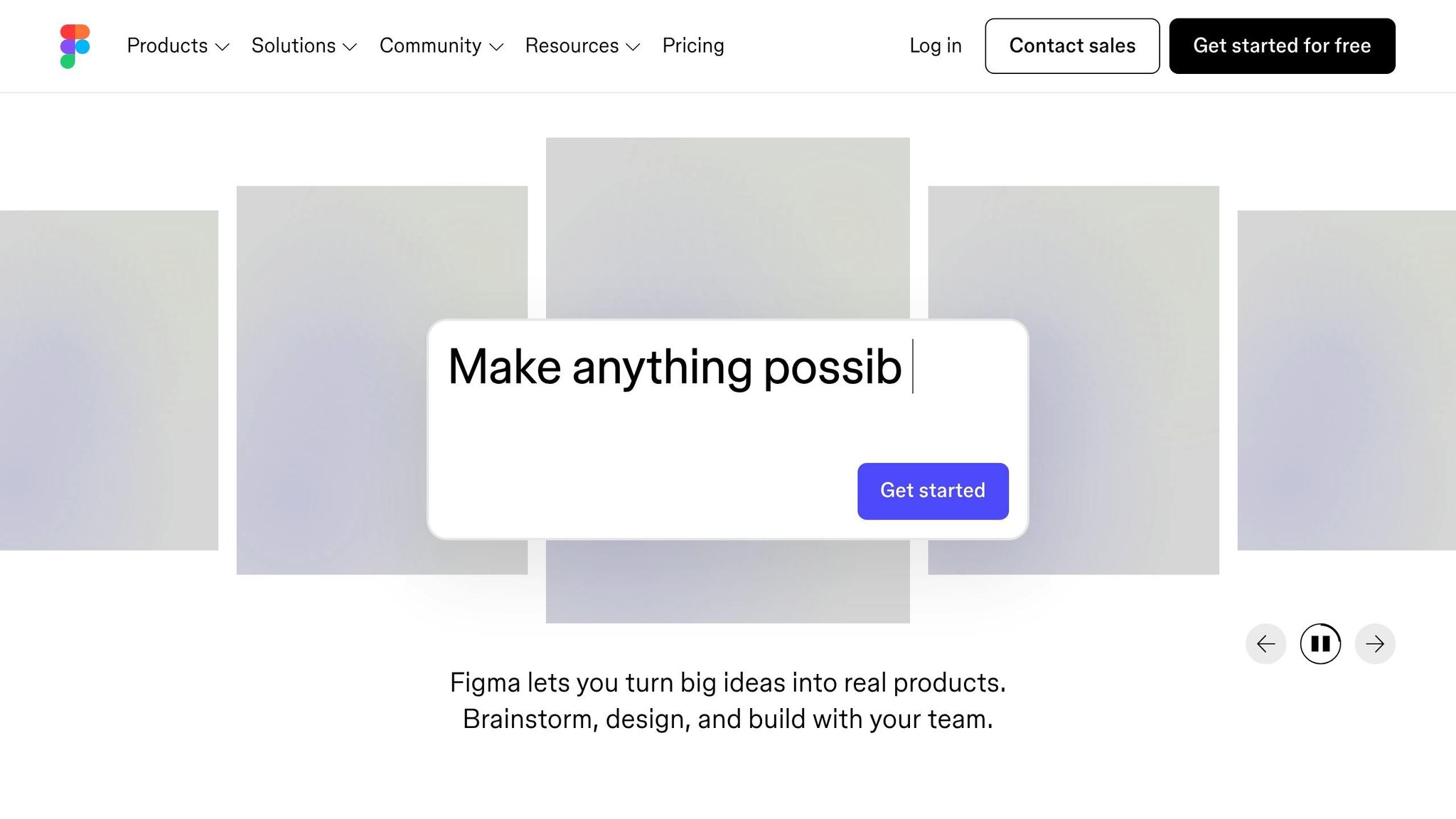
Conversion Rate (above 15%)
Figma's onboarding process doesn’t just meet expectations - it blows past them. With an activation rate of over 65% within the first session, it more than doubles the typical 20–30% seen in many SaaS products [22]. Even better, 73% of users return within 24 hours of signing up [22]. These numbers highlight a well-thought-out, user-driven onboarding strategy.
What’s their secret? Figma ensures users complete a meaningful action within just 30 seconds - far faster than the usual 15–45 minutes most SaaS products need to show their value [22]. This is achieved through a pop-up modal that stays within the product’s context [5]. Add to that a sleek interface with a single, bold call-to-action button, and you’ve got a distraction-free, confidence-inspiring experience [4].
Personalization and User Guidance
Figma’s onboarding strategy is built on a three-layer structure designed to engage users immediately:
- Layer 1 (0–30 seconds): Users are greeted with a pre-made canvas and a simple prompt: "Click to add" [22].
- Layer 2 (30 seconds to 2 minutes): Contextual tooltips guide users based on their actions, like hovering over tools. These hints disappear after the first successful interaction [22].
- Layer 3 (2–5 minutes): Advanced features and community templates are introduced gradually.
This step-by-step approach eases the learning curve, cutting cognitive load by an estimated 60% [22]. The result? 87% of users engage with Figma’s intended feature adoption flow [22]. As Ayan Wakil, Founder & CEO of Ayeans Studio, explains:
"Figma didn't just build great software, they engineered understanding. They proved that activation isn't about explaining everything; it's about creating immediate success." [22]
First Action Post-Signup
Figma skips passive tutorials and dives straight into interactive tasks that deliver real results. Within minutes, users are prompted to create a file, draw a shape, and invite a collaborator, resulting in an instant prototype [1]. Micro-animations and success messages celebrate these early wins, keeping users engaged [22]. At the final step, users select between "Free" and "Pro" plans, a move designed to capture high-intent users [5].
Reported Impact on Activation and Retention
Figma’s streamlined onboarding slashes time-to-value from the typical 15–45 minutes to under 5 minutes [22]. This efficiency pays off with a 73% Day 1 retention rate, far above the industry average of 40% [22]. Jonathan Anderson from Candu puts it best:
"Figma's ultra-clean design removes all distractions... Simplicity signals confidence." [4]
The results speak for themselves: a 50% higher lifetime value and 15% lower churn within the first 90 days [22].
5. Pinterest
Conversion Rate (above 15%)
Pinterest's Growth team didn’t just hit their 15% conversion target - they doubled it through a year of rigorous A/B testing [27]. The key? A streamlined three-step signup process that asks for just an email, gender/age, and interests [23]. By using a non-dismissible signup modal and refining design elements, they saw a noticeable boost in conversions.
In May 2014, Engineer Jean Yang conducted a test comparing a non-dismissible modal to one with a "Skip for now" button. The non-dismissible version led to 2 to 3 times more signups without affecting long-term retention or user engagement [27]. Even small changes made a difference - switching text color to white on a black background increased daily signups by 10%, while tweaking the call-to-action text added another 5% [27].
Personalization and User Guidance
Pinterest keeps users engaged by asking them to select at least five interests. The prompt - "Follow 5 topics... then we'll build a custom home feed" [26] - makes the value exchange clear and reduces drop-off. The platform also personalizes these suggestions based on browser data, tailoring them to the user’s country and demographic rather than defaulting to a generic U.S.-focused feed [24].
During Casey Winters' time as Product Lead, this localized approach boosted international activation rates by 5% to 10%, depending on the country [24][26]. Once users are inside, Pinterest uses visual cues like blue banners, pulsing hotspots, and tooltips to guide them toward their first "Save" action, which is central to the platform’s value [24][26]. Advanced features, like creating original pins or sharing boards, remain hidden until users are comfortable with the basics [24][26].
First Action Post-Signup
Pinterest focuses on getting users to their "aha" moment as quickly as possible. After selecting their interests, users are presented with a personalized feed tailored just for them. The interface is kept simple - new users only see basic options like searching and saving, while returning users gain access to advanced features [26]. A short introductory video helps guide users toward their first action before they dive into the full experience [25]. As Casey Winters explains:
"You really need to accomplish showing the main value in the first session. Or else there's no guarantee there will be a next session." [24]
Reported Impact on Activation and Retention
Pinterest’s "ladder of engagement" strategy - introducing features gradually as users master core actions - had a significant impact on activation metrics [26]. The Growth team tracks "signup retention", focusing on how well new users stick around and engage with core features [27]. By keeping things simple early on, they ensure users grasp the platform’s value before introducing more complex options [24][26]. Jean Yang highlights that while early experiments often attracted highly engaged users, Pinterest’s approach maintained strong retention rates even as signups scaled [27]. These data-driven refinements show how thoughtful design can directly enhance activation and retention, setting the stage for other onboarding strategies to follow. These refinements are core components of conversion rate optimization.
6. Spotify
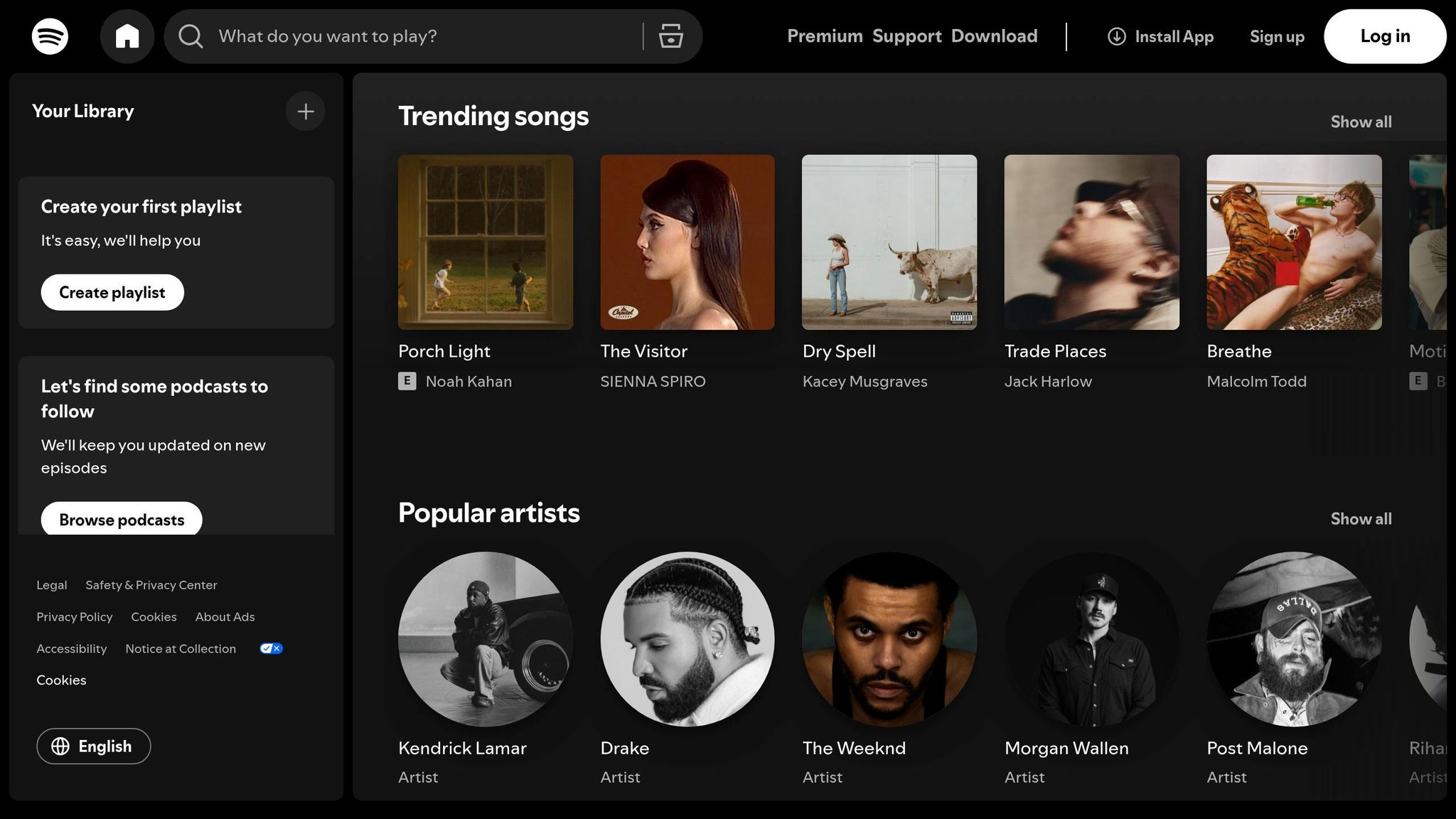
Conversion Rate (above 15%)
Spotify's onboarding process is in a league of its own, converting a staggering 46% of free users to premium in Q1 2019 - far exceeding the typical freemium model conversion rate of 2–5% [28]. By March 2020, 45.7% of Spotify's 270+ million monthly active users were paying subscribers [29]. UX Designer Eric Chung highlighted this achievement:
Spotify's conversion rate from free to premium topped 46% in Q1 2019 - well above the typical 2–5% for freemium models. [28]
Personalization and User Guidance
From the moment a user signs up, Spotify sets the stage for a highly personalized experience. Right after creating an account, users are prompted to pick at least three favorite artists. This simple step ensures that Spotify can immediately tailor content to their preferences. Product Manager Ahmad Kabir explains:
By asking for artist preferences right away, Spotify avoids the 'what do I do now?' feeling that many apps give. [30]
During this selection process, users see artist photos, which adds a visual and emotional connection. Product Manager Smarth Vasdev notes:
Displaying artists' pictures adds extensive stickiness value - since the user feels much more connected to the content than otherwise. [29]
This instant personalization ensures new users are engaged from the start. Instead of being greeted by an empty home screen, they are presented with curated playlists and song recommendations aligned with their preferences. This not only introduces them to Spotify's value but also fine-tunes its recommendation algorithm. The entire setup process is seamless, with users playing their first track in under four minutes - installation to music in just about two minutes, and the first song by 3.5 minutes [29].
Reported Impact on Activation and Retention
Spotify's onboarding process is designed to deliver immediate value, which minimizes user drop-off and supports its exceptional conversion rate [28][29][30]. By presenting personalized content right out of the gate, Spotify ensures that new users are engaged from their very first session. This rapid time-to-value is a key driver of high engagement and retention, making Spotify's onboarding a standout success in the freemium space.
5 Best Practices for Better SaaS User Onboarding
::: @iframe https://www.youtube.com/embed/9kM-UMFIlms :::
7. Calendly
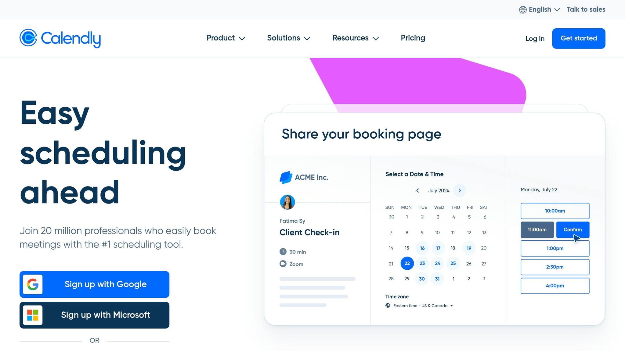
Calendly offers a masterclass in SaaS onboarding, combining a seamless setup process with well-placed nudges to fuel its impressive growth.
Conversion Rate (Above 15%)
Calendly's product-led approach has delivered outstanding results. With more than 10 million monthly users and over $100 million in annual recurring revenue, the platform achieved these milestones without relying on a traditional sales team [31]. By 2021, 100 million people had used Calendly [32], and today, 86% of Fortune 500 companies are among its users [34]. A key part of this success lies in their smart use of intent-driven CTAs. For instance, CTAs like "Talk to Sales" on pricing pages and "Get a Demo" on feature pages helped increase website leads by 50% [34].
Personalization and User Guidance
Calendly ensures its users enjoy a frictionless onboarding experience. A self-serve setup wizard walks users through account creation, calendar integration, and availability settings in just minutes [31]. The first welcome email feels personal, greeting users by name and including their unique Calendly scheduling link to encourage immediate sharing [36][37]. If users haven’t connected their calendar by day two, Calendly sends a targeted email reminder to complete this step [36][37]. Additionally, 45-minute live "Office Hours" sessions provide Q&A opportunities, helping new users quickly master the platform [36][37].
First Action Post-Signup
Calendly focuses on activation by encouraging users to connect their calendar and share their scheduling link. Activation is defined as securing bookings from at least five contacts [32][36]. This marks the "aha moment" - when users experience the ease of someone booking a meeting without the usual back-and-forth. The onboarding flow is designed to guide users toward this milestone seamlessly. As Founder and CEO Tope Awotona put it:
We're happy for people to use the product for free. Even free users have an LTV associated with them because we spend almost zero dollars on marketing campaigns. [32]
Reported Impact on Activation and Retention
Calendly's viral growth strategy turns every shared scheduling link into an effortless trial. Recipients can book meetings without needing an account, instantly experiencing the product's benefits [31]. This simplicity boosts both activation and retention. According to research shared by Calendly, 86% of customers are more likely to stay loyal to a business that offers welcoming and educational onboarding content [35].
8. Onsara
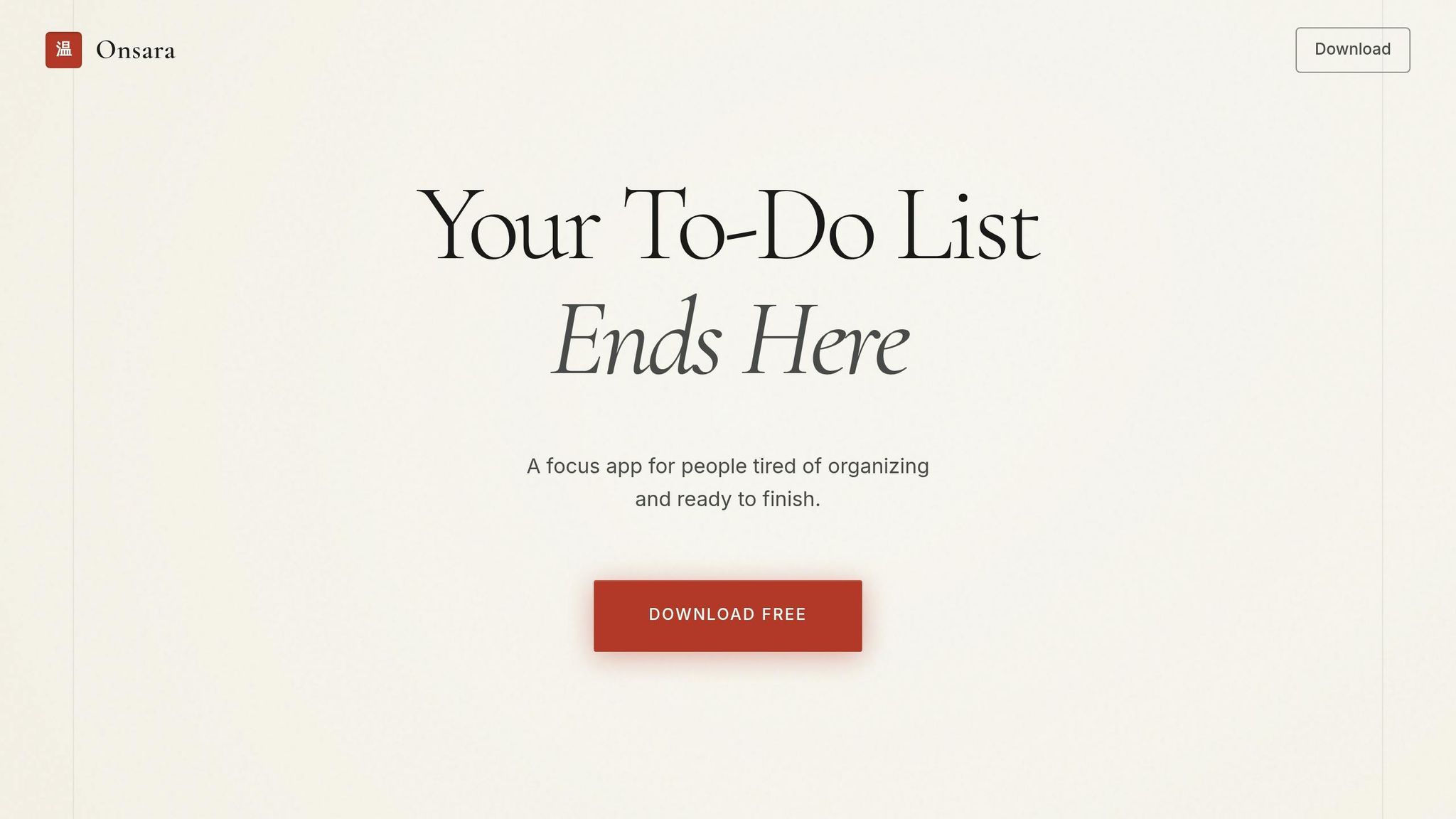
Onsara is a focus app for macOS, specifically designed to support individuals with ADHD and attention-related challenges. The app's success lies in its ability to minimize friction, enabling users to quickly access its core benefits. This approach has led to conversion rates that surpass industry standards.
Conversion Rate (Above 15%)
Onsara boasts an impressive 28.2% conversion rate, thanks to its simplified sign-up process. By requiring only an email address, the app eliminates unnecessary barriers often found in traditional sign-up flows. Instead of gathering extensive demographic details, Onsara focuses on behavioral questions like, "What are you trying to achieve today?" This approach aligns with users' immediate goals, streamlining the process and encouraging faster adoption [38]. This frictionless start lays the groundwork for a more tailored experience.
Personalization and User Guidance
After sign-up, Onsara segments users based on their specific needs. Whether someone is managing projects, working independently, or collaborating with a team, the app provides a customized dashboard and tutorial sequence. This personalized approach ensures that users are guided in a way that matches their workflow, making the onboarding process more relevant and effective.
First Action Post-Signup
Onsara takes personalization a step further by encouraging immediate action. The app prompts users to complete one meaningful task right after signing up. For a focus app, this means helping users quickly decide on their next task and start working on it. This immediate activation addresses common challenges like decision fatigue and task paralysis, allowing users to experience the app's value right away. By delivering this quick win, Onsara not only boosts user engagement but also increases the likelihood of converting users into paying customers.
9. Artisan Strategies Client Results
Artisan Strategies has consistently exceeded the 15% conversion benchmark by revamping SaaS onboarding flows. Their approach is built around a 7-stage framework that takes users from setup to habit formation, focusing on reducing friction and speeding up time-to-value at every stage. This framework emphasizes delivering immediate value and maintaining user engagement step-by-step, echoing earlier successful strategies.
Conversion Rate (Above 15%)
One of the standout tactics is simplifying sign-up forms. Research shows that for every additional form field beyond the first two, conversion rates drop by around 5% [4]. By cutting down forms to only the essentials and offering single sign-on (SSO) options, clients saw a 23% average conversion lift from fewer fields and a 21% boost from SSO. Pairing streamlined forms with sharp, value-driven messaging pushed conversion rates well past the 15% threshold.
Personalization and User Guidance
Artisan Strategies' 7-stage framework also excels at personalization and user guidance. Instead of overwhelming users with lengthy demographic questions upfront, the process begins with identifying their primary role and key challenges. This input shapes a customized, role-specific onboarding path. To keep things simple, progressive disclosure gradually introduces complex features, avoiding cognitive overload. Smart defaults further ease the process by pre-filling settings based on the user's industry or segment. Interactive product demos, which showcase core benefits before registration is completed, contributed to a 42% average lift in conversions.
First Action Post-Signup
The framework prioritizes a quick, impactful action immediately after signup. For one client, reducing their onboarding from nine steps to just three screens resulted in a 5× increase in retention. Shifting the focus to quick wins before diving into full product education delivered activation lifts of 30% to 50%, depending on the product category.
Reported Impact on Activation/Retention
The combination of reduced friction and tailored guidance has driven impressive improvements in both activation and retention. Interactive walkthroughs boosted activation rates by 25–40%, while personalized onboarding paths added another 20–35%. In one case, a SaaS pricing strategy experiment generated $748,000 in annualized revenue growth. Another client saw a 47% jump in checkout conversions after implementing progressive onboarding strategies. These efforts - centered on reducing friction, offering personalized guidance, and delivering immediate value - have led to compounding improvements across the entire customer lifecycle.
Side-by-Side Comparison
Looking at nine different onboarding flows, some clear trends emerge. Social login options like Google, Apple, or Microsoft make a big difference in boosting conversions by eliminating the need for manual form entry. Interestingly, none of the high-performing flows ask for credit card details upfront, which helps prevent users from dropping off early [5].
The differences between these flows are just as revealing as their similarities. For example, B2B platforms like Slack often require specific fields like "Team Name" or "Work Email", while B2C services such as Spotify and Pinterest lean toward personal details and preferences [2]. Some, like Notion, have moved away from traditional passwords altogether, opting for magic links or email verification codes to make the process easier [5]. Meanwhile, Canva and Figma use pop-up modals to keep users on the same page, while 80% of other SaaS platforms redirect users to separate landing pages [5]. These shared and unique elements set the stage for the detailed comparison below.
| SaaS Flow | Required Fields | Personalization Approach | Initial Action | Key Result |
|---|---|---|---|---|
| Slack | Email/SSO, Team Name [2] | Team-based workspace setup | Create a channel | >15% conversion |
| Notion | Email or SSO [4] | "What will you use Notion for?" survey [3] | Pick a template or start typing [3] | >15% conversion |
| Canva | Email/SSO, Use Case [2] | Role-based template suggestions [5] | Select a design type [2] | >15% conversion |
| Figma | Email, Password [5] | Minimalist, tool-focused | Draw a shape on canvas [3] | >15% conversion |
| Email, Password, Age [2] | Interest-based content gating [2] | Save/Pin an image [2] | >15% conversion | |
| Spotify | Email/SSO, DOB, Gender [2] | AI-driven artist/genre selection [2] | Play a personalized playlist [2] | >15% conversion |
| Calendly | Email/SSO | Meeting type selection | Set availability | >15% conversion |
| Onsara | Email, Welcome Survey [39] | HealthTech/EdTech segmentation [39] | Resume upload/Profile setup [39] | >15% conversion |
| Artisan Client | Name, Work Email, Company [33] | Outcome-focused (ROI) targeting [33] | View data/ROI analysis [33] | 19% to 67% lift |
This comparison highlights that a smooth, personalized onboarding experience is key to driving higher conversion rates. The best flows encourage users to take an action - like pinning an image or starting a project - within 60 seconds. They also delay asking for detailed information using progressive profiling and adapt the experience based on user intent [3][4].
A great example of this in action is TechFlow Analytics. By simplifying their form to just three fields - first name, work email, and company name - and focusing on outcome-oriented headlines, they saw their conversion rate soar from 19% to 67% [33]. These findings offer practical lessons for refining SaaS sign-up processes.
Conclusion
The nine sign-up flows we’ve reviewed all share one key focus: delivering value as quickly as possible. Whether it’s Slack setting up a channel, Figma letting users draw a shape, or Pinterest saving an image, these products minimize the time between signup and the moment users see the benefit. As Rakesh Mondal explains:
Confidence before completeness. A user who feels confident after 60 seconds will explore the other 90% of your product on their own [3].
The numbers speak for themselves: users who find their "Aha Moment" convert to paid plans at 67%, compared to just 3% for those who don’t [38]. For example, in early 2026, a project management SaaS reduced its signup form from 12 fields to 3 and introduced role-specific paths. The result? Trial-to-paid conversions jumped from 11% to 28.2%, increasing $32,627 in monthly recurring revenue [38].
To replicate this success, identify the single action in your product that best predicts retention, and guide users to it within the first 60 seconds. A simple, intent-based question like "What will you use this for?" can help personalize the experience. Even small changes, such as reducing fields from four to three, can increase conversions by nearly 50% [2]. This approach not only drives immediate engagement but also sets the stage for long-term user satisfaction.
FAQs
::: faq
What’s the single best “aha moment” action for my product?
The most impactful "aha moment" comes when users are guided to complete a key task that clearly highlights your product's main benefit. This might involve actions like setting up a profile, linking a tool, or finishing a specific task. When users achieve an early success, it not only gives them a sense of accomplishment but also boosts engagement and lowers the chances of them dropping off. :::
::: faq
How many sign-up fields should I keep to maximize conversions?
Want more people to complete your sign-up process? Keep it simple. Stick to three or fewer fields in your sign-up form.
Here’s why: Forms with three or fewer fields tend to see a 25% conversion rate. Add more fields, and that rate can drop to around 15%. The reason is straightforward - longer forms create more friction, making users less likely to follow through. By keeping it short and easy, you’re removing barriers and boosting the chances of success.
Less hassle, more sign-ups. Simple as that. :::
::: faq
When should I ask users to invite teammates or connect integrations?
After users have signed up and explored the core features of your product, it’s the perfect time to prompt them to invite teammates or connect integrations. Why? By this point, they’ve likely experienced the value your product offers, making them more inclined to take these next steps. Timing is everything - asking too early might feel pushy, while waiting too long could miss the momentum.
Encouraging these actions at the right moment not only helps users deepen their connection with your product but can also spark virality and improve retention. A well-timed nudge here can make all the difference. :::
Go deeper than any blog post.
The full system behind these articles—frameworks, diagnostics, and playbooks delivered to your inbox.
No spam. Unsubscribe anytime.