Conversion Audit Checklist: 47 Points to Evaluate Before Hiring a CRO Agency
47-point conversion audit to find funnel leaks, prioritize fixes, and decide when to hire a CRO agency.
Conversion Audit Checklist: 47 Points to Evaluate Before Hiring a CRO Agency
Before hiring a CRO agency, run a detailed conversion audit. This 47-point checklist helps you identify leaks in your funnel, prioritize fixes, and decide if external help is necessary. Here's the core idea: fix what you can first, then hire experts for complex challenges.
Key takeaways:
- Boosting conversions by just 1% can mean thousands in extra revenue.
- Common issues include slow page speeds, unclear CTAs, and poor mobile performance.
- Use tools like GA4, Hotjar, and heatmaps to collect actionable data.
- Focus on high-traffic pages, checkout flows, and onboarding steps.
Example: Fixing 3 UX issues increased conversions by 72% for Barbeque Nation.
If your metrics fall below industry benchmarks - or you’re overwhelmed by technical fixes - this audit will show exactly when to bring in a CRO agency. Keep reading for the full checklist and actionable steps.
::: @figure 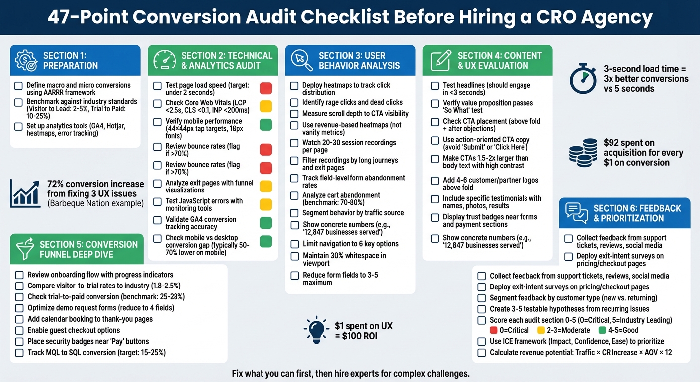 :::
:::
CRO Audit - A Real Example of How to Perform a CRO Audit of Your Website
::: @iframe https://www.youtube.com/embed/gSN1lUpmrZg :::
Preparation: Setting Up Your Audit
Before diving into page analysis or user behavior, it’s important to establish a clear definition of success. This initial step is what separates audits that deliver actionable insights from those that rely on guesswork.
Define Key Metrics and Goals
Start by dividing your goals into two types: macro conversions and micro conversions. Macro conversions are the big wins, such as completed purchases, paid subscriptions, or closed deals. Micro conversions, on the other hand, are smaller actions that signal intent - think trial signups, demo requests, newsletter subscriptions, or adding items to a cart [3][4]. Use the AARRR framework (Acquisition, Activation, Retention, Referral, and Revenue) to pinpoint where users are dropping off in your funnel [7].
For SaaS companies, certain metrics deserve extra attention. Time to Value (TTV) and activation rate are crucial indicators of user engagement. If you offer a trial model, the trial-to-paid conversion rate is a key metric to monitor. On average, trials without a credit card requirement convert at rates of 8% to 12%, while those requiring a credit card upfront often see higher rates, ranging from 20% to 40% [7].
Focus your efforts on high-traffic pages with underperforming conversion rates. Landing pages, pricing pages, and checkout flows are common problem areas [1][4]. Take Obvi, for example - a health brand that adjusted its primary call-to-action (CTA) button based on data analysis. That one tweak boosted Revenue Per Session (RPS) by 7.8% and added $2.5 million in revenue within a single month [3]. Defining success for each page is the first step toward achieving results like these.
Once your goals are clear, benchmark your current performance to identify the most pressing gaps.
Compare Your Performance to Industry Standards
After setting your goals, measure your baseline against industry benchmarks to flag potential issues. For instance, a visitor-to-signup rate below 1% could indicate that your messaging or value proposition isn’t connecting with your audience [7]. In B2B SaaS, demo leads typically convert to paying customers at rates between 25% and 45%, with sales-assisted demos often outperforming self-service trials [7].
| SaaS Funnel Stage | Average Conversion Rate | "Excellent" Benchmark |
|---|---|---|
| Visitor to Lead | 2–5% | 7–10% |
| Trial to Paid | 10–25% | 40%+ |
| Lead to MQL | 20–30% | – |
| MQL to SQL | 15–25% | – |
These benchmarks can vary depending on your business model. For example, requiring a credit card for trials might result in fewer signups but higher conversion rates [7]. If your metrics fall short of the average, you’ve identified a key area to address. On the flip side, if your numbers are already strong, your focus should shift to scaling what’s working.
With benchmarks in hand, the next step is ensuring your data collection tools are set up correctly.
Check Your Analytics Tools and Tracking Setup
Once you’ve benchmarked your metrics, it’s time to validate your data sources. This ensures that your audit rests on reliable information. Start by confirming that GA4 is tracking both macro and micro conversions accurately. Look for any data anomalies that could skew your analysis. To dig deeper, integrate behavioral tools like Hotjar, Microsoft Clarity, or heatmapAI, and use performance tools like Google PageSpeed Insights or GTmetrix to assess technical metrics [3][4][5][8].
Keep in mind that mobile traffic now makes up about 60% of all web traffic. A delay in page load time from 1 to 3 seconds can increase bounce rates by 32% [3]. To catch potential issues, implement error tracking tools like Sentry to identify JavaScript errors that might block conversions [3]. Additionally, tools like Typeform can help you deploy on-site surveys or exit-intent pop-ups to understand user behavior [3][5]. If you plan to test changes later, make sure A/B testing platforms like Optimizely, VWO, or Convert are integrated with your analytics setup [3][5]. Without these measures, your audit may fail to deliver dependable insights.
Technical and Analytics Audit: Finding Critical Issues
Once your metrics are defined and tracking tools are set up, it's time to tackle technical problems that might be hurting your conversions. These issues can lead to slow-loading pages, broken interactions, or disrupted layouts, all of which can frustrate users and drive them away.
Check Page Speed and Mobile Performance
Page speed isn't just a technical metric - it directly affects your revenue. Websites that load in under 2 seconds convert three times better than those taking 5 seconds or more, and even a 1-second delay can slash conversions by up to 20% [1][6]. To get a clear picture, analyze both lab data (synthetic tests using tools like Google PageSpeed Insights) and field data (real user monitoring from actual visitors). This combination helps you understand how your site performs across different devices and network conditions [10].
Pay close attention to Core Web Vitals, which measure essential aspects of user experience. Aim for these benchmarks:
- Largest Contentful Paint (LCP) under 2.5 seconds
- Cumulative Layout Shift (CLS) under 0.1
- Interaction to Next Paint (INP) under 200 milliseconds [9][11]
If your LCP is lagging, use waterfall analysis to pinpoint issues like render-blocking resources or a slow Time to First Byte (TTFB). Interestingly, 35% of LCP images are delayed because their source URLs aren't included in the initial HTML response [14]. Adding fetchpriority="high" to your LCP image can help prioritize its loading.
Mobile performance is another area that requires special attention since mobile conversion rates often trail desktop by 50–70% [1]. Ensure that:
- Tap targets are at least 44×44 pixels
- Font sizes are no smaller than 16 pixels
- The viewport is properly configured [1][3]
And don’t just rely on emulators - test your site on real devices to catch any overlooked issues.
Review Bounce Rates and Exit Pages
A high bounce rate is often a red flag that something isn't resonating with your audience. Generally, a bounce rate above 70% is considered poor [12]. Use GA4's funnel visualizations to identify where users are dropping off, and complement this with tools like heatmaps and session recordings to understand why they're leaving [1][4]. Look for signs like "rage clicks" (repeated clicks on non-functional elements) or moments of hesitation where users pause before abandoning the page [3].
For example, in 2025, That Works Agency used heatmapAI's session recordings to discover that users were abandoning their search because they couldn’t find the product sorting filter. After making the filter more accessible, the agency saw a 4.22% increase in conversions and a 13.07% boost in revenue per session [3]. If a funnel step shows a drop-off rate above 30%, it likely points to a critical issue or missing information [1].
Also, ensure there's a clear message match between your traffic sources and landing pages. If an ad promises one thing but the landing page delivers something else, users will bounce. Focus your audit on bottom-of-funnel pages like checkout and product pages, where exits represent a loss of high-intent leads [4]. Finally, check your Core Web Vitals and script performance to ensure technical hiccups aren’t derailing user interactions.
Test Core Web Vitals and JavaScript Errors
As of March 12, 2024, Interaction to Next Paint (INP) replaced First Input Delay (FID) as a Core Web Vital, measuring interaction latency throughout the page lifecycle [13][14]. Alarmingly, nearly 48% of websites fail the Core Web Vitals assessment, often due to JavaScript issues that block the main thread [13]. Use Chrome DevTools' Coverage tool to identify unused code and the Performance tab to spot "long tasks" (those taking over 50 milliseconds) that delay user interactions [14].
To fix JavaScript bottlenecks:
- Defer non-critical scripts
- Minify your code
- Break up long tasks using the
scheduler.yield()API [14] - Offload heavy calculations to web workers to free up the main thread [15]
One common mistake is applying loading="lazy" to an LCP image, which can delay its loading until the browser confirms it's in the viewport [14].
For Cumulative Layout Shift (CLS), always set explicit width and height attributes on images and videos to reserve space and prevent layout jumps [13][14]. Additionally, track JavaScript errors with tools like Sentry to catch bugs that might silently disrupt user flows [3].
User Behavior Analysis: What Visitors Are Actually Doing
Technical metrics show you what's happening on your site, but behavioral data uncovers why users are struggling. This step goes beyond numbers, letting you observe how people actually interact with your pages. Often, this reveals hidden friction points that analytics alone can’t detect - issues that may be silently hurting your conversions. With technical issues handled, understanding behavior adds an essential layer of insight.
Use Heatmaps to See Where Users Click
Heatmaps provide a visual breakdown of where users click, hover, and scroll on your site. This helps you spot patterns that directly impact conversions. One key insight is click distribution analysis: Are users clicking non-clickable elements repeatedly (indicating confusion)? Or ignoring your main call-to-action (a visibility problem)? Another red flag is rage clicks - rapid, repeated clicks in one spot, signaling frustration with broken elements or unresponsive features [3].
Scroll depth is another critical metric. If most visitors don’t scroll far enough to see your main CTA, it’s a clear visibility issue [5]. But don’t stop at total clicks - use revenue-based heatmaps to focus on elements that drive sales rather than vanity metrics [3]. For example, in 2024, Cooking Guild, an e-commerce kitchenware brand, used this approach to reorganize their product pages. They discovered that their most expensive items weren’t the most profitable. By rearranging products based on engagement and revenue data, they boosted Revenue Per Session by 48% and achieved a 40x ROI in just 30 days [3].
To dig deeper, review 20–30 session recordings per page to identify consistent patterns [5]. Segment your heatmap data by traffic source, as users from ads often behave differently from those arriving via organic search [5]. Heatmaps can highlight problem areas that warrant a closer look through session recordings.
Watch Session Recordings for Usability Problems
While heatmaps show where users interact, session recordings provide the context behind their actions. These recordings let you see your site through your visitors’ eyes, helping you spot confusion and friction that raw numbers can’t explain. Typically, reviewing 10–15 recordings is enough to uncover meaningful patterns [16].
Instead of watching every recording, filter strategically. Focus on "long journeys" (sessions with high page views or long durations), exit pages, or specific technical segments like device type or browser [16][17]. Look for behavioral warning signs such as rage clicks, dead clicks (clicking non-interactive elements), or pogo-sticking (rapidly bouncing between similar pages) [16][17]. Compare recordings of successful conversions with abandoned sessions to identify navigation or behavior differences [16].
To stay organized, use tools like spreadsheets or Trello boards to categorize your observations by page and issue type [16]. Cross-check your findings with heatmap data to confirm whether a behavior is widespread or isolated to a few sessions [16]. And keep in mind: about 17% of shoppers abandon their purchase due to overly complex checkout processes [17].
Identify Funnel Drop-Offs and Form Abandonment
Fixing high-traffic pages with low conversion rates can lead to significant improvements [1]. Track both micro-conversions (like add-to-cart actions or email signups) and macro-conversions (purchases, subscriptions) to find exactly where users are dropping off [3].
For forms, analyze field-level exit rates to pinpoint problem areas. Fields like phone number requests or “how did you hear about us” dropdowns are common culprits [3]. Simplify forms with single-column layouts, which are easier for users to complete than multi-column designs [1]. With eCommerce cart abandonment rates hovering between 70% and 80%, even small improvements can have a big impact [1].
Prioritize fixes based on clear behavioral signals. Rage clicks highlight broken elements, field-level exit rates reveal form issues, and slow page load speeds can turn users away before they even engage [3][1]. Since mobile conversion rates are typically 50% to 70% lower than desktop, paying extra attention to mobile funnel performance is crucial [1]. These insights round out your audit, helping you decide if you need external CRO expertise to tackle tougher challenges.
Content and UX Evaluation: Making Your Site Clear and Easy to Use
Understanding how users interact with your site is just the beginning. The next step is to evaluate your content and design to ensure they guide users toward taking action. Even if your site performs well technically and provides useful behavioral insights, unclear messaging or confusing navigation can derail conversions. Your headlines, calls-to-action (CTAs), and trust signals need to work together to eliminate hesitation and create a clear path forward.
Review Headlines, CTAs, and Value Propositions
Headlines play a massive role in driving conversions - accounting for 80% of a page's performance [18]. They need to deliver a clear benefit in under three seconds and align with the message that brought visitors to your page. A compelling headline can engage five times more readers than the rest of your content, making it a key element to focus on [18].
Ask yourself: Does your value proposition pass the "So What" test? It should immediately answer three critical questions - What is this? Who is it for? Why should I care? If it’s too vague, it risks blending in with competitors [18].
CTAs are another critical piece. Generic labels like "Submit" or "Click Here" don’t cut it. Instead, use action-oriented, benefit-driven language that completes the sentence, "I want to…". For example, a CTA like "Start Saving Time Now" can boost engagement by 20% to 40% compared to generic phrases. Place CTAs strategically - above the fold for users ready to act, and after sections addressing objections or providing proof for those who need more convincing. Since users spend 57% of their time on a page above the fold, make sure your primary CTA and most persuasive message are immediately visible [21].
Take Grammarly’s homepage as an example. It includes three CTAs above the fold: two prominent buttons ("Sign Up It’s Free" and a Google login option) and a "sticky" button in the navigation bar that remains visible as users scroll [19]. To make your CTAs stand out, use a unique color and size them 1.5–2 times larger than your body text. High-contrast buttons alone can increase click-through rates by up to 28% [21].
Once you’ve nailed your headlines and CTAs, use a landing page optimization checklist to ensure every element is aligned before building trust with social proof.
Check Social Proof and Trust Signals
Social proof is a powerful tool for reducing visitor hesitation [21]. But generic testimonials like "Great product!" won’t cut it. Instead, aim for specifics - include full names, company affiliations, headshots, and measurable results. For example, 72% of customers say positive reviews increase their trust in a business, and video testimonials can convert 80% better than text alone [21][22].
Replace vague claims like "trusted by many" with concrete data, such as "12,847 businesses served." Display 4–6 recognizable customer or partner logos within the first scroll to establish credibility [22].
Position trust signals where users are most likely to feel uncertain - near forms, CTAs, or payment sections. For B2B and SaaS companies, highlighting data security is crucial. Use badges for SOC 2 compliance, GDPR adherence, and integration compatibility. For e-commerce, include SSL badges and secure payment icons like Visa or Mastercard. Since 93% of users review privacy practices before sharing personal data, make these credentials easy to spot [21].
Risk reversal can also ease concerns. Prominently display money-back guarantees or "cancel anytime" policies near CTAs. An FAQ section addressing top concerns - like data security or implementation - can further reassure hesitant users [20].
Once your content builds trust, ensure your navigation helps users move smoothly through the site.
Test Navigation and Accessibility
Navigation is the backbone of the user experience. For landing pages, consider removing unnecessary navigation links to keep visitors focused on conversion [20][21]. On more complex websites, tools like breadcrumbs help users understand their location and navigate easily, while sticky menus or cart buttons keep key actions accessible as users scroll [23].
Create a clear visual hierarchy: headline, subheadline, social proof, and CTA [20]. Reducing navigation options from 24 to 6 can significantly boost conversions [21]. Similarly, increasing whitespace around text and titles improves readability by up to 20%. Ideally, whitespace should take up at least 30% of the viewport to reduce cognitive load and emphasize key elements [21][22].
For mobile users, ensure all buttons and links are at least 44×44 pixels for easy tapping [22]. A great example is Arcos, a cutlery brand that worked with Onilab to simplify its mobile checkout process. By replacing a multi-page checkout with a single, streamlined page, they reduced friction and improved the overall user experience [4].
Accessibility is just as important. Use high-contrast text, semantic markup, and alt text for images to ensure inclusivity [8][20]. Simplify forms by limiting fields to 3–5 and using drop-down menus or autofill options. For instance, reducing form fields from 11 to 4 can increase conversions by 120%, while autofill speeds up completion by 30% [21]. Subtle visual cues, like arrows or directional images, can guide users toward your primary CTA [20].
Conversion Funnel Deep Dive: Examining Each Stage
Having a well-designed website and compelling content is great, but conversions don’t happen all at once. They unfold in stages, and at every step - from the initial visit to the final purchase - there’s a chance users might drop off. Conducting a detailed funnel audit can help you pinpoint exactly where potential customers are leaving and how much revenue you’re missing out on.
Review Onboarding Flows and Activation Steps
The onboarding process plays a huge role in whether users stick with your product or abandon it shortly after signing up. The key is to deliver quick wins that hook users early. For example, interactive walkthroughs and early achievements can increase activation rates by as much as 50% [5]. Even something as simple as adding progress indicators can boost activation by 15% to 25% [5]. A smooth onboarding experience that aligns with what users were promised before signing up also helps reduce churn [2].
If you’re in the SaaS space, it’s useful to compare your visitor-to-trial and trial-to-paid conversion rates against industry norms. For instance, project management tools tend to see 2.5% of visitors start a free trial, with 25% of those trial users converting into paying customers. Sales software, on the other hand, averages a 1.8% visitor-to-trial rate, with 28% of trial users becoming paying customers [1].
Once your onboarding process is in a good place, shift your attention to fine-tuning the checkout and post-purchase experience.
Examine Checkout and Post-Purchase Experiences
After you’ve secured initial user engagement, it’s time to focus on the later stages of the funnel. Checkout friction is a common roadblock for conversions. For example, B2B companies that reduce their demo request forms from 12 fields to just 4 often see a 34% increase in form submissions [5]. Offering guest checkout options and using progressive profiling can also help minimize cart abandonment.
Don’t overlook the thank-you page - it’s more than just a polite gesture. For demo signups, include a calendar booking link directly on the thank-you page so users can schedule a meeting right away instead of waiting for a sales rep to follow up [2]. Additionally, page speed is critical at this stage. Websites that load in under two seconds convert three times better than those that take five seconds or more [1]. To ease any hesitations, place trust signals like security badges or testimonials close to the "Pay" or "Sign Up" buttons, where users are most likely to hesitate [5].
Compare Funnel Metrics to SaaS Standards
Analyzing funnel metrics helps you see where your process excels and where it falls short. Once you’ve optimized onboarding and checkout, benchmarks can highlight broader performance gaps. For instance, visitor-to-lead conversion rates typically range from 2% to 5%, but high-performing funnels can hit 7% to 10%. In the lead stage, about 15% to 25% of marketing qualified leads (MQLs) should convert to sales qualified leads (SQLs), and 30% to 40% of SQLs should turn into opportunities [1].
To dig deeper, use tools like heatmaps and session recordings. These can reveal the reasons behind your metrics, providing insights that raw numbers might not capture [5]. For example, if your trial-to-paid conversion rate is lagging behind industry benchmarks, session recordings can help identify exactly where users are encountering friction, allowing you to address those pain points directly.
Customer Feedback and Data-Driven Prioritization
Once you've gathered technical and behavioral data, the next logical step is to dive into user sentiment by collecting direct feedback. This helps validate earlier insights from your funnel analysis and ensures that your optimizations address genuine user concerns by following proven conversion rate optimization steps.
Collect and Review Customer Feedback
Gather feedback from every possible touchpoint - support tickets, exit surveys, online reviews, sales call recordings, and even social media comments [24][25]. To get the most out of this data, segment it by customer type. For example, first-time visitors may struggle with navigation, while long-time users might notice missing features or functionality [24].
On high-stakes pages like pricing or checkout, use exit-intent surveys to pinpoint why users leave. Pair this with tools that track rage clicks to uncover specific UI pain points. Ask targeted questions like, "What stopped you from completing your purchase today?" to capture feedback in the moment [3][4]. A great example of this approach comes from That Works Agency in 2025. By analyzing session recordings, they discovered that users were abandoning searches because the product filter was hard to find. Fixing this issue led to a 4.22% increase in conversion rates and a 14.19% boost in average basket size [3].
"Customers often speak in broad strokes, but the actionable insights are usually buried in the specifics. Taking the time to interpret that nuance turned vague feedback into concrete business results."
- Robert Gilbreath, Fractional CMO and SaaS Advisor [24]
By interpreting this feedback carefully, you can turn general comments into specific, actionable insights.
Create Hypotheses for Testing
Once you've identified recurring issues, translate them into 3–5 testable hypotheses. These should address the most common objections - like price, usability, or trust - on the pages where users encounter the most friction [20]. To prioritize these changes, use the ICE framework, which evaluates potential optimizations based on Impact, Confidence, and Ease [3].
For a more data-driven approach, estimate the revenue potential of each change using this formula:
Current Traffic × Conversion Rate Increase × Average Order Value × 12 [3].
"The best conversion copy is not written - it is discovered."
- Rob Palmer, Direct-Response Copywriter [20]
Scoring and Action Plan: What to Do Next
Now that you've gathered your audit data, it's time to assess the issues and map out your next steps.
Score Each Audit Section
Evaluate each audit category - Technical, Analytics, User Behavior, Content/UX, and Conversion Funnel - using a 0–5 scale. A score of 0 indicates a "Critical Failure" (e.g., broken tracking, load times over 3 seconds, or checkout errors), while a 5 signifies "Industry Leading" performance. This approach helps you zero in on your biggest problem areas [26].
To prioritize fixes, use an Impact vs. Effort Matrix. Quick wins - like fixing broken links or improving CTA visibility - are low-effort, high-impact tasks you can address within 1–2 weeks. Larger, more resource-intensive projects, such as a checkout flow redesign or platform migration, may take 3 or more months [3]. If any Technical or Funnel scores fall below 2, it’s a red flag for significant revenue loss due to critical issues.
To determine the financial value of a fix, calculate its potential impact with this formula:
Monthly Traffic × Conversion Rate Increase × Average Order Value × 12.
For example, if you have 10,000 monthly visitors, an average order value of $100, and you expect a conversion rate improvement from 2% to 3% after fixing your checkout flow, that’s a potential $120,000 annual revenue boost [3]. These numbers can help you decide whether your team can handle the fixes or if external expertise is needed.
Decide If You Need External Help
If your audit uncovers complex issues - like multi-step funnels, outdated CMS technical debt, or internal disagreements on messaging - consider bringing in an agency for advanced testing or a complete UX overhaul [26]. Internal teams are great for quick fixes, such as simplifying value propositions, reducing form fields, or adding trust signals. However, tasks like multivariate experiments, advanced statistical testing, or full-scale UX redesigns are often better handled by specialists.
"Before you spend thousands hiring a conversion rate optimization (CRO) consultant... run this diagnostic checklist yourself. You might discover your biggest 'lead leaks' are fixable with a few small optimization efforts."
- Bryan Reynolds, SEO Consultant [26]
Start by ensuring your conversion tracking is functional in Google Analytics 4. Perform a “squint test” to confirm that your primary CTA stands out as the most visible element on the page. Address any broken links or 404 errors that could derail user experience [3][26]. If these basic issues persist and your scores remain low across multiple categories, it’s time to call in external experts.
Conclusion: The Value of a Complete Conversion Audit
Bringing together the findings from your technical, behavioral, content, and funnel audits highlights just how crucial a thorough conversion rate optimization audit is. This process goes beyond surface-level fixes, diving into the root causes of conversion challenges. It provides a clear, data-backed picture of where your funnel might be losing potential customers - whether it’s a sluggish 3-second load time driving away mobile users or a value proposition that fails to grab attention within five seconds [3].
"Conversion rate optimization always starts with an audit. It's a sizeable chunk of work... but, frankly, it's mandatory."
Here’s a startling fact: businesses spend $92 to acquire a customer for every $1 spent on conversion efforts. Addressing simple internal issues like broken links, vague CTAs, or missing trust signals can save valuable resources and ensure your budget is directed toward more impactful optimizations [27]. A complete audit identifies everything from page speed bottlenecks to unclear messaging, giving you the clarity needed to capitalize on both quick fixes and long-term growth opportunities. And if you need more convincing, consider this: every $1 spent on UX can yield up to $100 in ROI [6].
Beyond identifying problems, an audit establishes measurable benchmarks. It helps you determine whether your issues require immediate attention or if your efforts are simply leveling off. This insight allows you to balance quick wins with larger, specialized strategies. Most importantly, an audit replaces guesswork with actionable steps, ensuring your team knows exactly what to tackle in-house and when to seek external expertise. With this clarity, you’ll be ready to turn insights into results.
FAQs
::: faq
How do I estimate the revenue impact of a CRO fix?
To figure out how much revenue a CRO (Conversion Rate Optimization) fix could bring in, you’ll need to calculate the potential boost in conversions and translate that into dollars. Here's how to do it step by step:
- Start with your current stats: Note your existing conversion rate and the amount of traffic your site gets.
- Estimate the improvement: Predict the new conversion rate you’re aiming for (e.g., increasing from 2% to 3%).
- Calculate additional conversions: Apply the updated conversion rate to your traffic to see how many more conversions you’d achieve.
- Turn conversions into revenue: Multiply those extra conversions by your average revenue per conversion. For instance, if you gain 100 extra conversions and each one brings in $100, that’s an additional $10,000.
This simple formula helps you connect CRO improvements directly to revenue, making it easier to measure the impact. :::
::: faq
Which pages should I audit first for quick wins?
To see quick improvements in conversions, focus on auditing your most impactful pages. Start with landing pages and key entry points, as these are often the first touchpoints for visitors and play a major role in shaping their initial impressions. Don't overlook critical areas like trial signup pages, pricing pages, and even thank you pages - each of these directly affects user decisions. By zeroing in on these pages, you can pinpoint small, data-backed tweaks that could lead to noticeable, immediate gains. :::
::: faq
When should I hire a CRO agency vs fix issues in-house?
If you're seeking specialized expertise, quicker outcomes, or your team doesn't have the skills or bandwidth to implement strategies efficiently, hiring a CRO agency is the way to go. On the other hand, if your team is focused on a long-term vision (think 18 months or more) and wants to develop internal capabilities for ongoing growth, tackling the issues in-house might be the better option.
When making your decision, weigh factors like your budget, the level of urgency, and whether you lean toward external support or building internal resources. :::
Go deeper than any blog post.
The full system behind these articles—frameworks, diagnostics, and playbooks delivered to your inbox.
No spam. Unsubscribe anytime.