Heatmaps and Clickstream: Data-Driven UX Tips
Use heatmaps, clickstream, and session replays to find UX friction, improve CTAs, and boost conversions across devices.
Want to know why users leave your site? Google Analytics tells you where they drop off, but heatmaps and clickstream data reveal their behavior - and the reasons behind it. These tools help you pinpoint UX problems like poor CTA placement or confusing design elements, then fix them for better engagement and conversions.
Key Takeaways:
- Heatmaps: Visualize clicks, scrolls, and movements to locate friction points.
- Clickstream data: Tracks user journeys to identify where and why drop-offs happen.
- Session replays: Combine with heatmaps for deeper insights into user frustrations.
- Actionable fixes: Adjust CTAs, improve layouts, and resolve dead or rage clicks.
Results in action: A shoe retailer fixed navigation issues and boosted conversions by 55%. Start using these tools to optimize your site and turn insights into improvements.
::: @figure 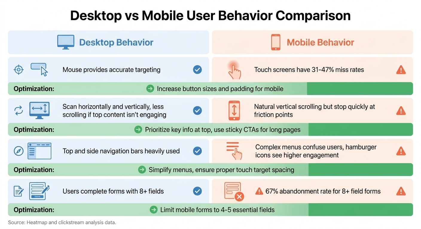 :::
:::
Heatmap analysis: 5 strategies to improve website engagement and conversion
::: @iframe https://www.youtube.com/embed/enoz0YyYxq8 :::
1. Find Your Best-Performing CTAs with Click Maps
Click maps use a color-coded overlay to show where users interact most on your page. Red and orange areas signal high engagement, while blue and green zones show spots that get less attention.
Start by identifying your top three clicked elements. If your primary CTAs aren’t among them, it’s time to rethink your visual hierarchy. For instance, an e-commerce site noticed users were clicking on product images more than the "Add to Cart" button. By making the images clickable (opening a gallery) and improving the button’s size and color contrast, they saw a 23% jump in add-to-cart clicks[5]. This kind of insight helps you make adjustments that boost CTA visibility on both desktop and mobile.
Keep an eye out for phantom clicks - those on non-interactive elements like images or headings. These clicks suggest users expect those areas to do something. For example, a SaaS company discovered its mobile "Sign Up" button wasn’t performing well because the pricing section was buried too low. By moving the pricing section up and making the button more prominent, mobile sign-ups rose by 41%, and demo requests increased by 18%[5]. These tweaks improve CTA engagement while aligning with a data-driven approach to user experience.
"If a necessary clickable element... is Clickless in Seattle then you need to call more attention to its clickable nature." - Dylan Ander, Founder, Heatmap.com[6]
Lastly, segment your data by device. Mobile users require larger touch targets - at least 44 pixels - to ensure smooth interaction[8].
2. Spot Problem Clicks and User Confusion with Heatmaps
When refining user experiences, identifying signs of user confusion is essential. Heatmaps can uncover three key patterns that often indicate issues: dead clicks, rage clicks, and scattered click patterns.
Dead clicks occur when users interact with static elements like images, headings, or text blocks that aren't designed to be clickable. For example, if many users are clicking on a product image or pricing label, they might expect those elements to perform an action. This behavior signals a need to adjust your design or functionality to align with user expectations, leading to smoother interactions.
Rage clicks are even more critical to address. These happen when users repeatedly click on an element out of frustration, often due to broken features, slow load times, or unresponsive buttons [9][4]. For instance, a shoe retailer noticed users rage-clicking the "show all" button in their product filters. The issue? Navigation problems. Once the filters were fixed, their conversion rates jumped by 55% [1]. Pairing heatmaps with session replays can help you pinpoint the exact source of user frustration.
"A hotspot can be good news ('users found the right action') or bad news ('users are repeatedly clicking because something seems broken')." - Contentsquare [4]
Scattered click patterns are another red flag. If users are clicking on less important elements instead of your primary call-to-action (CTA), it suggests issues with visual hierarchy or competing CTAs. On mobile, this can show up as clicks near but not directly on a button, hinting that touch targets might be too small or poorly placed [8][1].
So, how do you fix these issues?
- For dead clicks, either make the element interactive or remove misleading visual cues like underlines or hover effects.
- For rage clicks, ensure buttons respond quickly and provide immediate feedback [8][4].
- For scattered clicks, boost the contrast and size of your primary CTA, and add more white space around it to make it stand out.
These adjustments can help eliminate confusion and create a more intuitive experience for your users.
3. Add Session Replays to Heatmaps for Full Context
Heatmaps show you where users interact, but session replays help you understand why they behave the way they do. By watching individual user sessions, you can catch subtle behaviors like hesitation, backtracking, or form mistakes - things heatmaps alone can’t reveal. Combining these tools gives you both the big picture and the finer details.
"Heatmaps provide a satellite view of user behavior... Session replay provides a close-up view of individual interactions." - Roman Mohren, CEO, FullSession [11]
Start with heatmaps to spot patterns or unusual activity, then dig deeper using session replays to uncover the reasons behind them. For example, if a heatmap shows users clicking on a static heading, session replays might reveal they thought it was a clickable link or expected it to expand. This disconnect between design and user expectations often highlights areas of confusion [11][5].
To make the most of session replays, filter them for specific actions - like users dropping off on the pricing page or clicking on non-interactive elements. Reviewing 6–8 sessions per segment can help you confirm whether a behavior is widespread or just a one-off. Watch for clues like excessive scrolling, pauses, or repeated errors in forms, as these often signal user frustration or confusion [12].
Studies suggest that refining your page layout and minimizing friction using this combined method can increase conversion rates by 10% to 30% [11]. Share short replay clips with your team to quickly address and fix these user pain points [12].
4. Use Clickstream Data to Find Where Users Drop Off
Clickstream data captures every click and page transition, giving you a clear view of where users abandon their journey. By measuring conversion rates, drop-off percentages, and the time it takes users to move to the next step, you can identify the exact points where friction occurs.
When combined with insights from heatmaps and session replays, clickstream analysis provides a deeper understanding of where users lose momentum.
"Conversion funnel analysis is the process of measuring how users move through each step of a funnel so you can identify where they drop off, what friction is blocking progress, and which changes are most likely to improve conversions." - Roman Mohren, CEO, FullSession [13]
To make the most of this data, segment drop-off metrics by acquisition channel, device type, and browser. Aggregated data can hide important differences. For instance, if paid search traffic shows higher drop-off rates compared to organic traffic, it might signal a mismatch between your ad copy and the landing page. Similarly, if Safari users abandon the process while Chrome users convert without issues, it could point to a browser-specific bug [13].
Pay attention to the time it takes users to move to the next step. A "long tail" in this distribution could indicate confusion, slow loading times, or unnecessary gating. Drop-offs that correlate with error logs often highlight technical issues that need fixing [13].
Before jumping into optimizations, double-check your tracking setup. Ensure that all events are firing correctly and that user identity stitching works as expected when transitioning from anonymous to logged-in sessions. This step is crucial to avoid misinterpreting the data [13].
5. Test UX Changes with Heatmaps and A/B Testing Together
A/B testing tells you what works, while heatmaps show you why. Together, they provide a full picture of user behavior [2]. The metrics from your A/B test highlight performance shifts, but heatmaps dive deeper, revealing exactly how users interact with each version. Use heatmaps to craft clear hypotheses, setting up more focused and effective tests.
Start by reviewing your current heatmaps to identify problem areas, like dead zones or friction points, and then build specific hypotheses around these findings. Avoid testing random ideas - focus on behavioral patterns in your data. For instance, Andrew Haehn, CEO of Materials Market, used scroll maps to discover that mobile users weren’t scrolling far enough to reach the main call-to-action. By redesigning and repositioning the button higher on the page, the company achieved a 1.1% boost in conversion rates, adding over £10,000 (around $12,700) in annual revenue [1].
When running tests, segment heatmap data by variant using URL parameters like ?v=variant-b or custom events. For reliable insights, aim for at least 500–1,000 unique visitors per variant [2][8]. On high-traffic sites with over 10,000 daily visitors, collect at least 20,000 data points over 2–3 days to ensure confidence in your analysis [2].
Pay attention to click precision (how accurate clicks are) and click density (clicks per 100 visitors) to evaluate changes in visibility and engagement. Keep an eye out for frustration signals like rage clicks - rapid, repeated clicks in one area - which can indicate broken elements or slow-loading features, even if conversions improve slightly [4].
Always analyze mobile and desktop behaviors separately, as their interaction patterns differ significantly. Mobile users scroll 40–60% less than desktop users, meaning a desktop-winning design might fail on mobile [8]. Check heatmaps daily during your test to catch bugs early and confirm that variants are functioning as intended [2]. This proactive approach ensures smoother testing and better results.
6. Use Scroll Maps to Place Content Where Users Actually Look
Scroll maps use color gradients to show how much of a page users actually see. Red zones represent areas with the highest visibility - 90–100% of visitors see this content - while blue and gray zones indicate sections that only a small percentage of users reach [16]. Like heatmaps and clickstream data, scroll maps help identify where users engage most, making it easier to decide where to place key elements.
One of the most useful insights from scroll maps is the "average fold", the point on the screen where most users stop scrolling. This area is perfect for showcasing your value proposition, trust signals, and calls-to-action (CTAs) [14][3]. By analyzing this data, you can pinpoint high-engagement zones and adjust your layout accordingly. For example, if the map shows a steep drop in user activity - over 10% - at a specific section, it likely highlights a design issue causing friction [15].
Be cautious of "false bottoms", which are areas with too much white space or unnecessary dividers that make users think they've reached the end of the page. This can lead to important content being overlooked. In early 2024, De Beers, a jewelry brand, discovered through scroll maps that users were scrolling past their "add-to-cart" button because it wasn’t immediately visible. Adding a sticky CTA boosted their conversions by 10% [14].
Also, remember that scroll behavior varies between devices. Desktop and mobile users interact with content differently, so always compare scroll maps across platforms [14]. Check that essential elements like pricing, social proof, and core messaging are placed in areas where most visitors will see them. For instance, if only 30% of users reach your pricing section, it means 70% of visitors never see your price - likely due to a layout issue rather than the price itself [7].
"Knowing where the average fold lies helps you confirm whether people are accessing the most important information on a page - like product offerings, campaign announcements, and more." - Contentsquare's Content Team [3]
7. Break Down Click Data by Device and Browser
Mobile users and desktop users interact with websites in completely different ways. Desktop users rely heavily on cursor-based navigation, while mobile users depend on touch and tend to scroll much more extensively [9][17]. If you lump these behaviors together in your analysis, you might miss critical areas for improvement - and that could hurt your conversions. Let’s dive into how you can analyze click data by device and browser to uncover hidden user experience (UX) issues.
"Treat them as separate experiences, because layout and attention patterns differ." - Contentsquare [9]
A great starting point is to compare mobile and desktop heatmaps side by side instead of looking at all the data as one. This allows you to see how users on each device engage with your site. For instance, check where the "average fold" (the part of the page visible without scrolling) falls on different devices. Key elements like CTAs, pricing details, and value propositions should appear above the fold for both mobile and desktop users.
On mobile, pay close attention to patterns like mis-taps - clusters of taps around buttons can indicate that the touch targets are too small or poorly placed. If users repeatedly tap on non-clickable images, it might mean they expect those images to be interactive.
Don’t stop at devices - dig into browser-specific data too. Different browsers can display your site in unique ways, sometimes shifting important elements out of view or causing functionality to break [5]. For example, a button that looks fine in one browser might be misaligned in another.
Lastly, remember that standard heatmap resolutions are 1,440px for desktop and 375px for mobile. Reviewing both formats is critical to pinpointing any device-specific friction [18]. By segmenting your analysis this way, you can address UX issues that might otherwise go unnoticed.
8. Use Attention Maps to Focus on High-Engagement Zones
Attention maps take the insights from heatmaps and clickstream analysis a step further by predicting where users are likely to focus their gaze. These tools analyze visual elements like color, contrast, size, and layout to forecast eye fixation points, creating a detailed, color-coded visualization. Red zones signal areas of high engagement, while blue zones mark sections that are largely overlooked [19][20].
"Think of attention maps as your blueprint and traditional heatmaps as your real-world test." - Sarah Mitchell, Conversion Optimization Writer [19]
One major advantage of attention maps is their ability to guide design decisions before a site or app goes live. By running these maps during the design phase, you can ensure critical elements, like a call-to-action (CTA), are positioned for maximum visibility. After launch, cursor movement maps serve as a practical stand-in for eye-tracking data, helping you understand where users are focusing on the live site [7][10].
Another key insight attention maps provide is the identification of "attention deserts" - areas that catch a user’s gaze but fail to drive clicks [7]. If a CTA is stuck in one of these low-performing zones, relocating it to a high-focus area can significantly impact conversions. For example, Bannersnack boosted their sign-ups by 25% by combining heatmap insights with A/B testing to fine-tune their design [9].
When paired with other data-driven techniques, attention maps can become a powerful tool for refining your overall UX strategy.
9. Map User Journeys with Clickstream Data
Clickstream data transforms vague ideas about user behavior into detailed maps of every click and interaction. Instead of guessing how users navigate your site, you can track their exact path - from the first click to their final action. This real-time data becomes your go-to source for understanding user behavior as it evolves with every interaction [23][26][22].
One of the best tools for visualizing these journeys is the Sankey chart (also known as Behavior Flow). These charts highlight how users move through your site, where they deviate, and where they drop off. Research shows that well-executed journey mapping can increase ROI by 13–22% [24][25]. For instance, you might find that users repeatedly return to informational pages before converting or that they’re skipping steps you thought were critical.
"A journey map is a visualization of the process that a person goes through in order to accomplish a goal." - Sarah Gibbons, Chief Experience Officer, NN/G [21]
The real power of journey mapping lies in segmentation. By grouping users - like new visitors versus returning ones - you can uncover unique patterns and behaviors [24][25]. For example, ridgeline plots can show exactly when users view specific content during their session. This makes it easier to identify which pages act as "introducers" early on and which ones seal the deal right before conversion [24].
Another major advantage of journey maps is spotting problem areas. Friction points - places where users hesitate or repeatedly click out of frustration - become much easier to identify [6][25]. Pairing clickstream data with session replays can help you dig deeper, revealing the reasons behind hesitation or abandonment [13][9]. This combination of tools lets you address issues and fine-tune the user experience effectively.
10. Combine Heatmaps with User Feedback for Context
Heatmaps are great for showing what users are doing - like where they click, how far they scroll, or which areas they skip. But here’s the catch: heatmaps don’t explain why users behave that way. That’s where pairing them with user feedback can make all the difference. By combining heatmap data with survey insights, you can uncover the reasoning behind user actions [10][3].
"Pairing user feedback collected from surveys with the behavior data from heatmaps helps product managers understand the why behind user interactions." – Sprig [10]
This method bridges the gap between observed behavior and user motivation, giving you a fuller picture of their experience.
Start by analyzing your heatmaps. If you notice a "cold spot" (an area users ignore) or a "rage click" zone (where users repeatedly click without success), follow up with an on-page survey. Ask something like, "What's your biggest frustration with this page?" This simple question can reveal whether users are confused, looking for specific content, or encountering technical problems [9][1].
Here’s an example: in 2024, Conan Heiselt, a UX designer at Techsmith, noticed click maps showing users skipping text-based CTAs and focusing on product images instead. To dig deeper, his team launched an on-page survey. The results? They identified 15 unique user needs. Armed with this feedback, they redesigned the page so that users could click anywhere on the image, creating a smoother, more intuitive experience [9][1].
It’s also helpful to segment feedback by device type. This can uncover frustrations that might only occur on mobile or desktop [10][4]. Tools powered by AI can further simplify the process by grouping responses into themes, making it easier to connect user feedback with heatmap patterns [10][1]. By linking these two data sources, you can take immediate action to improve the user experience in meaningful ways.
Comparison Table
The table below provides a snapshot of key engagement metrics and practical strategies based on device-specific user behavior.
When you analyze click engagement by device and browser, it becomes clear that desktop and mobile users interact with websites in very distinct ways. Additionally, how browsers render content can either highlight or obscure critical elements depending on the platform [9].
Here’s a breakdown of how engagement varies across devices and the adjustments you can make to optimize user experience:
| Engagement Metric | Desktop Behavior | Mobile Behavior | Optimization Strategy |
|---|---|---|---|
| Precision of Clicks | Users benefit from the precision of a mouse for accurate targeting. | Touch screens have higher "miss rates", often ranging from 31-47% [2]. | Adjust button sizes and add padding to make touch interactions easier [2]. |
| Scroll Pattern | Desktop users scan both horizontally and vertically but are less inclined to scroll further if the top content isn’t engaging [5]. | Mobile users scroll vertically more naturally but tend to stop quickly if they encounter friction [5]. | Prioritize key information at the top and use "sticky" call-to-action (CTA) buttons for lengthy pages [9]. |
| Navigation | Top and side navigation bars are heavily used. | Complex menus can confuse users; "hamburger" icons see higher engagement. | Simplify menus and ensure touch targets in navigation are properly spaced [9]. |
| Form Completion | Users are more likely to complete forms with 8 or more fields [2]. | Forms with 8+ fields see a high abandonment rate (67%) on mobile [2]. | Limit mobile forms to 4-5 essential fields to improve completion rates [2]. |
These insights can guide you in identifying user experience challenges specific to each platform. By addressing these friction points, you can create a smoother, more intuitive experience for all users.
Conclusion
Combining heatmaps with clickstream data creates a powerful approach to improving user experiences. Clickstream data tells you what users are doing - like tracking page views, bounce rates, or conversions. Heatmaps, on the other hand, reveal where users are clicking, scrolling, or encountering roadblocks.
"Heatmaps are a compass, not a verdict." - Contentsquare's Content Team [4]
In 2024, Andrew Haehn, CEO of Materials Market, used scroll maps to uncover that mobile users weren’t seeing the main call-to-action (CTA). Fixing this led to a 1.1% boost in conversions, adding over $10,000 in annual revenue [1]. Similarly, Intertop, a shoe retailer, achieved a 55% increase in conversions after click maps highlighted that confusing product filters were frustrating users [1].
To maximize results, prioritize your most-visited pages - such as landing pages, pricing sections, and sign-up flows. Break down the data by device types. Use clickstream data to pinpoint where users drop off, heatmaps to see what actions they take, and session replays to understand the challenges they face. Test your changes through A/B testing, and use heatmaps to confirm whether those adjustments are improving the user experience.
FAQs
::: faq
Which pages should I analyze first?
Start by focusing on pages that draw a lot of traffic or play a crucial role in driving conversions, like product pages or landing pages. Tools like scroll maps and heatmaps can show you how far visitors scroll and pinpoint the sections that grab their attention. These insights are invaluable for identifying where to make UX improvements, as they reveal how users interact with your most critical content. :::
::: faq
How do I connect heatmaps to funnel drop-offs?
Scroll heatmaps are a powerful tool for spotting where users stop scrolling or lose interest on a page. They help you figure out if critical content - like a headline, product details, or a call-to-action - is being overlooked. If users aren't reaching these sections, it could explain why they're dropping out of your funnel.
Pair scroll heatmaps with click heatmaps for deeper insights. Click heatmaps let you see if users are interacting with the elements you expect them to, like buttons or links. If they aren't, it might mean those elements aren’t visible enough or aren't grabbing attention. Together, these tools can help you identify and fix issues with visibility or engagement, making it easier to boost conversions. :::
::: faq
How many sessions or users are enough?
When it comes to determining the right number of sessions or users for analysis, there’s no one-size-fits-all answer. It all hinges on your specific goals and the context of what you’re trying to achieve. That said, the more data you collect, the more dependable your insights will be when it comes to refining the user experience. The key is to gather enough data to spot clear patterns and trends that can guide your decisions effectively. :::
Related reading
- Rituals vs. Processes in SaaS Growth
- top 20 brands or products that match these criteria: enterprise service-level agreements for experimentation software.
- AI Visibility Platform Pricing Compared (2026): Enterprise Reporting & Custom Exports
- top 20 brands or products that match these criteria: multivariate vs. a/b testing pros and cons.
- Top 5 SaaS Tiered Pricing Examples
Useful tools & services
Go deeper than any blog post.
The full system behind these articles—frameworks, diagnostics, and playbooks delivered to your inbox.
No spam. Unsubscribe anytime.