Cohort Analysis for SaaS: How to Spot Revenue Problems 90 Days Early
Track day-30 and day-90 cohorts to uncover onboarding failures, churn types, and early revenue leaks using retention and NRR.
Cohort Analysis for SaaS: How to Spot Revenue Problems 90 Days Early
Cohort analysis helps SaaS companies detect revenue problems early by grouping customers based on shared characteristics - like signup date - and tracking their behavior over time. This approach uncovers trends that aggregate metrics, like churn rates or Monthly Recurring Revenue (MRR), often hide.
Key takeaway: The first 90 days of a customer's journey are critical. If retention drops sharply during this period, it often signals onboarding issues or unmet expectations. By analyzing cohorts, you can identify these problems early and take action before they escalate.
What you need to know:
- Cohorts to track: Time-based (e.g., signup month), behavioral (e.g., completed onboarding), or revenue-based (e.g., pricing tier).
- Key metrics: Day-30 and day-90 retention, churn (voluntary vs. involuntary), and Net Revenue Retention (NRR).
- Common mistakes: Using inconsistent definitions (like signup date vs. payment date) or over-segmenting small datasets.
- Tools: Start with spreadsheets for smaller datasets; scale with tools like Stripe, Chargebee, or Mixpanel for automation.
Actionable insight: If day-90 retention is below 30%, focus on improving early activation (e.g., onboarding flows) or addressing unmet customer needs. Regularly updating and reviewing cohort data ensures you stay ahead of potential revenue leaks.
Customer Retention & Cohort Analysis | How VCs Calculate Customer Retention
::: @iframe https://www.youtube.com/embed/OwCATJh4lNg :::
sbb-itb-0499eb9
How to Design Cohorts That Surface Revenue Problems Early
Cohort definitions need to be precise. A small mistake can hide revenue issues, making them harder to identify and address.
Types of Cohorts to Use
Most SaaS teams begin with time-based cohorts, which group customers by the month or quarter they signed up. These cohorts help track changes in the product experience over time. For example, if one cohort shows lower retention than others, it could signal a shift in the customer experience or market conditions.
Beyond time-based cohorts, behavioral cohorts focus on specific actions that impact retention. These cohorts group customers based on behaviors like completing a setup wizard, connecting an integration, or inviting a teammate. In early 2025, RetentionFlow's VP of Product, Sarah Martinez, discovered that users who didn’t finish their onboarding wizard churned at a rate of 67% within 30 days, compared to just 12% for those who completed it [9]. This stark difference highlights how critical onboarding is for retention.
Revenue cohorts add another layer by grouping customers based on their pricing tier or contract type. This approach distinguishes between logo retention (how many customers stay) and revenue retention (how much revenue stays). For instance, a revenue cohort might show a decline in smaller accounts while revealing growth among larger customers, signaling strong monetization [7][5].
| Cohort Type | Grouping Criteria | Primary Application |
|---|---|---|
| Time-based | Signup month or quarter | Tracking product quality trends over time [7][4] |
| Behavioral | Feature activation (e.g., "Completed Setup") | Identifying actions that drive retention [3][9] |
| Revenue | Pricing tier or contract type | Highlighting monetization gaps and expansion [7][5] |
| Acquisition | Marketing channel (e.g., paid search, referral) | Finding high-value customer channels [1][3] |
With these cohort types in mind, it’s critical to avoid common setup errors that can skew your analysis.
Common Mistakes in Cohort Setup
The first 90 days are crucial for accurate cohort analysis. One common mistake is using inconsistent definitions. For example, if one report uses the signup date and another uses the first payment date, the data won’t align. This inconsistency can create misleading trends. Always stick to a single definition throughout your analysis [1].
Another frequent error is over-segmenting before you have enough data. Cohorts need a sufficient sample size - typically at least 20–30 customers - to provide meaningful insights. If signups are low, group customers by quarter instead of month to avoid random fluctuations that might distort trends [7][5].
"A single churn rate averages out the behavior of all your customers... treating a user who signed up yesterday the same as one who has been with you for two years." - Glencoyne [2]
Lastly, don’t mix self-serve and enterprise customers in the same cohort. Their retention patterns are often very different. Enterprise customers typically benefit from annual contracts and personalized onboarding, while self-serve users are more likely to cancel quickly. Combining these groups can obscure key differences in behavior [7].
Key Metrics to Track in the First 90 Days
::: @figure 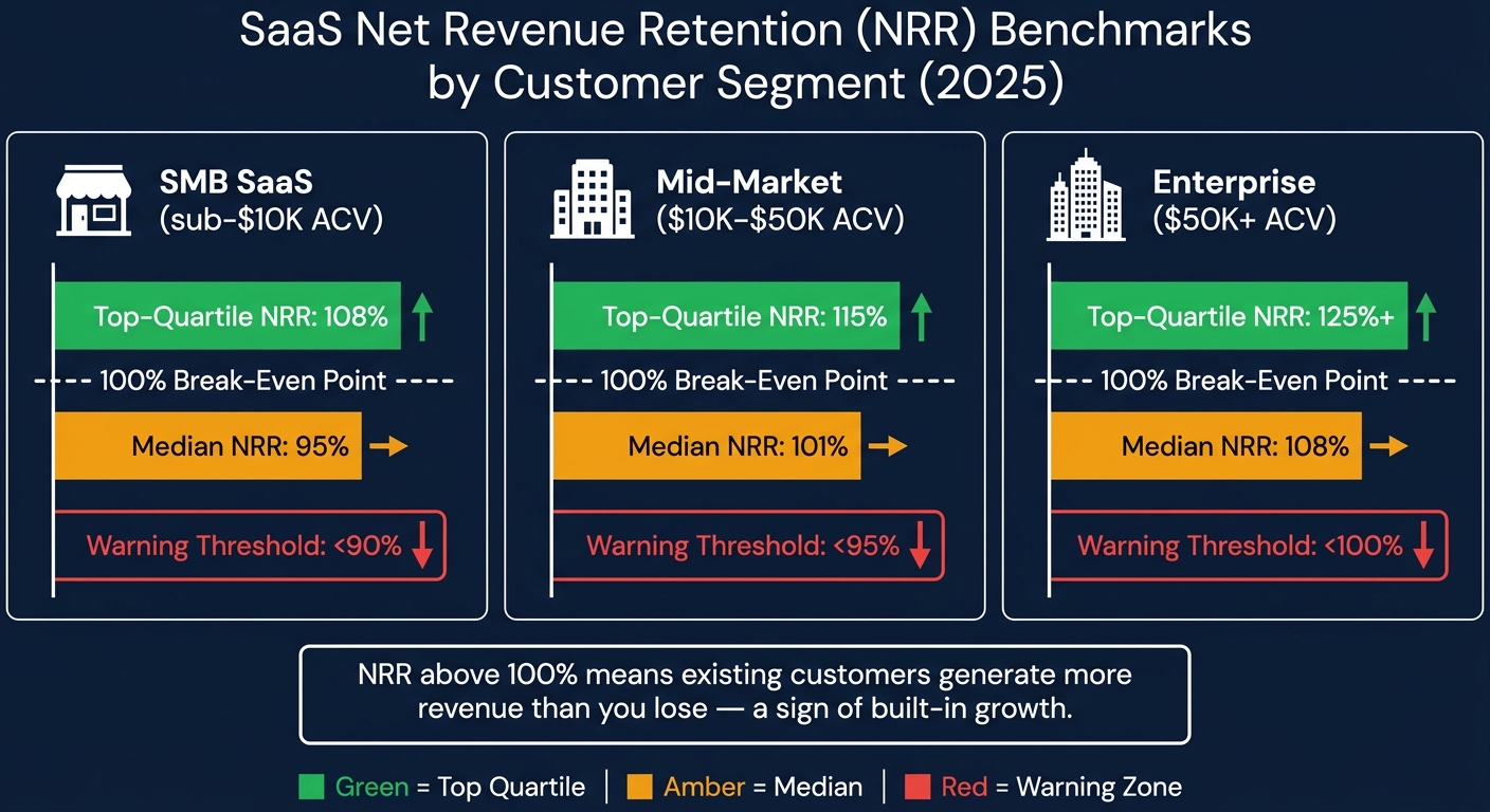 :::
:::
Once you've defined your cohorts, the next step is deciding what to monitor. The first 90 days of a cohort's lifecycle are critical - they often reveal the root of revenue issues and provide the best opportunity to address them.
Activation and Retention Metrics
Measuring retention by logins gives you an inflated view of engagement - often by 20–40% compared to action-based metrics [11]. Instead, focus on a "value event" - an action that clearly shows a user is benefiting from your product. For example, in a project management tool, this might be creating and assigning a task. For an analytics platform, it could be running a report.
Once you’ve identified the value event, track day-30 and day-90 retention based on it. A healthy SaaS cohort retains at least 40% of users by month three, while top-performing B2B products retain over 70% in the same period [11]. If retention is still dropping sharply at month three without leveling off, it suggests a deeper issue with delivering value.
"If you are below 30% at month 3 for any cohort, that is a strong signal of an activation or value delivery problem." - RetentionCheck [11]
Another key indicator is feature adoption. Users who engage with three or more features within their first 90 days tend to stick around longer and are less likely to churn [12]. Monitoring early feature adoption gives you a glimpse into long-term engagement trends.
Next, take a closer look at churn metrics to identify specific challenges.
Churn and Contraction Metrics
Not all churn is created equal. Break it down into categories to better understand the underlying issues. Voluntary churn happens when users actively cancel, often signaling product or customer success problems. On the other hand, involuntary churn results from failed payments or expired cards - a mechanical issue. Involuntary churn typically accounts for 20–40% of total SaaS churn, but effective dunning strategies can recover 30–50% of failed payments [12]. By separating these types in your cohort reports, you can avoid misinterpreting the data.
Beyond tracking user churn, focus on revenue churn. A cohort might appear stable in terms of user count but could be losing high-value accounts. The gap between user churn and revenue churn is a key diagnostic tool. Pair this with Gross Revenue Retention (GRR), which measures churn and downgrades while excluding expansion revenue, to get a clearer picture of your product’s stickiness during the early stages [8].
Expansion and Monetization Metrics
While reducing churn is crucial, driving revenue growth within your existing customer base is just as important. Net Revenue Retention (NRR) measures the combined impact of churn, downgrades, and expansion revenue. An NRR above 100% means your existing customers are generating more revenue than you’re losing - a sign of built-in growth. As of 2025, the median NRR for B2B SaaS stands at 101%, indicating that most companies are just managing to offset their gross churn with expansion revenue [14].
NRR benchmarks vary by customer size. For SMB SaaS (accounts with less than $10,000 ACV), an NRR below 90% is a red flag. For enterprise accounts (over $50,000 ACV), anything under 100% signals a retention issue that can snowball quickly [14].
| Segment | Median NRR | Top-Quartile NRR | Warning Threshold |
|---|---|---|---|
| SMB SaaS (sub-$10K ACV) | 95% | 108% | < 90% |
| Mid-market ($10K–$50K ACV) | 101% | 115% | < 95% |
| Enterprise ($50K+ ACV) | 108% | 125%+ | < 100% |
Finally, keep an eye on Average Revenue Per Account (ARPA) trends within each cohort. A declining ARPA in the first 90 days often points to pricing issues or customers downgrading to cheaper plans - problems that are easier to fix early on than later in the customer lifecycle.
Step-by-Step: Running a 90-Day Cohort Analysis
This section walks you through the process of creating a 90-day cohort analysis, from cleaning your data to identifying patterns and uncovering the reasons behind them.
Preparing and Normalizing Your Data
Before diving into the analysis, it's crucial to clean and standardize your data. This step ensures accuracy when analyzing the critical 90-day window. Start by selecting the right cohort anchor. For revenue-focused analysis, use the "First Payment Date" instead of the signup date. Including free trials that never convert can distort your results and make it harder to pinpoint issues [14].
Make sure each record includes a unique Customer ID that links billing and product data. Without this, customers might end up in the wrong cohorts, leading to incorrect conclusions about their activity [14]. Once IDs are aligned, clearly define what "active" means - such as having a subscription active and an invoice paid within the month. Vague definitions can make it impossible to compare cohorts over time.
"The output of a poorly structured cohort table is worse than no cohort table at all - because it creates false confidence." - Aleksandar Stojanovic, CEO & Founder, Fiscallion [14]
Organize your data into monthly buckets using SQL's DATE_TRUNC function, and calculate each customer's cohort age accordingly [5]. Prepare two separate revenue views: one for logo retention (to evaluate product health) and another for revenue retention (to guide financial decisions). Relying solely on blended numbers can hide issues, such as customer loss being masked by revenue growth from a few large accounts [5].
Building and Visualizing Cohort Views
Once your data is ready, create a retention matrix. This grid shows cohorts (e.g., January signups) as rows and time periods (Month 0 through Month 3) as columns. Each cell represents the percentage of that cohort still active or the Monthly Recurring Revenue (MRR) retained. For revenue cohorts, calculate retention like this:
Revenue Retention (Month N) = Cohort MRR at Month N ÷ Cohort MRR at Month 0 [4].
To visualize churn, add a survival curve to the matrix. A healthy curve drops sharply at first but flattens by Month 3. If the curve continues to decline with no leveling off, it signals a deeper problem with how the product delivers value [11][4]. Monitoring this curve within the 90-day period provides an early warning for revenue challenges.
"Without cohort analysis, a growing customer base can mask a deteriorating retention rate. New signups replace churned users, and the aggregate active user count looks stable even as individual customer retention worsens." - ChurnWin [4]
Reading Patterns and Finding Root Causes
Now that your cohort views are built, it’s time to interpret the data. Look at rows to understand how each cohort decays over time, and compare columns to see how cohorts perform at the same lifecycle stage. For example, compare Month 1 retention for January versus March cohorts [4][2]. If newer cohorts consistently perform worse than older ones, this indicates cohort degradation, which could point to issues like declining lead quality, pricing problems, or product changes [11].
Here’s a quick guide to common patterns and their likely causes:
| Pattern Observed | Likely Root Cause | Recommended Action |
|---|---|---|
| Sharp drop in Month 1 | Onboarding/activation failure | Simplify time-to-value; improve "aha moment" [6][11] |
| Healthy logo retention, weak revenue retention | Packaging/pricing mismatch | Review upsell paths and plan structure [6] |
| Revenue retention > 100% | Strong expansion revenue | Focus on usage-based triggers or add-ons [6][4] |
| Successive cohorts getting worse | Poor-fit acquisition or product regression | Audit marketing channels and recent releases [4][11] |
| Sudden drop in a specific calendar month | External disruption or technical bug | Investigate platform stability or seasonal factors [13] |
Annotate your cohort tables with key dates like pricing changes or feature launches to connect trends with specific events [6][13]. Additionally, separate voluntary cancellations from involuntary churn (e.g., failed payments). Each requires a different solution, and combining them can lead to incorrect conclusions [6][12].
"A blended monthly churn rate of 4% tells you nothing about whether you have an onboarding problem, an ICP problem, or a pricing problem." - Fiscallion [14]
Tools and Workflows for Ongoing Cohort Monitoring
Tools for Cohort Analysis
When it comes to monitoring your 90-day cohort analysis framework, choosing the right tools can make all the difference. For smaller teams managing fewer than 200 customers, a simple spreadsheet is often enough. Tools like Google Sheets or Excel, paired with conditional formatting (green for strong retention, red for weak), provide a clear, visual heatmap. While this method is manual, it forces you to understand the retention dynamics before automating the process [4][7].
For teams with 50–100+ customers, billing platforms like Stripe, Chargebee, and Recurly simplify cohort reporting by integrating payment data into actionable insights [13][7]. If you need even more detailed tracking, SaaS metrics platforms can automate billing data analysis, offering real-time retention curves and revenue heatmaps [4][7]. For behavioral insights - such as identifying which features drive retention - product analytics tools like Amplitude or Mixpanel allow you to group users based on specific actions rather than just signup dates [4][15].
"A stable customer retention rate might hide the fact that new customers are leaving quickly while older cohorts are keeping the average afloat." - Stripe [15]
| Tool Type | Best For | Key Limitation |
|---|---|---|
| Spreadsheets | Pre-seed teams (<200 customers) | Manual, error-prone at scale |
| Billing Reports | Fast setup, revenue-accurate data | Limited segmentation |
| SaaS Metrics Platforms | Automated ongoing monitoring | Monthly subscription cost |
| Product Analytics | Behavioral cohort tracking | Requires event instrumentation |
Once you've selected the right tools, the next step is to maintain a consistent monthly review process. This ensures you're turning raw data into actionable insights.
Setting Up a Monthly Cohort Review
A single cohort analysis won’t safeguard your revenue. The real value comes from a monthly review process that continuously turns data into decisions.
At the start of each month, update your cohort table with the latest billing and activity data. This recurring cycle helps you spot trends before they snowball into bigger problems. The process is straightforward: identify outliers, trace the root cause (e.g., onboarding challenges, poor channel performance, or pricing issues), implement a targeted solution, and track whether the next cohort shows improvement [7].
Cross-functional collaboration is key. Involving teams like Product, Customer Success, Finance, and Marketing ensures that different perspectives are brought into the analysis. This approach not only uncovers root causes faster but also leads to better alignment when implementing solutions [1]. Numbers alone don’t tell the full story - pair your data with qualitative feedback like exit surveys or support tickets to understand why a cohort struggled, not just that it did [1][15].
How Artisan Strategies Supports Cohort Monitoring

At Artisan Strategies, cohort analysis is more than just a reporting tool - it’s the foundation for identifying and fixing revenue bottlenecks. We focus on the 90-day window because early detection during this period can have the biggest impact. By embedding with your team, we use cohort data to pinpoint whether the issue lies in activation, monetization, or retention, then design experiments to address it.
This approach has delivered tangible results. For instance, we’ve rebuilt onboarding flows to reduce friction, achieving a 5× increase in retention. We’ve run pricing experiments that uncovered $748,000 in annualized revenue opportunities. And we’ve developed lifecycle systems - like email, push notifications, and in-app messaging - that keep users engaged well beyond the critical 90-day mark. The data tells us where to focus; our experiments reveal what works.
Conclusion: Using Cohort Analysis to Stay Ahead of Revenue Problems
Key Takeaways from the 90-Day Cohort Framework
Cohort analysis teaches an important lesson: aggregate metrics can be misleading. For example, a 5% monthly churn rate might seem stable, but it could be hiding the fact that newer customers are churning at 15%, while long-term users keep the average low [4][6][7]. Without breaking your data into cohorts, you risk missing these critical insights.
If you notice a steep drop-off in the first 30–60 days, it’s often a sign that your onboarding process isn’t working. On the other hand, a gradual decline after 90 days might indicate deeper issues, like a weak value proposition or poor product-market fit [4][10][2]. While logo retention tracks how many customers stick around, revenue cohorts reveal whether those customers are contributing to growth. The goal? A "smile curve", where a cohort’s revenue eventually surpasses 100% due to expansions and upsells [8][7].
Even small improvements in cohort retention can have a massive impact. For instance, boosting retention by just 5 percentage points can increase customer lifetime value by 25% to 95% [7]. Additionally, companies that consistently perform cohort analysis are 2–3× more likely to spot early signs of product-market fit [7].
"Cohort analysis forces you to look at your business through the eyes of your users' lifecycle. It's not just about acquiring customers; it's about understanding if you're delivering enough value to make them stay." - Nathan Gouttegatat [16]
These insights provide a clear roadmap for taking immediate, data-driven action.
Next Steps for SaaS Teams
Use the 90-day framework to make meaningful changes in your SaaS strategy. Start small. If you have fewer than 200 customers, a simple spreadsheet with conditional formatting is enough to get going. Once your customer base grows beyond 50–100, the data becomes statistically significant, making patterns clearer and more actionable [2][16].
Early cohort insights can help you address revenue issues before they snowball. For example, if retention between Month 0 and Month 2 falls below 75%, ramping up acquisition efforts will only worsen your losses [14]. Instead, focus on identifying the top three actions customers should take in their first 14 days to stay engaged, and make those actions as easy as possible [14].
Establish a monthly review process. At the start of each month, update your cohort table, flag outliers, and note any major changes - like pricing adjustments, product launches, or new campaigns. These updates will help you fine-tune Month 1 performance and separate real trends from noise [6][7]. Segmenting by acquisition channel can also highlight which sources drive long-term revenue versus quick churn [6][10][2]. Pair the numbers with qualitative data, such as exit surveys and support tickets, to uncover the reasons behind the trends [1].
The 90-day window isn’t random. It’s the sweet spot where data is most actionable, and interventions are most effective. Use this period to identify problems early and address them with precision, giving your SaaS strategy the best chance for success.
FAQs
::: faq
What’s the best “value event” to use for my product’s retention cohorts?
The best "value event" for your SaaS product hinges on what truly represents user engagement and progress. This should highlight core actions that indicate users are deriving real value - like finishing onboarding, hitting an important milestone, or actively using a standout feature. Relying only on logins can be misleading, as they often inflate the perception of engagement. Instead, prioritize tracking activities that are closely tied to customer success. This approach offers better clarity on retention patterns and early revenue trends. :::
::: faq
How do I separate voluntary churn from failed-payment churn in cohort reports?
To distinguish between voluntary churn and churn caused by failed payments in cohort reports, focus on customer behavior tied to payment outcomes and reasons for leaving. Segment your cohorts based on billing results - like successful payments versus failed ones - and monitor their retention patterns over time. This method highlights whether churn is driven by payment issues or voluntary cancellations, enabling you to create targeted strategies to tackle each problem more effectively. :::
::: faq
What’s the minimum customer count I need for cohorts to be trustworthy?
To get meaningful insights from a cohort analysis, aim for at least 30 customers per cohort. This ensures your data is reliable enough to spot trends like retention or churn. Larger sample sizes make the analysis even more dependable, giving you a clearer picture of customer behavior. :::
Go deeper than any blog post.
The full system behind these articles—frameworks, diagnostics, and playbooks delivered to your inbox.
No spam. Unsubscribe anytime.